• Home
  • About Steven
  • IDENTITY
  • PLACES & SPACES
  • SOCIETY
  • TRANSFORMING THE EVERYDAY
  • WRITING
Menu

steven lee

material poet.
  • Home
  • About Steven
  • IDENTITY
  • PLACES & SPACES
  • SOCIETY
  • TRANSFORMING THE EVERYDAY
  • WRITING

Assignment 06

Post-Graffiti Practices, Part Two: Glocalism and Identity Politics

Focus on urban art and its intersection with gentrification and shifting urban tensions globally

Week 06: Assignment 06

June 21, 2022

ANNOTATED BIBLIOGRAPHY PREPARATION

For your final project due June 26th, you will be asked to include an annotated bibliography at the end of your written project of 6 CAREFULLY SELECTED SOURCES that should include at least three resources that are scholarly in nature (i.e. book, book chapter, scholarly journal article) that you consulted and would ideally help someone just coming to your project learn about your chosen artists, art works, themes, ideas, history, etc..

I would like you to use this Assignment to get started on your annotated bibliography and produce THREE annotation entries for your project. For this assignment, at least one of the entries must be linked to a scholarly source and you can use one source provided in the course library on Moodle. The final three entries must be 200-250 words each and include the following:

  1. Summarize and briefly describe the chosen source, who created it, where it was published and any other details of interest about the author or publisher.

  2. Briefly describe and identify the main argument/thesis of the source in your own words using any quotations sparingly.

  3. Discuss why you chose this particular source for the bibliography and how it helps you express the stakes and themes of your exhibition and/or support educating your target audience.

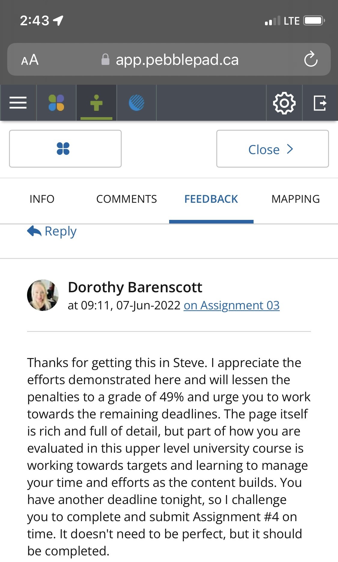
For your PebblePad entry, make sure to link to your source and add an image/screen grab of the source for illustration. Remember I am grading you on strategically you are choosing source material to enhance an understanding of your curatorial project.

  1. Gelperin, Roman. And It Was All Your Fault: Unraveling the Inner Psychology of Depression, How it Begins, and What Cures it. Roman Gelperin, 2019. Chapters 1 & 2.

    Chapters 1 & 2 of Roman Gelperin’s book, And it Was All Your Fault provides an overview of depression and an overview of the symptoms and causes of depression as a mental illness. He opens his overview by comparing the first time someone falls into a clinical depression with the first time someone falls in love. Both of these specific experiences come with overwhelming feelings and changes in one’s behaviour that are what Gelperin describes as being alien to the one experiencing these feelings. Gelperin not only relates information from the DSM-4 and 5, which provide a basis for understanding depression from a psychiatric point of view, but he also provides a brief historical overview - wherein depression itself as a concept dates back to the 5th century BCE and the time of Hippocrates. Ultimately, I was drawn to this work to help better understand what depression is, as a way into figuring out how psychology views it as a mental illness

  2. Rustin, Terry A. “Using artwork to understand the experience of mental illness: Mainstream artists and Outsider artists.” Psycho-social medicine vol. 5 Doc07. 8 Jul. 2008 PMID: 19742284; PMCID: PMC2736519.

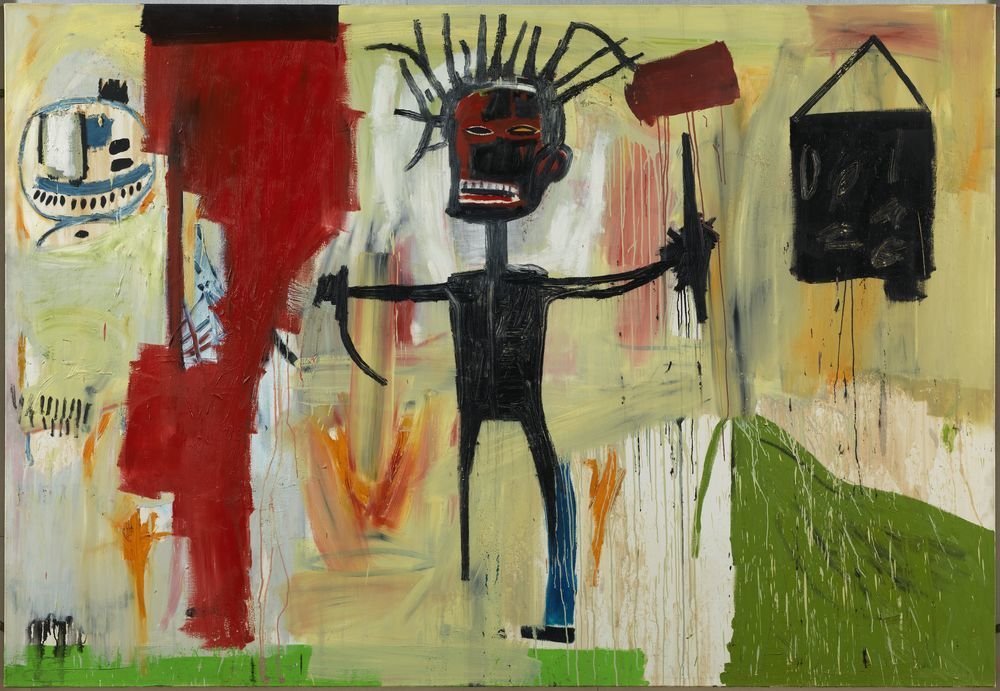
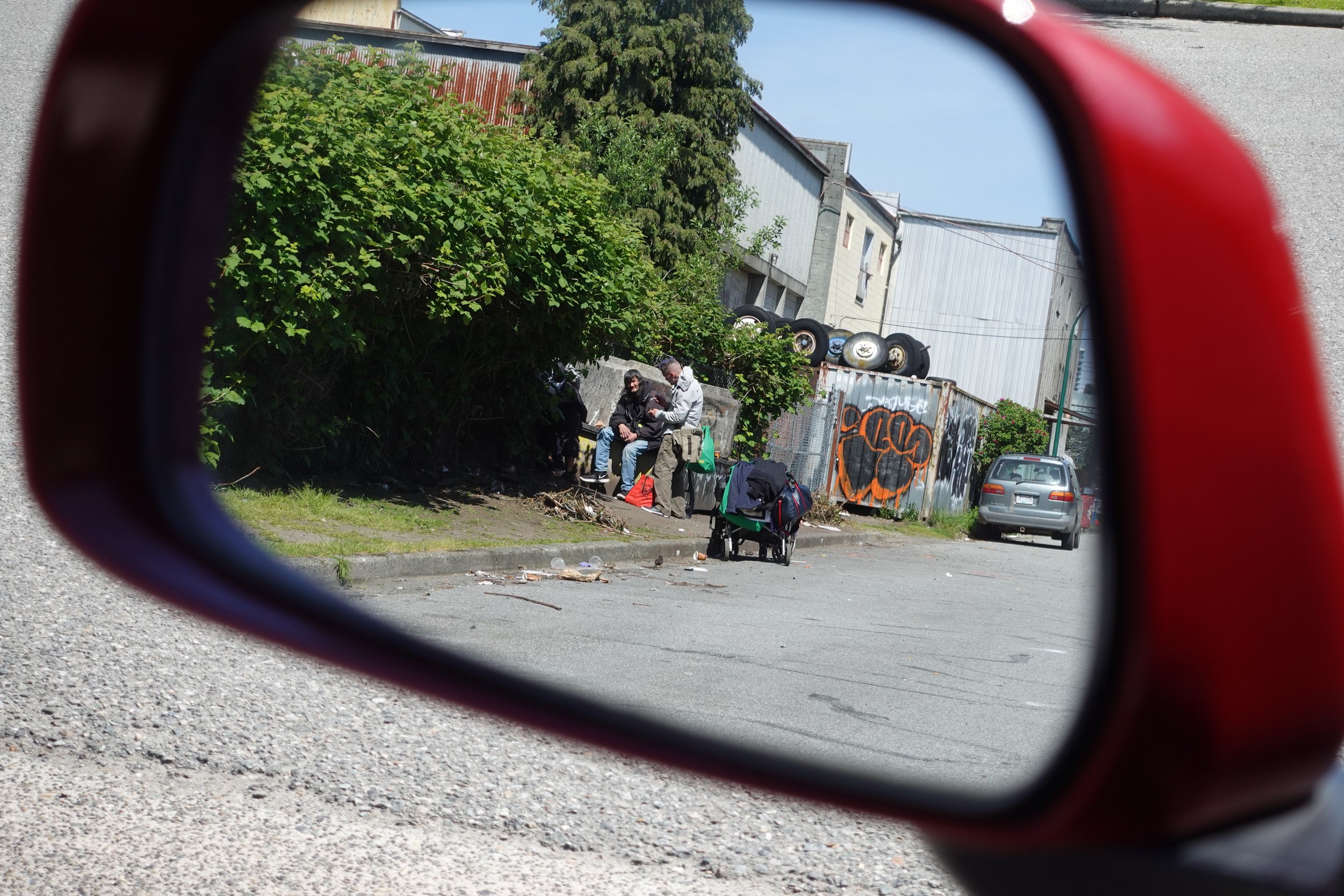
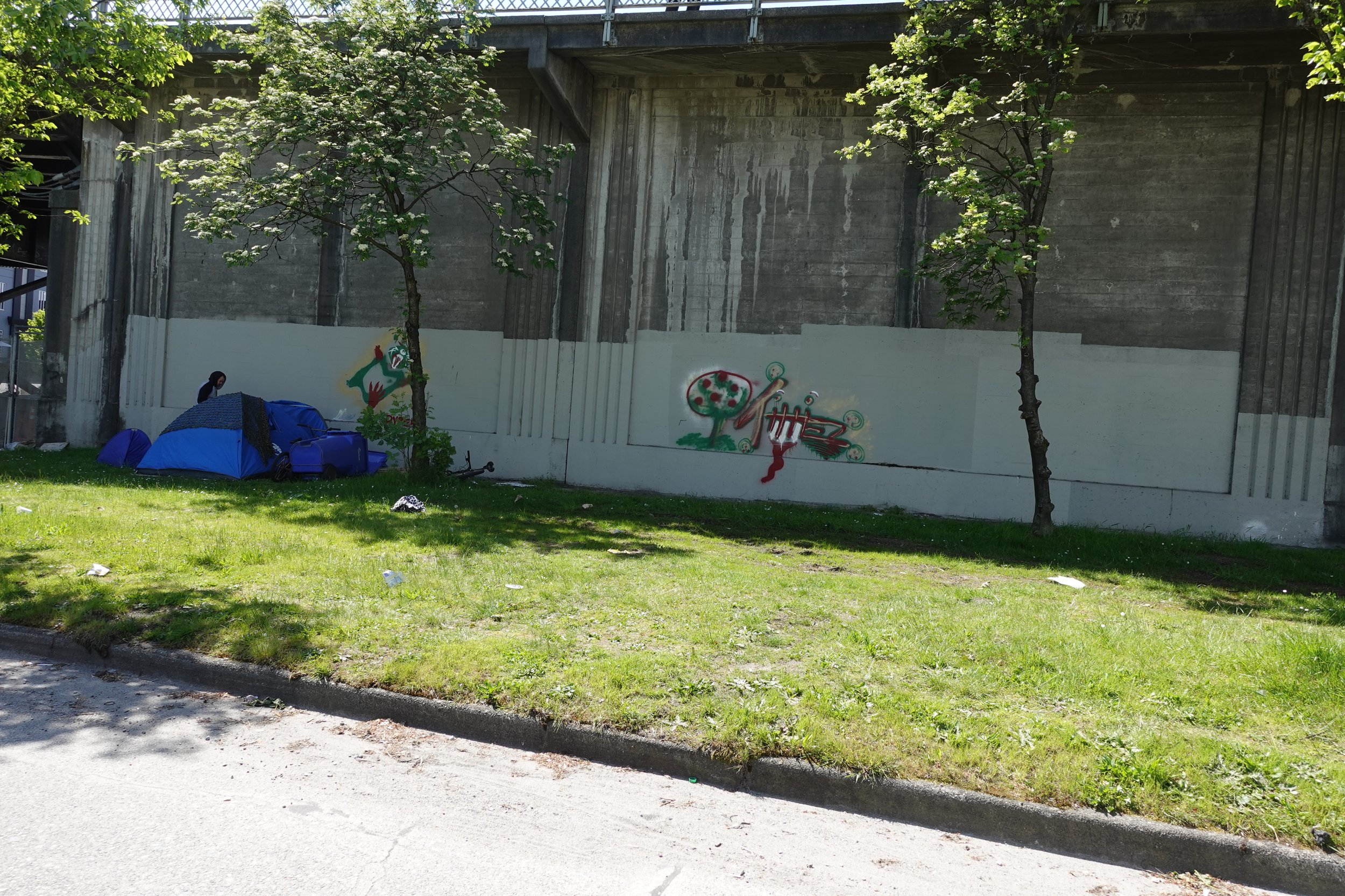
    Rustin’s article, “Using artwork to understand the experience of mental illness” was his exploration of how artwork can help to explore the complex emotions and feelings related to mental illness. It did this through an examination of the art historical cannon of artists and art movements that Rustin felt accomplished this goal: specifically, through art brut (which can be defined as coarse or rough art), which can also be included in outsider art, art that is created by individuals who stood outside of the traditional art establishment. Rustin explores artists such as such as Bernard Buffet, Edward Munch, Mark Rothko, and Vincent Van Gogh to explore how art can exist as a reflection of mental illness, and in particular, depression. In addition to this art historical examination, Rustin examines how he created his own paintings to help explore and better understand what his clients were going through. I liked this article for the historical context it provided, as well as for how Rustin examined outsider artists who, as a group could include the many urban, graffiti, and street artists that exist, many of whom were self-taught, developing outside of the influence of traditional art schools in a DIY culture. As seen in the work of artists I’m considering for this exhibition, many also explored the feelings of isolation, rejection, loss, and alienation that Rustin references, which exist within the world of mental illnesses such as depression.

  3. Stuckey, Heather L., & Nobel, Jeremy. “The Connection Between Art, Healing, and Public Health: A Review of Current Literature”, American Journal of Public Health 100, no. 2, 1 Feb 2010, pp. 254-263. https://doi.org/10.2105/AJPH.2008.156497 PMID: 20019311

    Stuckey’s article, “The Connection Between Art, Healing, and Public Health” was a review of studies concerning research studies conducted primarily between 1995 and 2007 on the topic of the arts and healing. The study looked at four areas of creativity, specifically: music, visual arts, movement-based creative expression, and creative writing. I chose to focus on primarily on the section devoted to the visual arts (although I also looked at the section regarding expressive writing). The article concluded that qualitative research has shown that there is likely a connection between engagement in the arts and an overall positive improvement regarding one’s own health outcomes including reductions in depression, negative emotions, and stress - although it noted that more quantitative studies with control groups were needed to help confirm the qualitative conclusions. I found this article when I was searching for information about how the visual arts can help open up discussions on difficult subjects such as mental health. I was hoping that the information might be as simple as viewing works of art, but the study did primarily discuss studies that involved participants making art, in hospitalized settings. Another recommendation of this review was that more studies should be conducted to see if similar outcomes could be achieved in community based settings - and I wonder if that could involve anything as simple as seeing a work of art on the street or in public. Many artists do make art as a way of dealing with issues they are personally facing - as seen with artists I’m looking at for this exhibition such as Ryan Brunty, and TrustyScribe; as well as other contemporary artists such as Juliet’s Christy, Marcia Diaz, and Tracey Emin. And of course, one can also look at a much wider range of artists from the art historical cannon including Frida Khalo, Edward Munch, and Vincent Van Gogh.


CREATIVE ACTIVITY: Creative Engagement with “Banksy and the Rise of Outlaw Art” (2020)

For this week’s module theme, the street art film I chose focuses on last week’s theme of “punk capitalism” and the institutionalization of street art, along with this week’s focus on urban art and its intersection with gentrification and shifting urban tensions globally.

STEP ONE: Select one of the themes listed below to work with and watch the film looking for place.

STEP TWO: Once you've chosen which question to work with, please use any creative way that you like (text + image collage; drawing; poetry; short story; video; etc..) to answer and address the question, focusing very specifically on the chosen question’s theme.

2. INSTITUTIONALIZATION OF STREET ART: How does the film capture the ways in which street art was in tension with traditional art spaces and/or how street artists attempted to be in conversation with the art world?

“It isn’t easy getting your work into some of the world’s best museums, especially the way I’ve ended up going about doing it. Not that the way it’s traditionally done is any easier. Maybe it’s easier if you’re dead.” I squirmed a little bit in my seat, the hoodie I wore was hot and uncomfortable. The bandana that covered my face was making my right cheek itch. Wearing sunglasses indoors at night also felt like I was impersonating Romo Lampkin on the Battlestar Galactica reboot, a lawyer who wore shades inside a spaceship with no windows.

Photo: Steve Lazarides. “Banksy.”

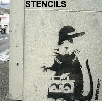
“I remember when I first started bombing tags, throw-ups, and masterpieces all across the city. I was one of hundreds doing it across the UK, trying to etch out a style that might get me noticed by not just other writers, but by the public too. It’s great to be noticed by your peers, but better to be noticed by a wider audience.” I picture the director assembling a montage with imagery of some of my early street pieces. His camera stood still, standing firm on a tripod in my London apartment. At times I became fixated on the flashing red light that indicated the unit was recording. “When I wasn’t on the streets, my head was often buried in my sketchbook. My eyes darted across the page, keeping up with my hand that moved tirelessly to fill its blank pages with ideas for pieces and notes about where they might eventually live on the street.” I paused. I’m not used to this kind of interaction – not one that’s so prolonged anyway. We’re not sure what we will do with this yet. I haven’t agreed to release this yet, just to film it with my friend who is a video documentarian. There’s been a lot already said about me, by my friends, with permission of course, but I’ve always stuck to the shadows. “When my work shifted from writing to stencils featuring various figures and other characters, their accessibility helped in generating a following that was somewhat unexpected. I bombed these stencils as frequently as I used to bomb my tags. Making them ubiquitous was still the main concern. I think that’s a staple of any artist whose work originates on the street. But while commercial galleries were open to receiving the work of street artists, the more traditional galleries and museums always turned a blind eye. Finding any crack to let the light pour in was always so difficult. You see that all the way back to Basquiat, when the only work he had a place like MOMA was something they got on loan, where during his life, they never purchased anything because they were too blind to see the value in it. So, the first time I installed one of my works in a museum, it was pretty much on a dare. But we knew how much of a message it would send if we could pull it off. A giant middle finger to the establishment that was so afraid to even acknowledge urban street art. With each museum that followed, it became like a high stakes poker game. Like something out of Ocean’s Eleven. Only instead of trying to rip off the house, we were trying to leave something behind. A mark.”

I shifted in my seat, my hands rested on my legs, and I felt the texture denim of my dark blue jeans beneath my hands as I slowly rubbed them as I spoke. “When it came to Sotheby’s though. Now this was an idea that I’d had percolating in my mind for a long time now. Like leaving works in the museums, this would serve as a chance to take something away from those who only saw the work for the money that could be made off of it. Like DaVinci and countless other artists have done before me, I journal extensively about my ideas. I sketch them out, exploring different possibilities. The floor of my closet has several boxes full of old black books that will probably sell for millions should they ever fall into the hands of others after I shed my mortal coil. I’ve ripped up a lot of those sketches, tearing them right out of my sketchbook, sometimes with rage and frustration, other times rather nonchalantly. Other times I’ve scribbled over pages when something wasn’t working the way I wanted it to. I’ve also talked to my most trusted friends about it, and sketched more designs based off of their ideas, before building a test unit – sixteen by twenty inches in size with the parts I’d acquired from a hardware store. The frame, from a second hand store. Electronics as a hobby is pretty nonexistent these days and anyone who does need components can get them on the Internet which is what I’ve done, although what I’ve built didn’t need much. I was insanely giddy when the mockup worked, and it’s something that still hangs on the wall of my studio today.”

I looked up and out the window. “Being there, was kind of surreal. It was the last item to be sold that day. Everything was in place. The gavel came down and I pressed the button. At first no one really noticed, but quickly – it was like the room was on fire. The auctioneer’s look of horror. Cell phones recording it for prosperity. News coverage for days. Of everything we’ve ever done, it was pretty sweet. It’s amusing to see how people trip over themselves to get a piece of my work. Every celebrity will say this, that they never ask to become famous. I just wanted to make my art, but once you reach that level, you gotta leverage it. But that leveraging comes with it’s own host of issues. But things are starting to change. The work we are doing with the museum in Bristol for example. Of course, they see it as a way of attracting more people in to see the work they’ve always had. And I see it as helping to push the acceptance of urban street art by not just myself, as I’m already seen, but to maybe open doors for people who come after me. It’s a tit for tat, some might say we’re using each other, but isn’t that the basis of all transactions in our capitalist society? Will this become a new normal? Perhaps. I don’t know. We’ll see. It’s nice not having to fight to be seen, to be accepted by what’s seen, as a kind of higher echelon of art. At the end of the day it’s just art, a means of expression, of telling stories, of offering critiques and new ideas. That’s never been a criminal undertaking in my mind. No. To me, it doesn’t matter where art lives as long as it’s accessible to the world.”


Header Photo: Steven Lee. “March 30, 2020 Subverted Selfie Project Post.” Instagram / Flickr, 30 Mar 2020.

Comment

Assignment 05

Post-Graffiti Practices, Part One: Brandalism and Subvertising 

Focus on the intersection of street art culture and fashion/design/commercial interests

Week 05: Assignment 05

June 18, 2022

READING ANALYSIS

Anna Waclawek, excerpt from Chapter 5: “Urban Visual Culture” in Graffiti and Street Art, 2011 (pp. 157-195).

The purpose of these questions is to evaluate your ability to comprehend and offer analysis of a targeted text, and then to apply that analysis to a work of street art not directly discussed in the text that you choose to work with.

To complete this part of the assignment, please choose FOUR QUESTIONS from those listed below to answer. Use ONLY the reading and your own opinions / observations to help you answer the first part of each chosen question, and then feel free to research the Internet for the artwork you will choose and analyze in the second part of each chosen question.

1. Visual Culture/Art History 1 (p. 157-161): What is the difference between art history and visual culture studies? How does the artist Psalm play both sides of this divide? Find a Psalm work not cited in the reading—add it to your PebblePad page—and offer an analysis that furthers the argument offered in this reading.

Waclawek defines art history as traditionally representing “…a focus on visual production that is first and foremost ‘art.’… whereas art-historical research tends to emphasize form, content, and the function of art within historical contexts” (159). By contrast, Waclawek describes visual culture studies as placing focus on the “…contemporary, everyday experiences of visual consumption” (159). Specifically, it seems fair to suggest that Waclawek is arguing that the difference between art history and visual culture studies lies in a question of scope. Whereas in art history considers a more micro view, looking at specific movements in art, as well as the art and artists being created; whereas visual culture studies approaches the world around us by taking a broader (or macro) look at the plethora of rich visuals that people can choose to interact with on a day to day basis. Art is art, but visual culture is art plus advertising, movies, television shows, and, as Waclawek explains: “…the images disseminated in our cities are bound to our reality – whether the reality is that we are consumers (advertisements), we have laws (road signs), or that we rebel (graffiti)… studying visual culture is thus a way of tapping into the images that circulate within a particular society, what they tell us about ourselves, and whom they represent” (158).

For Waclawek, the street artist PSALM represents a street artist who plays both sides of this divide, because he has been inspired by both “…iconic images from the history of art” as well as by images from visual pop culture (161).

ARTIFACT 1 - Photo: Shellie Lewis. “PSALM: Australian stencil graffiti artist.” WordPress Blog, 16 Jul 2010.

ARTIFACT 1 highlights how PSALM plays with both art historical and pop culture imagery. With this stencil, PSALM features a stereotypical, Hollywoodesque image of a First Nations individual, in this case, a Native American man. This kind of image is rooted in European representations of First Nations in paintings and in photography. This ties into the stereotypical elements in PSALM’s stencil, including the presentation of the kind of headdress that many assume is worn by many First Nations, when in reality it is only worn by a few Indigenous peoples in North America, such as the Sioux Nation.

In many ways, PSALM’s simple black lined image, sitting in its circular frame, feels as though it could serve as the logo of a sports team, which, at the time of PSALM’s production could be seen in the kinds of logos presented in ARTIFACT 2, including: A. the NHL’s Chicago Blackhawks; B. the MLB’s Cleveland Indians; C. the University of Illinois intercollegiate athletic program; or D. the NFL’s Washington Redskins. ARTIFACT 3 shows the logo of E. the Bendigo Braves, a Southeast Australian Basketball team. As seen by these logos being used by sports teams, PSALM is likely commenting on the ways in which global populations portray their unhealthy fascination with American First Nations through the appropriation and generalization of First Nations imagery.

ARTIFACT 2 - Logos of North American Sports Teams

ARTIFACT 3 - Logo of an Australian Basketball team - the Bendigo Braves.


3. Street Art Off the Streets (p. 169-173): How does graffiti and street art shape, influence, and impact the world of video, gaming, street wear, cosmetics, design as seen in the the work of Blu, Fafi and/or Buff Monster. Find a Blu, Fafi and/or Buff Monster work not cited in the reading—add it to your PebblePad page—and offer an analysis that furthers the argument offered in this reading.

Graffiti and street are shapes, influences, and impacts the worlds of video, gaming, street wear, cosmetics and design by helping to primarily transform the street art into new forms of visual representations where Waclawek describes how the works are “…heavily mediated and rendered… whereby choices were made in terms of how the work would be viewed, (and) the audience itself has a great deal more control over their experience of the work” (169).

Graffiti and street art shapes and influences the world of video art as seen in the work of Italian street artist Blu, wherein Blu uses technology to create video art in the form of stop motion animations that navigate the surfaces of outdoor spaces in a parkour like fashion, surfaces which serve as the canvas upon which he creates his animations, in a style that isn’t that different from the work of artists like William Kentridge (the key difference is that the works of Kentridge are created on paper in studio, as opposed to on the streets). Marks, lines and smudges are made, photographed, altered, erased, painted over, and photographed again with each change that is made. The images are then assembled into an animation, and distributed online through sites such as YouTube, as seen in ARTIFACT 4 - COMBO. COMBO is a collaboration which sees Blu work with several other artists in the creation of a work that also sees the addition of objects being manipulated to form part of the stop motion animation. Waclawek describes how Blu transforms his street art by bringing it to life in his animations, thereby creating an entirely new piece of art, and he also allows it to have a wider range of distribution online. And with his animations, Blu is bringing his urban street art works from the streets to computers, smartphones, tablets, televisions and even theatre screens around the world.

ARTIFACT 4 - Video: notblu. “COMBO: a collaborative animation by Blu and David Ellis (2 times loop).” YouTube. 13 Sept 2009.

Waclawek also describes how many street artists are working with consumer products “…to infuse merchandise with their creations” (170). Waclawek introduces the artist Fafi, who has a history of producing playful street art murals, with a variety of colourful characters which she has been able to use as the basis for a commercial line of dolls, “…in the vein of Barbi” (170), wherein an entire world has been crafted by Fafi. Fafi has also served as the spokesperson for major multinational corporations like MAC cosmetics, which Waclawek explains has provided an example of how street art has been transfigured into merchandising opportunities.

One of the artists I am considering for my street art exhibition, Ryan Brunty, created a yeti like monster named Yerman, who is the focus of a lot of Brunty’s mural work which explores mental health issues. The character also serves as the subject for a wide range of apparel, pins, keychains, toys, and other products which are sold through his website as promoted by his wide social media presence. Brunty also notes on his website how “…a portion of all proceeds is donated to top mental health agencies to help fight the stigma around the conversation of mental health awareness.” Like Fafi, Brunty is bringing his work from the streets to a wider audience than would otherwise exist for his artwork.

4. In the Gallery (p. 174-178): What are the pros and cons of moving street art into the gallery space? What are some strategies for display and curation connected to the examples of Miss Van and/or Swoon. Find a Miss Van and/or Swoon work not cited in the reading—add it to your PebblePad page—and offer an analysis that furthers the argument offered in this reading.

Waclawek notes how a street artist’s practice changes in terms of its form, content, and context, which she describes as “…materially, spatially, and visually when performed indoors” (174).

Specifically, Waclawek describes some of the pros of moving street art into the gallery space as being what street artist Swoon highlights as opportunities “…to create a small world” or “…a whole environment” (174). Waclawek also quotes street artist Vexta, who says gallery exhibits “…give her a chance ‘to create things that are more complex and intricate’” (174), and which moves “…beyond the scope of their street practices” (174). This sentiment is echoed by Miss Van who Waclawek says uses “…the gallery to create more detailed pieces, which push(es) her practice forward both conceptually and technically” (175). And to this end she also quotes Roadsworth, who describes how “I find any and every space and / or situation has different possibilities and challenges” (174) for creating work. Many artists such as Swoon are able to create work that straddle the divide between the gallery space and the street, with works that have the ability to disrupt the mainstream gallery system (175). Waclawek also lists how gallery spaces are safe spaces to create work, where the illegality of creating work is wiped away (174). Galleries also provide new opportunities to be seen that street artists wouldn’t otherwise be able to access (174). And finally, Waclawek notes how artworks created for the gallery can often find “…their way onto the streets and into other exhibitions” (178).

In terms of the cons surrounding moving street art into the gallery, Waclawek explores how most graffiti writers are against the practice of formally exhibiting their work (174). Many writers feel that work developed for the street loses its impact when moved into the gallery, and that the illegality of the work is an important aspect of their subculture, and to move away from that is seen by some as disrespectful (174).

Miss Van’s website contains has many pages that feature both her street work murals as well as her gallery work. She has a page dedicated to murals. another to paintings, and another to exhibitions. The exhibitions page features links to pages that feature photos to different shows she’s been a part of - both solo and group exhibitions. Hairy Nest 1, as seen in ARTIFACT 5, was one work featured in a 2011 solo show called MUSES, held at the Inoperable Gallery in Vienna, Austria. It’s an acrylic on wood piece, which has been framed for display in the gallery. Other photos show how most of her work is fairly small, and each one framed, and hung on the wall in a salon style, which would be a more traditional way of displaying artwork in a gallery, as seen in ARTIFACT 6. It’s a far cry from the kind of very large scale murals that she has done, as seen in ARTIFACT 7.

ARTIFACT 5 - Photo: Miss Van. “Hairy Nest 1.” Acrylic on Wood Panel, 2011.

ARTIFACT 6 - Photo: Miss Van. “Muses.” 2011.

ARTIFACT 7 - Photo: “'Guerreras' Mural.” Mural Festival, Montreal, June 2019

5. On the Internet (p. 178-185): What changes with street and graffiti art when it is circulated via the Internet in photographic form? What are the pros and cons of encountering graffiti on the Internet? See examples related to Jace, M-City, Swoon, and/or Invader. Find a Jace, M-City, Swoon, and/or Invader work not cited in the reading—add it to your PebblePad page—and offer an analysis that furthers the argument offered in this reading.

ARTIFACT 8 - Swoon. “Philadelphia, Pennsylvania.” 2010.

For Waclawek, the most significant change that occurs when graffiti and street art is circulated via the Internet in photographic form is the context of where a work is located becomes lost. Specifically, “…the piece’s material presence in a particular site is obscured” (178). It also distances a viewer from the immediacy that’s felt when one encounters a piece on the street. For example, seeing a photo of a shadowman figure by Richard Hambleton is much different than encountering a life size shadow figure on the streets in a back ally late at night. Specifically, “…the Internet dilutes the viewing experience” (179). And yet, Waclawek also noted how, in spite of this, photographs still serve as a means for allowing this culture to be remembered, as well as to thrive and evolve on a formal level - all of which can be held up as a pro regarding the distribution of graffiti online (178). It also promotes inclusivity, allowing artists with equal opportunity for exposure.

ARTIFACT 8 is a photograph titled PHILADELPHIA, PENNSYLVANIA, 2010 and it’s of a wheatpaste figure featured on street artist Swoon’s website swoonstudio.org. Several of the photos on Swoon’s website do give a slight indication of the context of where the work is located, as seen by the derelict building it’s painted on. A window frame is visible in the left hand corner of the photo, through which one can see the building has fallen in on itself. But, without the name of the work, it’s largely unclear as to where the work was done. There’s nothing distinct in the photo that screams out, Philadelphia on its own.


CREATIVE ACTIVITY: Preparing For Your Curatorial Project Zoom Pitch

 In the last two weeks creative activities, I have asked you to brainstorm ideas for your curatorial project and then create three potential exhibition ideas. For next week, I want you to actively prepare for the Zoom pitch meeting that you will schedule with me on June 13-14th.  

Please be prepared with the following when you speak with me at our Zoom meeting:

1)  Describe to me what topic and theme you have decided upon in a few clear sentences along with indicating the location of your exhibition (city, institution, or other specific locale). Tell me why this topic is of interest to you and why this kind of street art exhibition would be of interest to your target audience. You want to speak with some level of interest and enthusiasm just as if you were pitching this idea to someone you were asking for a grant or investment in the event.

WHAT LIES BENEATH is envisioned as different kind of street art exhibit that explores the difficult topic of mental health, including addictions, bipolar disorder, depression, and even suicide.

The exhibit would present artwork in two locations: the first would be a large mural placed in a yet to be determined part of the city; and the second would be several works created in the generally inaccessible and hidden spaces of the Burrard Street Bridge in Vancouver. I chose the Burrard Street Bridge because it has a history as being a place from which people have taken their own lives. On July 22, 2015, CBC News reported that suicide barriers were being recommended for installation on the Burrard Street bridge because, “…on average, one person per year dies by suicide, jumping off Burrard Bridge — compared to more than four each year on the Lions Gate Bridge.” In 2016, Paula Baker and Tanja Beja of Global News reported, in a May 24 article called “Controversy flares over suicide barriers on iconic Burrard Street Bridge,” how “…according to the Suicide Prevention Centre of BC, there are about 17 suicide attempts a year on the Burrard Street Bridge.” More specifically, Kenneth Chan, writing for The Daily Hive on January 3, 2017, noted how there “…have been seven known suicides from the bridge from 2006 to 2015, an average of approximately one death per year.” Another reason why I chose the Burrard Street Bridge is because of the hidden stairwells and walkways within the structure that makes up the Burrard Bridge. When the bridge was renovated, the architectural firm in charge of the renovations, as well as two local artists, looked at the possibility of opening up these hidden spaces to the public, as explored in this December 13, 2019 article for MonteCristo Magazine, but nothing came to fruition. The artists did shoot video footage of one of the bridge’s stairwells which can be found on Vimeo. As these hidden spaces are currently inaccessible to the public, the finished artworks would be shared and discussed across social media, as was done with the Underbelly Project in New York City.

This topic is of interest to me from both a personal perspective and an art historical perspective. Personally, I am someone who has had his own struggles. Mental Health issues also go unreported and remained unresolved for those who are suffering, and society has a terrible history in maturely discussing them, despite initiatives such as Bell Canada’s Let’s Talk Day. With respect to WHAT LIES BENEATH, in order to bring the work to the world, artists would document and distribute imagery of their artworks over various social media networks. Finally, in terms of art history, I’ve found that there are far too many creative individuals who have suffered from, and even lost their lives to mental health issues.

2) Clearly communicate to me WHAT IS AT STAKE in your exhibition. In other words, describe what is important/significant about the exhibition, and how it could open someone’s eyes who visits your show. Write out and provide this statement in no more than two sentences. I will ask you to copy and paste it into the chat box so that I can evaluate and help guide you with any refinements or revisions.

 WHAT LIES BENEATH is important in helping to further shine a light on creating a discourse about the stigma that’s long been attached to the issues of mental health and wellness.

3) Provide me with links to 2 artworks at the meeting (and/or share images via screen at our meeting) for me to review that you are considering for inclusion in your exhibition, and be prepared to discuss with me why you are thinking these works would fit the framework of your exhibition.

ARTIFACT 9 - The Postman / TrustyScribe. “Just Because I’m Smiling, Doesn’t Mean I’m happy.” Instagram, 13 May 2019.

One artwork that I think would serve as inspiration for the commissioned mural, as shown in ARTIFACT 9, is “Just Because I’m Smiling, Doesn’t Mean I’m Happy,” which was a 2019 collaboration between American street artist TRUSTYSCRIBE and London street artist THE POSTMAN. It features a portrait of Robin Williams, who suffered from his own demons for many decades, including a severe addiction to alcohol and drugs, as well as bouts with depression. He would ultimately take his own life out of fear of being diagnosed with Parkinson’s Disease, as documented in this May 2018 article from The Toronto Sun, titled “'I can't imagine living like that': Inside Robin Williams' final months.”

ARTIFACT 10 - chopfire / Ryan Brunty. “Depressed Monsters.” Instagram, 6 Nov 2021.

A second artist I’d like to feature is Ryan Brunty, who created the character of YERMAN, a yetti creature that Brunty uses to explore issues related to mental health and wellness. Brunty was interviewed in 2016 for an article called Mental Health Awareness Through Street Art: Depressed Monsters (graffitikings.co.uk) and he described his inspiration for creating depressed monsters as laying in the ashes of his own depression, as well as in the do it yourself asethetic related to punk rock:

“I’ve always been influenced by punk music and punk culture. Growing up, I was really into the DIY aspect of skate punk; making zines, writing on t-shirts with sharpies, self-producing music. I was playing drums in the garage on the weekends with my friends, skating at night and drawing whenever I could; monsters were always the constant. So, Depressed Monsters has always had a DIY approach because of this.”

This piece, is a play on the saying - “See no evil, hear no evil, speak no evil,” and it really helps to shine a light on the hidden aspects of mental health issues, where people struggle on the inside, but don’t always share or get help for their struggles. In the Graffiti Kings article, it’s noted how: “In countries where data is available, it’s noted that 1 in 4 people suffer from some kind of mental illness. 2 out of 3 never receive professional help due to stigma, discrimination and neglect.”


Header Photo: Steven Lee. “Gastown 12.” Flickr, 5 Aug 2013.

Comment

Assignment 04

 History of Street and Graffiti Art: Global Networks and the Internet Between the Street and the Web, 2000’s


Focus on the radical circulation and redistribution of graffiti and street art in the Internet Age.

Week 04: Assignment 04

June 8, 2022

LECTURE & VIDEO ANALYSIS

For this week’s questions, I am looking for you to work your analysis muscles! Be sure to watch and listen to the RECORDED LECTURE located under this week’s module “Content.” The questions will only make sense in the context of the material presented there, and I will expect your analysis and responses to be based only on what is presented there, i.e. no need to do outside research.

  1. Select FOUR of the listed street art form types presented in the PowerPoint slide to work with from among: stencils; wheatpaste posters; reverse graffiti; sculptural street art; installations; ceramic; yarn bombing.

    For each of the FOUR form types you select, describe and analyze what YOU THINK are the special advantages and disadvantages of the FORM? Next, turn your attention to the CONTENT of each of the four chosen works. Describe and analyze how and why YOU THINK the FORM (materials, composition, colour, line/shape) works with and contributes in specific ways to express the particular CONTENT of each piece?

STENCILS: Stencils look like they could be used fairly quickly on the street, provided the street artist was organized, especially when multiple stencils are used with multiple colours to create different layers which helps make the works more complex. Stencils would be designed and cut off of the street, in a street artist’s home or studio. This would allow an artist to play around with ideas in their black books before committing to a specific direction for a cut. They could also create new cuts if they don’t like what they made. This provides a lot of flexibility in terms of coming up with a work’s overall design which might not be as available for an artist making works using different materials. Some artists create stencils that are designed to be used either just once or only a few times, as they are cut out of paper or some kind of cardboard. Others create stencils out of wood or metal panels, so that they have a much longer life and can be used in many places. Stencils can be small or very large which would impact portability of materials, and the amount of time needed to get an artwork transferred onto a surface.

ARTIFACT 1 - Photo: Dorothy Barenscott. “Bansky’s Hip Hop Gangsta Rat.”

Banksy’s hip hop gangsta rat (ARTIFACT 1) at first appears rather simplistic, but it actually has a lot of detail in it. This stencil appears to be just a single piece, there aren’t other layers to this piece. This would have made it fairly easy to apply the work to the wall. stencil contains spaces where the paint does and doesn’t hit the wall, which helps create the overall figure. The light colour of the wall becomes a part of the shapes, that would have been covered by the stencil, and are formed out of the areas that are painted black. You feel as though this gangsta rat has been stopped in his tracks - caught in a stollen moment from an otherwise busy hip hop life. Some of the lines are vey sharp and clear, others are faded, making them feel that they are just suggestions of a form - as seen in the rat’s hands, and in parts of the rat’s face.

WHEATPASTE POSTERS: This is another form of street art that has a lot of planning done in the studio, wherein the entire piece is essentially created in the studio before being brought out onto the street to be applied to a surface by an artist using paste, made of a flour and water mixture that could also be created in a studio, and carried in a paint can or bucket like container. I believe the paste is then poured into a paint rolling tray, and applied to the surface and the poster being hung with a paint roller brush. In terms of supplies, this process might make it difficult to move around quickly from place to place - which is why you usually see the same poster image repeated en mass across a specific area as it would be easy to roll out a block of space for the posters to be placed on.

ARTIFACT 2 - Photo: Dorothy Barenscott. “Shepard Fairey’s OBEY.”

Shepard Fairey’s OBEY (as seen in ARTIFACT 2) is a very famous wheatpaste poster that features a very basic colour scheme, and graphical design that could easily exist as a stencil. The word “OBEY” in white all-capital lettering, on a red background, clearly works as a command. But the command is soft spoken, as Andre the Giant appeared that way, he was a huge man, but he had a kind softness of lovability that came through and Fairey has captured that soft seriousness here in his work. The repetitiveness of the image makes the overall pieces feel like advertising. Thanks to this easy to replicate, graphically rooted design, I believe the image has also had life as sticker art and has been used on merchandise such as t-shirts among other items.

REVERSE GRAFFITI: Reverse graffiti looks as though it would require the least amount of investment, as you don’t need to purchase paint. A graffiti or street artist wouldn’t have to carry paint or other items needed to create a work with them. Having said that, the process does look like it could be time consuming to remove the dirt and grime from surfaces - especially in cases where it might be a more elaborate or detailed work. Reverse graffiti also appears to be more ephemeral than other forms of graffiti and urban street art (such as works made with spray paint for example), however with the rise of smart devices and the internet, it’s very easy to preserve and share a work digitally.

ARTIFACT 3 - Photo: Dorothy Barenscott. “Reverse Graffiti.”

The reverse graffiti artwork presented in ARTIFACT 3 consists again of a fairly simple image, that of a flock of birds in flight. It’s a piece that appears as if it could have also been created using stencils in a similar manner to that of Bansky’s hip hop rat. But, by utilizing reverse graffiti, the artist was able to repeat the bird imagery many times, thereby giving the piece a larger, more mural like presence. It also has a more ephemeral and sketchlike feel to the piece, which makes it feel both eerie and uplifting at the same time.

CERAMICS: I assume that a ceramics piece would require an artist to perform the same kind of at home or in studio work that stencils and wheatpaste posters require. A ceramics piece could be assembled in studio, and mounted onto a mosaic mesh. That finished piece could then be taken from the studio and installed on the streets with relative ease using some kind of very strong, fast drying adhesive. I don’t think there wouldn’t necessarily be time to grout it into place, as would happen with a more traditional mosaic. I think that consideration would depend on where it’s mounted. When I studied street art in 2019 and 2020, I did read or see an interview with INVADER, where he discussed finding materials that made the finished pieces lighter and easier to carry around. For example, he has used rubix cube pieces to create works which mimic the look of ceramics but are lighter to carry and mount quickly.

ARTIFACT 4 - Photo: Dorothy Barenscott. “Invader’s Ceramics Tile Art.”

INVADER uses ceramics and other tile like material to create artworks that mimic the look of 8 bit computer generated imagery from the 1980s, as seen in ARTIFACT 4. His street name, is a play off of the video game SPACE INVADER, which had pixilated graphics due to the limitations of the technology of that time when it came to creating and rendering video game graphics. The tiles help create works of art that hold a lot of nostalgia for the Atari and Nintendo like games of that era. This work here is rectangular, which mimics the feel of a television or computer screen (albeit a more recent screen, as screens of the 1980s were square). This specific piece is blue on black, with the central ghost like invader ship figure surrounded by black tiles, and then a frame of one row of blue tiles, and a second row of black tiles. Within the figure itself, there are no tiles in the place of what form’s the figure’s eyes. The piece for me evokes not just the SPACE INVADER game, but PACKMAN as well, which had figures moving across a maze laid out from coloured lines, where everything sits on a black background.


2. Select THREE of the listed 1990-2000’s street artist presented in the PowerPoint slides and videos to work with from among: BLEK LE CAT; EINE; MAGDA SAYEG; FAITH 47; ZEVS

For each of the THREE artists you choose to focus on, carefully watch the accompanying video and describe and analyze what the specific CONTEXTS are that stood out for you that helps the street artist make their signature style and impact as a street artist? Be sure to comment on the varied circumstances of production and different audiences for the artworks that you can make out from the accompanying videos?

ARTIFACT 5 - Video: Michael Cuffe. “Blek le Rat Interview on Street Art.” YouTube, 19 May 2010.

BLECK LE RAT: As shown in ARTIFACT 5, Le Rat first describes how he started off making thousands of small rat images across Paris in the early 1980s using simple stencils. He then notes how it was the influence of Richard Hambleton coming to Paris, France in 1984 and painting his life sized shadowman pieces throughout the city that served as inspiration for Le Rat to start creating his own life sized images, and to be seen in the streets by utilizing large characters using bigger stencils. He described these larger stencils would represent something that was important - a start of an expansion of graffiti and street art. He noted how Hambleton was one of the first artists he noticed that took his practice and moved it from city to city. Specifically, Le Rat notes how Hambleton moved around Europe, from Italy to Berlin and more (as shown in the Shadowman documentary), but we also know from the documentary that Hambleton started in Vancouver and moved across the United States before landing in New York City.

ARTIFACT 6 - Video: Michael Cuffe. “Street Artist Ben Eine.” YouTube, 25 Mar 2011.

EINE: As shown in ARTIFACT 6, street artist Ben Eine describes how he wanted to bring a very unique look to graffiti as a street art writer, and ended up rooting his practice in his interest in traditional typography. He wasn’t interested in doing work that was similar to other writer’s masterpieces in terms of the elaborate backgrounds and wild style lettering, rather he wanted to find a way to make his work stand out in a way that was conceptually different in terms of its formal implementation, but also in some ways sharing that same history of playing with how letters and words are presented through graffiti. He describes a desire to not just be tagging and vandalizing (1m 15s). In this respect, he is rooted in a conceptual basis for his work, which isn’t that different from what we’ve seen with artists like Hambleton. There’s thought behind what Eine does, there’s thought behind why he’s decided to approach his work the way he has done. Eine discusses the influence of Bansky and Fairey, in how those artists pushed their form to make them very unique and distinctively their own. This was important for Eine, which is why he returned to exploring old forms of typography, reinterpreting them and placing them in the world using spray paint and stencils.

ARTIFACT 7 - Video: UIA Congress. “FAITH47 - A Study of Warwick Triangle.” YouTube, 6 Aug 2014.

FAITH47: In ARTIFACT 7, Faith47 discusses how the energy of the place where she created her murals served as the basis for the work she created in this area. From her interaction with and movement through the Warwick Triangle, she knew that the work she would create there would have to be rooted in the systems and the people of that place. It had to be relevant to the people living and working their. She discusses how the different “models” she represented in her work influenced her. Each person had their own stories that Faith47 wanted to put into her work.


3. Select THREE of the listed contemporary street artist presented in the previous PowerPoint slides and videos to work with from among: SPACE INVADER; JR; LADY AIKO; SWOON; OMEN

For each of the THREE artists you choose to focus on, carefully watch the accompanying video and describe and analyze how and why the graffiti and street art practices of your artist gain new kinds of exposure, audience, and purpose within the present context of the Internet age?

ARTIFACT 8 - Video: Medina Digital Media. “INVADER: Who is he and what is his legacy?” YouTube, 7 Mar 2021.

SPACE INVADER: This video describes how Invader first appeared in Paris in the late 1990s, and quickly moved into using tiles as a way of producing his artwork. It was interesting to see more information about Invader’s work, as I didn’t know a lot about the process, or had forgotten about it when I discussed possible advantages and disadvantages of ceramics as a form. Invader’s practice has evolved over time, especially as he’s become more popular - for example, he uses more delicate tiles that would break if people try to take works down. It mentions how his appeal. The video describes how his work is cheeky, and helps to challenge the propaganda of the advertising world, interrupting the conformity of people’s lives.

ARTIFACT 9 - Video: JapanSocietyNYC. “Edo Pop - AIKO: the making of Sunrise.” YouTube, 7 Mar 2013.

LADY AIKO: liked the anonymity of creating street art, and describes going out on the street to create imagery using spray paint and stencils. In Artifact 9, the video highlights how an image can be created using many stencils, to create layers, on a very large scale. She finds it a challenge to continue finding new things to say as her practice gains a wider international reach.

ARTIFACT 10 - Video: TedX. “Graffiti is not the problem | Omen.” YouTube, 6 Oct 2014.

OMEN: As shown in ARTIFACT 10, graffiti writer and street artist Omen starts off with a contextual discussion about graffiti from a kind of macro perspective in terms of how it’s been traditionally viewed by contemporary society: as an illegal and undesirable act, “…as a negative thing.” Omen also discussed the tensions that exist with our planned cityscapes, complete with the straight lines of urban (and one could argue suburban) architecture, as contrasted with nature and it’s organic forms, which exist as a far cry from our planned and constructed environments. He suggested a similar tension is seen with graffiti which is seen by many as an incursion and pushback against those straight lines. Throughout his talk he crosses back and forth to the question of what is and isn’t acceptable. Graffiti in public spaces is traditionally viewed as unacceptable, but graffiti on a canvas or painted as part of a commissioned mural is.

In terms of Omen’s own practice and how it’s similar to their artists, he discussed how it had been difficult to get recognition in the early 2000s in Canada. But each choice he made did have the impact of widening the circle of how many people were exposed to his work. He then eventually ended up in Taiwan where he began painting. His work gained recognition locally, and he even had support from local politicians. He continued sending work home until eventually his work was purchased by the President of Cirque de Soleil. This led to media coverage and his ability to secure shows with more influential galleries which he described as marking his own entrance into the art world.


CREATIVE ACTIVITY: Brainstorming Your Curatorial Project CONTENT (PART TWO)

In last week’s creative activity, I asked you to start figuring out your direction for the curatorial project and to generate ideas by brainstorming the following categories:

1) A THEME; 2) A PARTICULAR SPACE/CITY; 3) A PARTICULAR FORM OF ARTWORK; 4) PARTICULAR STREET ART MOVEMENTS; 5) A RETROSPECTIVE OR ARTIST(S) FOCUS

In this week’s activity, I want you to take those brainstormed lists you made and work on formulating and describing three ideas for potential exhibitions that combine at least 2, but IDEALLY 3 brainstormed ideas into one dynamic and compelling show.

For each of your potential exhibitions, be sure to specifically list and describe which of the categories you are combining and offer a few sentences on why you think this show could work well. As always, be creative and illustrate your exhibition ideas with appropriate artifacts (image, video, audio, etc..) to help illustrate your points.

For bonus creativity points, create a great potential exhibition title for each brainstormed exhibition.

EXHIBITION #1: EXHIBITION THEME (Depression & Mental Health Issues) + PARTICULAR FORM (GRAFFITI TAGS / WORDS & WORD PHRASES) + PARTICULAR MOVEMENT (UNDERBELLY VANCOUVER)

I like the idea of placing artworks that deal with depression in inaccessible areas of the city, wherein they would have to be really well documented (by perhaps both analogue medium format and digital photograph, as well as 4K video), and then distributed online across various social media platforms (such as Facebook, Instagram, Twitter, and YouTube among others). The exhibit could possibly even be compiled in a book - as was the case with the New York City Underbelly Project, which was discussed by Lori Zimmer, in her book THE ART OF SPRAY PAINT (pages 38-39). Paul Wong is another example of an artist who has produced strong books that also documents the process of creating an exhibit, and discussing it.

In a 2019 article by Julia Kastner for the Untapped New York website, titled “URBAN EXPLORER DOCUMENTS THE UNDERBELLY PROJECT, A SECRET STREET ART INSTALLATION IN ABANDONED NYC SUBWAY STATION,” the kind of art created for the exhibition was:

…itself is equally as stunning and haunting as the context in which it was created. Some pieces are of a more sinister nature, such as one image of a mouse wearing a gas mask, whereas others have a slight anarchistic tone, such as the “we own the night” piece. More lighthearted pieces also adorn the hallways, including the ironic painting of a man on the subway, colorful butterflies, and more abstract shapes. The variety of the art speaks to the diversity of styles and perspectives within street art, emphasizing further the importance of independent work and de-institutionalising the art form.

Kastner’s article also discussed the process of organizing the show, which had layers of security and anonymity built into it in order to protect everyone involved. Another excellent article about the New York show was by Jasper Rees, writing for The New York Times, in an October 32, 2010 article called “Street Art Way Below the Street.”

Formally, the works would not have to be entirely text based, but I’d like text to be an element of the works created, as illustrated by the works of Basquiat that we have studied, or in the collaboration between TrustyScribe and The Postman in their piece that paid homage to Robin Williams (as seen in ARTIFACT 9 of Assignment 3). ARTIFACTS 11 & 12 are two short videos documenting the art that was created for this exhibit.

In Assignment 3, I listed possible locations for such an exhibit. One possible place that could be explored and used as a location would be the old asylum in New Westminster. I’ve listed several locations for such an exhibit - but the original NYC Underbelly project was contained to a single abandoned station. This could be done here as well.

ARTIFACT 11 - Video: Urban NYC. “The Underbelly Project.” YouTube, 20 Mar 2016.

ARTIFACT 12 - Video: The Museum of Contemporary Art. “The Underbelly Project - Walk Through - Art in the Streets.” YouTube, 10 Jan 2013.

Possible exhibition titles:

  • “HIDDEN FRAGMENTS”

  • “HIDDEN PIECES”

  • “UNDERBELLY VANCOUVER”

  • “WHAT LIES BENEATH”

EXHIBITION #2: EXHIBITION THEME (The Unexpected & Uplifting) + PARTICULAR FORM OF ARTWORK (Possible mix of Words / Word Phrases, with Murals and Smaller Playful Pieces) + PARTICULAR CITY, SITE, PLACE, OR MUSEUM (Specific Part of Surrey - Surrey City Centre)

This exhibit would be almost the opposite of the first exhibit, especially in terms of the tone and content of the work presented. During the pandemic there were many uplifting artworks created that spoke to that particular moment, as explored in the May 9, 2020 CBC News article titled “Pandemic-inspired street art in Canada and around the world.”

I spoke a lot to the kinds of artists that could be invited to this kind of show in assignment 3, but there are several artists I forgot to mention - artists that focus on mini style pieces that are placed in unexpected places such as, but not limited to curbs, sidewalks, and stairwells. The work they do today isn’t that dissimilar to the work Blek Le Rat created early on in his career, when he plastered Paris (no pun intended) with small images of rats from stencils he created. Examples include @JPS_artist and

Another artist that caught my attention was @GOIN.ART as well as @publicdisplayofawareness, an artist who creates street signage with messages of hope. I also loved this street art sculpture, which mysteriously appeared during a street art exhibition in Bristol on World Suicide Prevention Day.

Possible exhibition titles:

  • “CO-EXISTENCE”

  • “UNEXPECTED”

EXHIBITION #3: PARTICULAR MOVEMENTS / MOMENTS IN GRAFFITI / STREET ART (History of urban, graffiti & street art in Vancouver - Retrospection) + PARTICULAR CITY, SITE, PLACE, OR MUSEUM (Vancouver Art Gallery)

ARTIFACT 13 - Steven Lee. “VANCOUVER Urban, Graffiti, & Street Art Playlist” YouTube, 2022.

This would be similar to a BEYOND THE STREETS exhibit, only focused on Metro Vancouver work. In looking for places to go to where one might find graffiti and street art in Metro Vancouver, in 2019 and 2022, I found over 100 different videos exploring primarily graffiti tags, throwies, and pieces, with footage going back to the 1980s and 90s (that playlist is featured in ARTIFACT 13). There appear to have been moments where different writers had prominence within the city and it might be interesting to explore that. In addition to the video footage, it’s very likely that there are probably Martha Cooper like photographers, even if they were hobbyist, who documented the work. Such a show could also look at the history of murals and street art pieces in the city, and the tensions that exist between graffiti writers and street artists / muralists. It could be a kind of local mashup of urban, graffiti and street art that has existed during the history of Metro Vancouver.


Header Photo: Steven Lee. “Tower One (4/7).” Flickr, 13 Aug 2018.


Instructor Feedback…

Comment

Assignment 03

History of Street and Graffiti Art: International Exposure and the Move Inside Art Galleries, 1980’s

Focus on identifying CONTENT (stories, narrative, messages) in graffiti and street art

Week 03: Assignment 03

June 6, 2022

READING ANALYSIS

Laurie A. Rodrigues, “’SAMO as an Escape Clause’: Jean-Michel Basquiat’s Engagment with a Commodified American Africanism” in Journal of American Studies (May, 2011)

  1. After carefully reading this article and referring/citing/quoting directly from it in your response, identify and reflect on at least THREE REASONS why Basquiat appealed to the art world when he was first “discovered” during the early 1980’s. What was it about his persona, subject matter, and /or approach (even if some of these facts were false or stereotypes) that connected with art critics and art buyers? How do these ideas compare with what you have learned about Richard Hambleton? 

ARTIFACT 1 - Artwork - Jean-Michel Basquiat. "One Million Yen." Rubble Museum, Florida, 1982.

ARTIFACT 2 - Photo: Steven Lee. “Jean-Michel Basquiat’s A Panel of Experts, 1982 at the Vancouver Art Gallery”, Flickr, 25 Mar 2016. 

Jean-Michel Basquiat’s artwork - acrylic and oil paintstick and paper collage on canvas with exposed wood supports and twine. ( 60 × 60 in, 152.4 × 152.4 cm) As displayed at the 2016 Mashup! Art Exhibition at the Vancouver Art Gallery.

One prominent reason for Basquiat’s appeal to the art world lay in the formal choices he made in the construction of his artworks of the 1980s. Specifically, Rodrigues notes early on how “…Basquiat grew into one of the most influential artists of an international movement that began around 1980, marked by a (postmodern) return to figurative painting” (227). Along this discussion of figurative painting, Rodrigues references Richard Marshall, who describes how the art of the early 1980s was a kind of “assimilated abstract expressionism” (228), where “…more personalized and subjective figurative imagery came to the fore, characterized by its psychological and conceptual undertones” (228). In a kind of throwback to his roots as a street writer, Basquiat utilized text alongside his figurative imagery, to create works that were what Rodrigues describes as being both powerfully poetic and visually gifted (227). She also describes his work as “…rough, seemingly untrained and extreme” (227). Rodrigues also explores how Basquiat adopted “…unique, self-reflectively experimental visual practices of signifying” (230) through the use of “…signs, symbols… and text in (his) paintings” (231). In addition, Rodrigues also notes how “…the art world seemed to offer a sympathetic environment for Basquiat’s art brut sensibility” (228), and this was a term I wasn’t familiar with. Brut as a word sounds as though it could relate to the word brutish, as in brutish behaviour. Merriam-Webster describes how a brute can also be a term that describes someone as a beast, one who lacks intelligence, sensitivity, or compassion. And in visiting the Tate website, this definitely fits the ideas that lay at the heart of art brut, as the website describes the term as:

Art brut is a French term that translates as 'raw art', invented by the French artist Jean Dubuffet to describe art such as graffiti or naïve art which is made outside the academic tradition of fine art… Jean Dubuffet saw fine art as dominated by academic training, which he referred to as ‘art culturel’ or cultural art. For Dubuffet, art brut − which included graffiti, and the work of the insane, prisoners, children, and primitive artists was the raw expression of a vision or emotions, untramelled by convention.

The Tate website for the term art brut also describes how the term relates to graffiti, naïve, and primitive art. An art where the artist would work at deskilling their approach to the works they created. As a term, art brut definitely seems to fit as a way of describing the formal approach Basquiat leaned on in creating the work the art world would embrace. Many of the marks that Basquiat makes are raw, in a way that’s similar to the Shadowman figures created by Richard Hambleton, as seen in ARTIFACT 3 below. Like Hambleton, Basquait was also able to work with almost any material, as shown by the works he created on traditional supports such as canvas and wood panel; as well as non-traditional, makeshift supports as seen with work by artists such as Anselm Kiefer or Robert Rauschenberg. A PANEL OF EXPERTS, as seen in ARTIFACT 2, highlights canvas stretched onto a wood support in a non-traditional manner, with the corners of the frame sticking out from each corner of the piece. Basquiat’s 1982 piece, ONE MILLION YEN goes further than A PANEL OF EXPERTS, with two pieces of canvas appearing to be tied, scrunched, hung and nailed to its wood framed supports which are of different sizes, the lower horizontal support bar laying on an odd angle; and with the piece being hung by a visible rope that’s also non-traditionally attached to the piece. It’s almost as if the piece was found on the street. Rodrigues describes this mashup as a kind of disequilibrium when she notes how Basquiat “… accumulates visual cues and textual annotations– inducing disequilibrium among the paintings’ elements” (235).

ARTIFACT 3 - Photo: Brian McAward. "Richard Hambleton Shadowman 3." Pixels.com, 20 Jan 2020.

Tied to these formal ideas lies a second reason why Basquiat appealed to the art world of the early 1980s, which revolves around the art world’s desire to, as Rodriques notes, “…appropriate and to colonize American blackness so as to convince itself of its own authority (i.e. validity or legitimacy)” (236). This created a kind of unhealthy co-dependent relationship between Basquiat and the art world, as Basquiat continued to make work that interested him, work that the art world believed it needed to maintain its credibility. Rodrigues also notes how the “…art world seemed to offer a sympathetic environment for Basquiat’s art brut sensibility” (228) that was described above. Rodrigues describes how these ideas were problematic, as well as just plain wrong, and she navigates how this likely created tension for Basquiat, as she points out how:

Basquiat’s singularity in the predominantly white world of high art led to his being dubbed the ‘messiah’ of his race’s art, redeeming the reputation and heritage of his ‘people.’

In many ways this also ties into a third reason as to how Basquiat had appeal, and that is in regards to the content of Basquiat’s work, as well as into the audiences his work appealed to. Rodrigues explores how Basquiat carefully crafted his work to appeal to a broader community, which stands in sharp contrast to the roots of more traditional graffiti writers who made work for themselves and the other writers around them. Like Basquiat, Hambleton too saw his work as existing in a place that was both a part of and separate from the work of graffiti street artists. Both Basquiat and Hambleton were able to create works that stood out and appealed to the art world, as well as works that could exist in a broader public realm on the street where it could be interacted with and discussed by a broader audience. For example, Hambleton’s murder mystery pieces generated discussion by the media, the police, and the general public. To this end, Rodrigues explores how on both a formal, thematic and contextual level:

…Basquiat’s aesthetic makes of his paintings economies of accumulation, building a productive play of contingency concerning the mainstream’s constructions of race, which are commonly simplified and packaged for the audience’s consumption.


2. On p. 232, Rodrigues discusses what she explains as the “machinery” and “deterritorialization” evoked in Basquiat’s “hybrid” art that evokes content centered on African American identity. She then summarizes her discussions once again on p. 241. In your own words, describe what you understand these related ideas to mean and their importance in understanding Basquiat’s works. 

When someone says something is a hybrid, they are referencing the idea of how something (in this case, an artwork), is an amalgamation or mixture of different elements that makeup the whole. Rodrigues describes Basquiat’s work as representing a hybrid of ideas and themes related to African American identity. For Rodrigues, this hybridity can revolve around choices regarding style and, imagery; as well as with Basquiat’s own persona as related to his own culture, heritage, and history. Rodrigues also draws a direct line regarding the hybridity regarding his place as a black man within the predominantly white world of contemporary art.

All these amalgamated ideas that flow in and out of Basquiat’s artwork help to form “…the machinery that makes up the distilled, packaged blackness to which we are exposed through the mainstream media” (236). The word machinery often references equipment, gears, or hardware and can also describe administrative processes, as well as organizational behaviour. Beyond the social connotations tied to the idea of machinery, Rodrigues also appears to suggest that the formal and contextual choices Basquiat has made helps to form the machinery which carries the metaphors Basquiat leaves for his audiences to unpack. Specifically, Rodrigues notes how Basquiat “…reveals for us the machinery at work behind the construction of the celebrity black American figure – a commodified Africanist presence, distilled and packaged for consumption by the mainstream masses” (231). 

It's in the exploration and unpacking of a work that one stumbles onto the idea of deterritorialization, an idea that Rodrigues attributes to Gillesn Deleuze and Felix Guattari. It’s an idea that touches how a work’s meaning can be changed, altered, and reinterpreted again and again by the society that interacts with it. Specifically, Rodrigues explains how deterritorialization as “…the movement by which something escapes from a given territory” (232). With Basquiat’s work, ideas regarding blackness are distilled first by Basquiat into his work and then as the work travels out into the world, those ideas are no longer under the control of Basquiat, but instead, placed into the arms of his viewers as they become further and further removed from their cultural origins that Basquiat was initially exploring. Today, a work is even more mobile, as photographs and video can present and move an artwork around the globe.

ARTIFACT 4, featuring the painting ZYDECO is one of Basquiat's many paintings that explores African American identity in the music and film industries, serving as an example of Rodrigues's discussion of hybridity, machinery, and deterritorialization.

ARTIFACT 4 - Jean-Michel Basquiat. "Zydeco." Acrylic, Oil and Crayon on Canvas, Triptych - 218.5 x 518cm. 1984.


3. Turn your attention to and study Basquiat’s "Hollywood Africans" and summarize some of the key ideas that stood out to you about Basquiat’s understanding of the term “Hollywood” as discussed and argued in the article.

ARTIFACT 5 - Artwork: Jean-Michel Basquiat, “Hollywood Africans.” 84 1/16 × 84in., acrylic and oilstick on canvas, 1983.

Rodriguez explores Basquiat’s understanding of the term “Hollywood” by looking at the formal, conceptual, and contextual aspects of his painting, HOLLYWOOD AFRICANS. Rodrigues uses the terminology, “Basquiat teaches” several times in her article to emphasize how the machinery Basquiat employs in his work is carefully constructed to convey specific ideas. Ultimately, Rodrigues suggests that Basquiat’s messaging in paintings such as HOLLYWOOD AFRICANS serves to represent the unhealthy power dynamics and co-dependent connections between Black artists, the Hollywood mainstream media, and the consumer masses - all of which feeds a cycle of abuse that continues to this day, 39 years after Basquiat painted HOLLYWOOD AFRICANS.

Firstly, Rodrigues explains how Basquiat uses his painting to illustrate how the Hollywood mainstream media has a long history of appropriating and disseminating “marginalized cultures” to the consumer masses (233). On a relatively micro level for Basquiat, this appropriation results in black artists being “…stripped of any complexity and packaged for consumption by the masses” (234). This idea is built upon as Rodrigues examines HOLLYWOOD AFRICANS, noting how Basquiat argues that the black identity is consistently stripped of its unique and authoritative voice within the media (235); seen as a kind of exotic commodity by the Hollywood mainstream media (239). Essentially, Basquiat seems to be describing how black culture has become a new kind of slave to the white Hollywood elites. But on a macro level for Basquiat, this appropriation and marginalization of blacks ultimately serves to highlight “…the continued problem of racism in the academy, the arts, media and society” (234).

Secondly, Rodrigues notes how Basquiat is concerned that this unhealthy power dynamic between Black artists, the Hollywood mainstream media, and the consumer masses is something that goes relatively unnoticed by the masses. Ultimately, it appears that the masses either aren’t aware of it, or they chose to outright discredit or ignore it altogether.

On a third level, Rodrigues explores how Basquiat also teaches through the formal artistic choices that he has made. For example, Rodrigues notes how HOLLYWOOD AFRICANS features a large and prominent yellow background with a swath of turquoise blue in the lower right-hand corner, perhaps representing the surrounding sunny beaches and open ocean, but also the larger mass appeal of Hollywood along with all of its glitz and glamour, as seen in ARTIFACT 5 above. It’s a sunny promise of a seemingly attainable dream. But this dream is punctuated with swaths of black, “…marring the otherwise optimistic color tone of the painting” (233). Drawing back to the idea of how black artists are stripped of their humanity, Basquiat uses text in the form of very specific word phrases which inform the stereotypical roles in which black actors are subjugated to taking, where “…black celebrity figures are implicitly linked to a repressive, shameful past – (where) they are cast as dim-witted laborers or gangsters” (233). Specifically, as seen in ARTIFACT 5, these word phrases include “HOLLYWOOD AFRICANS,” “HOLLYWOOD AFRICANS FROM THE NINETEEN FORTIES,” “WHAT IS BWANA?,” and “GANGSTERISM.” Specifically Rodrigues notes how this ties to the first point raised above, as “Basquiat shows us how the black actor / rapper / musician / artist is constructed in the mainstream, outlining the means by which s/he is cast in the types of role that s/he is meant to play” (235).

Finally, Basquiat shows a concern for and a reflection on both the past and present aspects of Hollywood in relation to the experience of being black in America (234). The present moment is highlighted formally by the inclusion of three figures which include Basquiat himself (“SELF PORTRAIT AS A HEEL #3") and his two friends that he had travelled to California with. Here, Basquiat appears both self reflective and in shock, as his hand appears to be in both a contemplative, chin scratching position, but also possibly serving to cover his mouth in awe. The past is represented in the stereotypical viewpoints of black actors as being relegated to specific roles which were again, plays on stereotypes.


CREATIVE ACTIVITY: Brainstorming Your Curatorial Project CONTENT (PART ONE)

Over the next two assignments, I will be asking you to start figuring out your direction for the curatorial project. For part one, I am going to ask you to generate ideas using the following instructions. If you like, you can hold off on completing this activity until we meet in class Friday where I will explain the activity in more detail.

Ideally, you can create a great idea for an exhibition by combining 2-3 of these criteria:

1) A THEME; 2) A PARTICULAR SPACE/CITY; 3) A PARTICULAR FORM OF ARTWORK; 4) PARTICULAR STREET ART MOVEMENTS; 5) A RETROSPECTIVE OR ARTIST(S) FOCUS

PART A: CURATORIAL INVENTORY IDEAS BRAINSTORM

For each of the itemized categories please brainstorm THREE potential ideas and provide a short explanatory sentence or two about why you find the category ideas interesting, relevant, timely etc… In your PebblePad, you can creatively present your brainstorming anyway that you like—just be sure to include all of the content I am asking for.

A. EXHIBITION THEMES

1. Depression / Mental Health / Suicide: A show that brings together artists and artworks that explore the prevalence and stigma of mental illnesses such as depression and it’s impact on society.

In my revision of my ABOUT ME page, I referenced my own struggle with depression, and discussed how it has impacted artists and creative individuals, referencing several clips and articles about this, as well as two key quotes by positive psychologist Shawn Achor about the prevalence of depression in society, as shown in the following screen captures, ARTIFACTS 6a and 6b:

ARTIFACT 6a - Steven Lee - Screen Capture of “About Steve” page from this portfolio.

ARTIFACT 6b - Steven Lee - Screen Capture of “About Steve” page from this portfolio.

Furthermore, in my revised ASSIGNMENT 01 response to question 3, which asked us to reflect on what we found to be the biggest takeaway message or lesson for street artists today in response to Hambleton, I discussed the importance of looking after one’s own mental health, and citing the examples of expressionist artist Edvard Munch, as well as street artist Hash Halper (aka The New York Romantic), both of whom struggled with mental health issues as Hambleton did, as seen in ARTIFACTS 7a and 7b below:

ARTIFACT 7a - Steven Lee - Screen Capture of the “Assignment 01” page from this portfolio.

ARTIFACT 7b - Steven Lee - Screen Capture of the “Assignment 01” page from this portfolio.

Halper’s struggles led him to take his own life in June 2021. In November 2021, street artist and friend of Shepard Fairey, Lance De Los Reyes (aka Rambo) died of a heroin overdose, a result of De Los Reyes’s own drug addiction. In an November 2021 interview with The Art Newspaper called “Lance De Los Reyes, graffiti artist known as Rambo, had died, aged 44,” Fairey was quoted as saying how the prolific Rambo had:

“…been making his best art ever over the last couple of years, and I was very happy that he seemed to be in a healthy groove. I guess it didn’t last.”

A January 2020 article, titled Amman artist brings mental health talk onto the streets features an interview with Jordanian street artist Yara Hindawi whose work explores the “…similarities across the Middle East (and the rest of the world) when it comes to public discourse on mental health” by exploring her own struggles with mental health as well as “…the stories of the people closest to her.”

A September 2020 article appearing in The Artiface, titled “Expressing Mental Health Through Street Art” is an exploration of the work of Australian artist Thomas Readett, who the article describes as having “…made a name for himself by unearthing his darkness and turning it into art” where “…many of the subjects of his portraits are captured in a state of emotional turmoil, either breaking into tears or screaming” (I find that the screaming connotation seems to be a direct line back to Munch).

ARTIFACT 8 - Video: Carson Daily. “HOW A STREET ARTIST COPES WITH HIS DEPRESSION” Today Show / YouTube, 26 Apr 2021.

The video also notes how TrustyScribe’s stenciled bubble texts have spread around the world via posts on social media platforms such as Instagram.

Graffiti street artist TrustyScribe, in an April 2021 Today Show interview with Carson Daily, as seen in ARTIFACT 8, to the right, discusses how his own depression spurred his desire to create street art that might help people deal with their own mental health. A lot of his work, like the street work of Rambo’s and Basquiat’s, are word based works. One such piece featured in the interview says: “Please excuse my depression, it has a mind of its own” and “I don’t want to kill myself, I just don’t wan to be here anymore.”

In 2019, ABC News’s Sophie Flay, in a piece called “Street Artists Paint Mental Health Awareness Message,” it is revealed how TrustyScribe collaborated with London street artist The Postman, to create a mural in Hollywood which served as a tribute to Robin Williams, and to shed light on mental health issues. In 2021, the website Totally London, published a piece called “Meet the Londoner: The Street Artists of the Postman Art” in which The Postman is interviewed about his street art work which utilizes paste-ups (also known as wheat paste) to create and distribute the work.

ARTIFACT 9 - Photo: TrustyScribe / The Postman. “Just Because I’m Smiling, Doesn’t Mean I’m Happy.” Impermanent Art / Tumblr, 13 May 2019.

ARTIFACT 10 - Video: Book a Street Artist. “Brave Together: 4 female street artists - Graffiti advertising for Maybelline Berlin.” YouTube, 26 OCT 2021.

Finally, an October 26 2021 article on the Basa Studio website, called “Breaking taboos with Maybelline Berlin: Tape and graffiti advertising for mental health awareness” by Kylie Bolton, explores the creation of a large mural which “…depicts 4 different women bravely breaking the taboo of mental health by expressing their own vulnerable emotions… at the famous East Side Gallery in Berlin.” On one level, I do find this work to be problematic in that it’s sponsored by, and had its parameters set by a large, multinational cosmetics firm - but on another level, it does give voice to an important issue by creating a street art mural that might last a little bit longer than some murals do - and it also helps to give media attention to the artwork itself, as well as to four prominent female street artists. The artwork can be seen in ARTIFACT 9.

2. The Unexpected / Uplifting Surprises in the Streets: This theme is a born of the theme of having a street art exhibit focused on mental health and depression - by seeking out and bringing together works of art that are unexpected and perhaps a bit uplifting by their formal design and content.

My interest in this as a theme is tied to the work of Vancouver street artist Wrk(less), whose street art plays with a variety of pop-culture references through the placement of the work in unexpected places, as seen in this 2017 article by The Daily Hive, “Vancouver Doorway Turned into Giant R2D2.”

Another 2017 article from Untapped New York, called “This Mural Arts Project Uses Street Art to Start Conversations about Mental Illness in NYC” and it’s a show inspired by a similar show that has been run in Philadelphia for over 30 years, and it brings together the community and street artists to create large murals that explore this theme.

I particularly love Banksy-esque Iranian artist Hamid NikKhah, whose playful work serves to inform his interests in activism, consumerism as well as nature. I love his image of two kids in a radio flyer like wagon. It seems mundane enough, until you notice the cans of spray paint in the cart with the little girl. I also like his play on the prevalence of security cameras and social media - it kind of begs the question of how they are different but similar too.

Marianna Phillips, an artist in Austin, Texas, predominantly uses butterfly imagery she creates and places in public spaces. Speaking on her website, Phillips notes how the @weirdlittlelines project exists to create “…experimental works (that) draws the viewer into a whimsical world rooted in reality - reframing our relationship with the present & illustrating that anything is possible through the power of imagination.”

Manchester street artist Tasha Whittle (aka the colouring box) creates work that is playful and whimsical in both it’s formal style and in the stories that are told, as illustrated by this work, “Sneaky Afro kitten” and “this is the place.”

Other artists that could be considered for such a show (some could even be considered for a show about depression): @6zo6real’s street poll lego heads, and @kennyrandom (Faraway, so close…).

3. The Environment & Climate Change / Rewilding - Keeping the Earth Clean: This is another theme I’ve been drawn to exploring - and as with the first two articles - it’s a theme that has no shortage of graffiti and street artists exploring. I didn’t look into this too much, but stumbled upon this October 2014 article by Blaze Press about moss graffiti.

B. PARTICULAR CITY, SITE, PLACE, OR MUSEUM

1. Surrey, British Columbia, Canada: I’m tempted to choose a city like Vancouver, but Vancouver already has a huge presence of unsanctioned graffiti and sanctioned street art murals, so I thought it might be nice to look at a city that has little of either. In addition to having little of either, Surrey has a very active anti-graffiti task force that paints over any graffiti that might appear relatively quickly.

Tying this idea into the topic of depression and addiction, next to Vancouver, the City of Surrey had the second highest number of illicit drug toxicity deaths for ten years now, topping 283 deaths in 2021. There are likely many other stats about depression and other related themes available online.

ARTIFACT 11 - Photo: Tina Lovegreen. “Newton Street Art.” CBC News, 11 May 2017.

2. Specific Parts of Surrey: Surrey has such a wide geographical footprint that one could refine its use for a show that has art made on the streets, to be focused on a specific part of Surrey, such as Surrey City Centre, Newton, or South Surrey / White Rock. This might make movability easier for people to walk around and view the works (although some parts of Surrey City Centre and Newton are more disadvantaged than others - that is, some parts are a bit sketchy and might not be the best place to have people wander around in), as is done with the Vancouver Mural Festival. Newton contains maybe the most murals in the city, as representative of one done in 2017, shown in ARTIFACT 11.

3. Surrey Art Gallery: Sticking to Surrey, a show featuring urban, graffiti and street art could work in a gallery space. If the show focussed on artists who have lost their lives to mental health issues such as addiction and depression - then a gallery space could feature their artwork more easily by serving as a kind of retrospective of sorts.

An institution like this could also serve as a means for bringing urban, graffiti and street art into city owned and managed areas such as parks - specifically the parkour and skateboard parks that exist (I’m thinking here of one at Bear Creek Park and another at the South Surrey Recreation Centre and Park grounds).

C. PARTICULAR FORM OF GRAFFITI / STREET ART

1. Graffiti Tags / Word Phrases: I’m attracted to artists that play with words and word phrases, as seen by Basquiat, @caroleloeffler, @Publicdisplayofawareness, and @TrustyScribe.

2. Stickers: I’m attracted to the speed with which stickers can be produced and distributed across a city. Traditionally used to bomb a writer’s name, I have stumbled across stickers that move past the use of tags and the throwie style for the lettering of names - to incorporate word phrases, and visual imagery as well. Artists like Ji Lee, in what he called The Bubble Project, have also shown how stickering can provide an interactive experience as well, as he distributed and stuck empty comic speech-bubbles onto advertisements, allowing passers-by to write in their own captions. @_boxhed_ , and It’s Just Love Project by @t_the_illustrator.

3. Reverse graffiti: can be really beautiful - appearing like a negative or even a charcoal drawing that uses a process of removal to reveal an image. The Art Story website describes this process as: “…a method by which artists create images on walls or other surfaces by removing dirt from a surface. According to British reverse graffiti artist Moose, "Once you do this, you make people confront whether or not they like people cleaning walls or if they really have a problem with personal expression." This sort of work calls attention to environmental concerns in urban spaces, such as pollution.”” The website also notes that it is also known as “…clean tagging, dust tagging, grime writing, clean graffiti, green graffiti, or clean advertising." Widewalls also had an excellent article about the process.

D. PARTICULAR MOVEMENTS / MOMENTS IN GRAFFITI / STREET ART

ARTIFACT 12 - Video: PBS News Hour “Beyond the Streets LA exhibit showcases street art.” YouTube, 28 May 2018.

1. Graffiti & Street Art Origins & History: BEYOND THE STREET LA was a 2018 show that really dived into the history of graffiti and street art in Los Angeles, as highlighted in ARTIFACT 12, a video with curator Roger Gastman.

2. From the street to the gallery: Seeing how artists move from the street into the studios has been a movement that’s existed alongside graffiti and street art across it’s entire history, most notably starting in the 1980s. BEYOND THE STREET was a show from 2011 that was more about the movement of street artists from the street and into the gallery.

3. The Underbelly Project: In Lori Zimmer’s book, THE ART OF SPRAY PAINT, she reveals a fascinating New York City graffiti project that focused on creating graffiti and street artworks in places that were inaccessible to the general public - usually in abandoned subway tunnels among other places. How cool would it be to create such a show in Vancouver? At one time, Vancouver as well as other Metro Vancouver cities, such as New Westminster, has a history of various underground tunnels and other hidden places which have been discussed in local news media articles:

  • Bollwitt, Rebecca. “Tunnels under Downtown: Vancouver History.” Miss 604, 14 Jul 2010.

  • Brown, Scott. “The Tunnels of Vancouver.” Vancouver Sun, 25 Feb 2015.

  • CBC News. “Inside the wilderness shrouding a piece of Vancouver's history.” CBC, 14 Mar 2020.

  • Donaldson, Jesse. “The Burrard Street Bridge’s Hidden Stairwell.” MonteCristo Magazine, 2016.

  • Donaldson, Jesse. “The Museum of Anthropology’s Secret Tunnels.” MonteCristo Magazine, 2018.

  • Gill, Meagan. “Off-Limits Vancouver: 7 Hidden Places We’ll Likely Never Get To See.” 604 Now.

  • Gulamhusein, Nasreen. “Vancouver’s Historic Tunnels.” MonteCristo Magazine, 2009 / 2018.

  • McClachlan, Stacey. “Are There Secret Tunnels Underneath UBC?” Vancouver Magazine, 22 May 2018.

E. PARTICULAR ARTIST FOCUS FOR GROUP EXHIBIT OR RETROSPECTIVE SHOW

1. Hambleton Comes Home: Why hasn’t any Vancouver gallery space, or even the Vancouver Art Gallery, done a show featuring the work of Hambleton? Emily Carr? A private space?

2. i-Heart: Another Vancouver artist that is deserving of a show. His work is evocative of Banksy, and is deserving of recognition.

3. Kennyrandom: This graffiti artist to me evokes Hambleton’s shadowman figure in an entirely unique way, that has his dark figures playing with more colourful and absurdist elements.


Header Image: Jean-Michel Basquiat. Self-Portrait. Acrylic on Canvas, 180 x 260.5 cm, MACBA, 1986.


Instructor Feedback…

This assignment was due by 11:55pm on Tuesday, May 31, 2022. But due to personal health issues I was unable to complete it until Monday, June 6, 2022. This particular professor offers no concessions on any of the assignments, so I chose not to approach her my about any of my issues that came up over the past two weeks. As per the course outline, had I not submitted anything by the end of June 7, I would have received a failing grade of 0 on the assignment.

Comment

Assignment 02

History of Street and Graffiti Art: The Beginnings of a Movement, WWII - 1960’s 

Focus on the political and social early history of how graffiti and street art rose to prominence  

Week 02: Assignment 02

May 25, 2022

Anna Waclawek, excerpt from Chapter 1: “From Graffiti to Post-Graffiti” in Graffiti and Street Art, 2011 (pp. 10-25).

  1. ​​​​​​​Identify and describe the main differences between a tag, a throwie, and a piece.

    In your response, discuss how and why each of these styles of graffiti writing emerged and be sure to include one example of each as an artifact in your PebblePad entry.

In 2019, I shot a lot of graffiti around the Metro Vancouver region. I came across by the artist HOSER, who has several graffiti art crews who create tags, throwies and masterpieces using the word. All of those photos can be found on Flickr. ARTIFACT 6 below also features an exploration of Metro Vancouver and the search for throwies and pieces featuring HOSER.

ARTIFACT 1 - Photo: Steven Lee, "Hoser (2/22)," Flickr, 4 Oct 2019.

This tag playfully interacts with an advertisement that appears in an alleyway that intersected with Davie Street in Downtown Vancouver. 

ARTIFACT 2 - Photo: Steven Lee, "Hoser (19/22)." Flickr, 7 Oct 2019.

A simple HOSER tag on a telephone pole in East Vancouver. HOSER is the name of one artist, and it’s a name that is painted by several graffiti art crews across Vancouver as well as Toronto. Each crew signs the work they create as seen in the examples for a throwie and a piece, shown below.

The documentary film SYTLE WARS also described how tags form the backbone of other graffiti lettering styles which all use lines to form a signature.

TAG: Waclawek describes a tag as being “The earliest, simplest, most elemental form of graffiti writing… a quickly executed, monochromatic rendering of a writer’s graffiti name.” Tags were developed by graffiti writers in the 1960s as a means of quickly writing a nickname or pseudonym, which usually consisted of a name and a street number. The goal of writers was to get it out on the street in as many places as possible. As such, a tag wasn’t large or fancy in terms of its formal stylization, so it was usually printed as it needed to be easy to read.

Waclawek describes how it wouldn’t be until the mid-1970s that writers would move into using any particular word and begin to play with and stylize the lettering that they used (as seen by ARTIFACTS 1 and 2, featuring the word "Hoser"). This allowed individual artists to develop a variety of words that they could use throughout a city, which Waclawek notes had the added benefit of ensuring a level of anonymity, so the police would not be able to easily identify a writer.


ARTIFACT 3a - Photo: Steven Lee, "Hoser, (1/22)," Flickr, 27 Sept 2019.

A HOSER throw-up / throwie on the side of a farm vehicle, as signed by street art crew "ETC" that has sat on the north side of Highway 91, also known as the East-West Connector in Richmond, British Columbia, Canada. It's been in this spot for well over a decade - and is still easy to spot by vehicles today.

ARTIFACT 3b - Photo: Steven Lee. “HOSER REVISITED 2022.” Flickr, 22 May 2022.

THROWIE: Waclawek describes a throwie as being an evolution of the tag, as graffiti writers in the mid-1970s wanted to continue to get noticed for their work. Throwies, also known as throw-ups, were much larger works, using bubble letters that were outlined with one colour, and filled in with another.

For example, in ARTIFACTS 3a and 3b on the right, one can see the outline of the bubble letters being painted in the colour white, while each letter was filled in with the colour black. The white outline is thicker on the left side of the letters, to help give the overall work a feeling of popping up off the surface, as if it was a three dimensional object.

Waclawek also describes how the lettering is usually a bubble style of lettering, but can become more creative depending on the creativity of the writer. Wclawek notes how throwies are usually twenty times larger than a tag, and this is also illustrated by ARTIFACTS 3a and 3b, where the word HOSER takes up approximately 1/3rd of both the top and left hand side of the farm vehicle it’s written on. This throwie is definitely much larger than the ones in ARTIFACTS 1 and 2 above, where the one on the advertisement is fairly small, and the other was vertically scribbled onto the side of a telephone poll in Vancouver.


ARTIFACT 4 - Photo: Steven Lee, "Hoser, (10/22)," Flickr, 5 Oct 2019.

A HOSER masterpiece / piece by the street crew BAMC (whose initials can be seen above the letters H and O) in this HOSER piece. It’s the fourth of many in this area, sprayed onto the back of the Parker Street artist studios in Vancouver, British Columbia. Given the work by these artists is found across Metro Vancouver, they would qualify as being called what is known as an ALL CITY artist. More about Hoser can be discovered in the short video posted below as ARTIFACT 6.

PIECE: A piece (also known as a masterpiece) is a large, impressive works that Waclawek describes as being a natural evolution to the throwie that occurred in the late 1970s. Waclawek highlights how a piece is similar to a mural in terms of its scale and complexity of design, which requires a lot of pre-planning and technical expertise on the part of the writer. In terms of scale, for example, pieces would often take up the entire side of a subway car in New York City.

In ARTIFACT 4, one sees a piece featuring the word HOSER, by the street artist BAMC. Formally, there are many differences that distinguish it form the throwie and the tag. Most notable, the letters are approximately six feet in height, much larger than the throwie or the tag. This piece is also much more complex in design than the throwie and tag that are shown above.  

The letters shown in ARTIFACT 4 are more complex than bubble letters found in ARTIFACTS 3a and 3b above. The letters in ARTIFACT 4 also have rough edges that feel like a whiffs or puffs of smoke floating in the air. The linework of the letters also feature shapes that flow in and out of other parts of either the same letter, or even other letters altogether. There’s a gradient that can be seen across the colour purple used to fill in all of the letters. Specifically, one can see a light purple near the top that fades into a darker purple along the bottom of the piece. There are also red marks that serve as highlights on different parts of the lower half of the overall word. Finally, two shades of blue serve to form the outline of the letters in the piece, which lay on top of a dark black with shades of green that feel as though the letters might be floating high in the cosmos of outer space, or down deep hidden away in the underground sewers.

ARTIFACT 5 - Video: Steven Lee. “Tags, Throwies, & Pieces, Oh my!” Flickr / YouTube, 24 May 2022.

A video response to this question, made by myself behind the Parker Street Art Studios in Vancouver, British Columbia, Canada.

ARTIFACT 6 - Video: McLovin Gweilo. “Hoser.” YouTube, 20 Jun 2020.

A short video exploring throwies and pieces of Hoser in Metro Vancouver, British Columbia, Canada.


Ivor Miller, “Guerrilla Artists of New York City” in Race & Class (1993) available as a PDF on Moodle to answer the following question:

2. Ivor Miller’s essay deals with a set of “Guerrilla” artists, the NYC street and graffiti artists of the 1970-80’s. Identify and list in a short paragraph FOUR factors that stood out to you that Miller raises to explain the rise of graffiti art in the 1970-80’s, leading to the phenomenon of graffiti artists working together? To support your observations, you can upload up to 4 artifacts on your ePortfolio (images, video, illustrations etc..) to help support your points.​​​​​​​

In his essay, Guerrilla artists of New York City, Ivor Miller identifies several factors to explain the rise of graffiti art in the 1970's-80s and what lead to the phenomenon of graffiti artists working together. A few of these factors included: (1) bringing together youth in a competitively friendly and supportive atmosphere for both developing and established writers; (2) creating a means of communication for a youth culture that yearned to be seen; (3) providing a coping mechanism for writers attempting to escape the many social, class, and racial divides; and (4) allowing writers to reach out and form a kind of global influence that has helped to preserve graffiti as an ever evolving art form.

Artifact 7 - Photo: Henry Chalfant. "CYA by 2Mad." henrychalfant.com

(1) BRINGING YOUTH TOGETHER: Miller dives into how graffiti brought together hundreds of youth from across New York and other cities in ways that hadn’t been seen before (Miller 28). Miller explains how this was a positive development, as youth were able to avoid joining street gangs (28), and youth were able to offer protection for each other as they worked (29).

More importantly, on a formal level (and as seen in documentaries such as STYLE WARS, and MARTHA: A PICTURE STORY), youth who came together were able to serve as a source of inspiration for one another. Miller explains how: “…groups of writers met at certain train stations to watch the latest style innovations and to form painting crews" (28). In terms of what inspired innovation, Miller describes how: "…an African American cultural heritage provide(d) a base from which many writers construct(ed) and improvise(d) their pieces" (33), where "aerosol culture was a spontaneous response to a need for multicultural unity" (28). Specifically, Miller defines the concept of creolisation, which: "…tend(ed) to synthesize existing fragments together into a seamless whole" (30) where writers used their diversity to help inform their work, as:

...they were especially conscious of and open to cultural motifs from the world around them: their families taught them movement and language from their particular heritage; TV taught them advertising techniques; currents running within their communities taught them something about politics and the history of oppression (27).

ARTIFACT 8 - Video: MOMA. “This Mondrian painting is actually a jazz score.” YouTube, 19 Aug 2019.

Some writers, such as AMRL/BAMA, described this coming together as a meeting of the minds (29). Spar noted how "The media makes a form like this seem totally new, yet it is connected to our history. You listen to Cab Calloway, if that's not Hip Hop, then... what is?" (33). Calloway was a musician who was at the top of his form in the 1930s and 40s whose influence spanned his entire life, well into the 1970s and 80s. Calloway has a great energy to his music that would have undoubtedly influenced graffiti writers of the 1970s. The energy of his music was infectious and even on a subconscious level, could have impacted how graffiti artists designed their works, infusing them with a similar energy and movement not that dissimilar to how many art historians feel that the energy of New York influenced Piet Mondrian’s 1943 painting, BROADWAY BOOGIE WOOGIE, as seen in ARTIFACT 8, a short video by the Museum of Modern Art (MOMA).

ARTIFACT 9 - Video: montanacolorstv. “Vulcan @ VIMBY feat. Montana Colors.” YouTube, 10 Aug 2009.

(2) COMMUNICATION: Miller also explains how graffiti provided a means for youth to talk to one another (32). Youth were aware of each other through the tagging of trains (28). The tags, throwies and pieces painted on both the inside and outside of trains, provided an opportunity for youth to be seen by each other, and by the larger public. Speaking with Miller, graffiti writer Vulcan, argued that:

...the whole meaning behind the art is that it's a communication language... My main thing is taking letters and distorting them, changing them, mutating them. It's about evolving the alphabet... you can make it your own (32).

In ARTIFACT 8, Vulcan describes the collaboration process that is possible between writers when creating graffiti pieces.

(3) A MEANS OF COPING: Miller also explores how painters used graffiti as a coping mechanism that helped them to process “…the reality of their lives through their art” (10). Writers struggled with poverty, income inequality, a broken school system that failed to challenge youth or respond to their needs, as well as the very serious threat to well being created by gangs (30). Discussing why he turned to graffiti, writer Phase2 described how he:

...was totally bored with what I was being taught in school. To me it was tired. Even in elementary school it was tired. Ages ago I abandoned what they taught us in textbooks. I always found a need to do something different. I used to be able to print so perfectly that the script was just retarded. Even writing with th eleft hand looked better than printing the way that they taught us (33).

Miller also notes how painters used aerosol art to rebell against authority and marketplace consumerism. Specifically, Miller stated how graffiti art sprung "from an attitude of constant rebellion against the assimilation demanded by mas marketed culture" (31). Graffiti writer Spar expanded on this idea, saying:

We were kids faced with a world that said 'It's got to be done our way. You've got to live with it.' So we as kids just wanted to change that (32).

Finally, the work of writers served to confront and create tension in the lives of those who lived in more comfortable areas of New York. Miller describes how work was carried across a transit system that could easily cross through both affluent and impoverished areas of the city.

ARTIFACT 8 - Video: Metro Focus. “The Subway Slide.” YouTube, 09 May 2019.

ARTIFACT 9 - Video: Graffiti NYC. “Today’s NYC Graffiti Subway Train.” YouTube, 11 May 2020.

From: CBS News NY. “Demanding Answers: How Did Vandals Cover An Entire Subway Car In Graffiti?” YouTube, 22 Jan 2020.

ARTIFACT 10 - Video: CBS News NY. “Exclusive: Graffiti Vandals Strike Again, Hit ‘E’ Train In Lower Manhattan.” YouTube, 29 Jan 2020.

ARTIFACT 11 - Video: CBS News NY. “At Least Two Dozen Subway Cars Hit With Graffiti.” YouTube, 3 Dec 2020.

ARTIFACT 12 - Video: Fox News 5 NY. “NYC subway graffiti makes a comeback.” YouTube, 14 Mar 2022.

Also, as shown in ARTIFACTS 8-12, in May 2019, January and December 2020, as well as in March 2022, NYC news outlets reported how graffiti artists took NYC by surprise when they were able to access and paint various subway train cars, covering them in graffiti, in a throwback to the way things were in the 1970s and 80s (as seen in the videos posted in this section).

(4) GOING GLOBAL: Miller also notes how what began in Philadelphia and New York City quickly spread across the world, as: "…young artists from Europe, Australia and New Zealand now take inspiration from New York masterpieces" (14). As illustrated in class, through the film MARTHA: A PICTURE STORY, a major factor in the spread of graffiti was through photographers such as Martha Cooper and Henry Chalfant, both of whom documented the New York street culture and the graffiti scene in their book, Subway Art, which would become a sought after source of inspiration for street artists around the globe. 

ARTIFACT 13 - Video: MasterClass. “Futura Teaches Spray-Painting & Abstract Art.” YouTube, 12 Aug 2021.

Today, this kind of record continues to be created and spread digitally through social media platforms and websites. This not only includes a plethora of Instagram accounts run by independent graffiti writers and street artists, but instructional opportunities as well. Many videos about creating graffiti can be found on YouTube, as well as on online learning platforms such as Udemy, Skillshare and on MasterClass, whose course about graffiti and street art is led by street artist Futura. A commercial for Futura’s MasterClass can be seen in ARTIFACT 13, and another video, seen in ARTIFACT 14 features a father and daughter playing with making several artworks based on what they learned in Futura’s MasterClass.

ARTIFACT 14 - Video: Kevin Land. “MasterClass Lessons Learned with Futura Abstract Art.” YouTube, 29 Aug 2021.


Lori Zimmer, “The Roots of Graffiti” in The Art of Spray Paint: Inspirations and Techniques From Masters of Aerosol, 2017 (pp. 10-31)​​​​​​​.

3. On pp. 35-40 of the Ivor Miller article, several of the graffiti writers describe their reasons and motives for taking up graffiti in their own words. Looking to the Lori Zimmer profile of Crash, Pichiavo, and BR 163, describe some of the similarities and/or potential differences that you can pick out between these graffiti writers’ experience and philosophy compared to those profiled in the Miller article. Be sure to include at least two artifacts to support your points.

Zimmer discusses how street artist Crash was “…highly influenced by early anime such as Speed Racer and GIGANTOR, along with Marvel Comics…” (Zimmer 17) which is similar to what Vulcan describes in Miller’s article, when he said how:

Everything that we did with the spray can was done by trial and error. There were no teachers. There were no books, no schools. I grew up reading comic books. I was never taught to draw. The only thing I wanted to draw was pieces, letters, and draw them wilder and wilder. We evolved from spray painting one simple letter into these complicated styles.

ARTIFACT 15 - Video: Profets. “Painting 3 Murals in 3 Days! BLACK CLOVER + MHA.” YouTube, 03 Mar 2020.

The style of Crash is similar to the Australian graffiti artist Profets, who is another artist influenced by pop culture and specifically anime. Profets has many great videos about his process on his YouTube channel, such as the one seen in ARTIFACT 15.

Another influence that Crash raised was in regards to being influenced by "...the works of evolutionary Pop Artist James Rosenquist..." Zimmer also notes how "Crash integrated these early influences with spray paint, using a freehand style that teeters on the edge of Pop and graffiti" (Zimmer 17). This idea of integrating styles is also discussed by street artist Phase2 in Miller's article, where:

Phase 2 describes how the images that influenced writers were transformed on the trains: They try to make you think that everybody’s influenced so much by these Pop artists, Futurists, Surrealists and Vaun Bode,* but the creative guys are going to leed off of Bod~, they’re not going to copy his art to the letter. It’s good to be able to copy something, but it’s even better when you can take something and make it your own.

ARTIFACT 16 - Video: akerockstar. “Style Wars The Outtakes (train footage only edit).” YouTube, 16 Sep 2017.

Miller also touches upon how artists learned from each other. Specifically, Miller states how a: 

Writers’ redefinition of the alphabet was simultaneous with their creation of a written language that is the basis of their own culture. Vulcan says: When the trains were running with paintings, kids would stand out there all day, and they could read everything that went by, even the complicated Wild Style.

​​​​​​​The film STYLE WARS features many images of subway trains in the 1970s, as seen in ARTIFACT 16, a video found to the right.

Zimmer also notes how graffiti writer BR163 "is part of the new school of graffiti, inspired by graffiti history in his neighbourhood of the Bronx" (28). She also notes how BR163 was introduced to graffiti by older graffiti artists who were a part of a group called the TATS CRU. BR163 is a formally trained artist, which is similar to the cases of Hambleton  (who attended Emily Carr University) and Basquiat (who attended an art focused high school). 


ARTIFACT 17 - Photo: Steven Lee. "Parker Street Studio Graffiti Crown." 22 May 2022.

CREATIVE ACTIVITY: Create Your Own Graffiti Tag

  1. Please login to the Graffiti Empire Generator and design ONE word/name tag that incorporates THREE very different FORM choices—be it colour, composition, scale, dimension, complexity, potential materials etc.. Be sure to screen grab the three examples for inclusion in your PebblePad entry, and for each example, offer a brief explanation as to how a different potential meaning is created with each graffiti design.

This simple tag was designed so that it could be quickly drawn with a fat tipped sharpie marker. It would not be a large work, it would be no larger than two or three lines tall on a lined piece of paper. It was designed with the Graffiti Empire Generator.

This was designed to be a throwie, using large bubble letters. It was designed with an iPhone app called "Graffiti Creator." The app had set colour designs, that couldn't be altered to appear more plain, as one would find in the fill for the letters in a throwie.

This was designed to represent a masterpiece, with more colour, fancier letters, and a more interesting and complex background. It would be painted onto a large surface area. It was designed with the same Graffiti Empire Generator used to create the above tag.


BONUS CREATIVE ACTIVITY: Go out into your neighbourhood or anywhere around the Lower Mainland and document three different examples of graffiti, identifying them as a tag, throwie, or a piece.

These photographs should be selfies or identify you in some way in the photos. In the caption for each photo, simply include the approximate location/address of where you spotted the graffiti. 

South Surrey / White Rock really doesn't have any kind of graffiti. But I did manage to stumble upon a political tag, some generic selfies, as well as a some very simple throwies.

Land Back Selfie
Land Back Selfie

Photo: Steven Lee. "Land Back Selfie." Shot with i-Phone 11 Pro.

I first noticed the words "LAND BACK" scrolled onto the back of street signs in 2021.

Land Back
Land Back

Photo: Steven Lee. "Land Back." 2022. Shot with i-Phone 11 Pro.

The words have faded in the months since they were first tagged onto the back of this White Rock stop sign.

Land Back Selfie Land Back

Video: Steven Lee. “No Graffiti in White Rock?” Instagram / Flickr / YouTube, 24 May 2022.

White Rock Graffiti Selfie (01/09)

Photo: Steven Lee. “White Rock Graffiti Selfie - Electrical Box Tag, Roper Avenue @ Johnson Road (01/11).” 24 May 2022.

White Rock Graffiti (01/09)

Photo: Steven Lee. “White Rock Graffiti - Electrical Box Tag, Roper Avenue @ Johnson Road (01/09).” 24 May 2022.

White Rock Graffiti Selfie (02/09)

Photo: Steven Lee. “White Rock Graffiti Selfie - Sticker Art, Thrift Avenue (02/09).” 24 May 2022.

White Rock Graffiti (02/09)

Photo: Steven Lee. “White Rock Graffiti - Sticker Art, Thrift Avenue (02/09.” 24 May 2022.

South Surrey Graffiti Selfie (03/09)

Photo: Steven Lee. “South Surrey Covered Graffiti Selfie, Johnston’s Plaza Parking Lot (03/09).” 24 May 2022.

South Surrey Graffiti (03/09)

Photo: Steven Lee. “South Surrey Covered Graffiti, Johnston’s Plaza Parking Lot (03/09).” 24 May 2022.

South Surrey Graffiti Selfie (04/09)

Photo: Steven Lee. “South Surrey Graffiti Selfie - Tag, Johnston’s Plaza Parking Lot (04/09).” 24 May 2022.

South Surrey Graffiti (04/09)

Photo: Steven Lee. “South Surrey Graffiti - Tag, Johnston’s Plaza Parking Lot (04/09).” 24 May 2022.

South Surrey Graffiti Selfie (05/09)

Photo: Steven Lee. “South Surrey Graffiti Selfie - Tag, Johnston’s Plaza Parking Lot (05/09)” 24 May 2022.

South Surrey Graffiti (05/09)

Photo: Steven Lee. “South Surrey Graffiti - Tag, Johnston’s Plaza Parking Lot (05/09).” 24 May 2022.

South Surrey Graffiti Selfie (06/09)

Photo: Steven Lee. “South Surrey Graffiti Selfie - Tag, Johnston’s Plaza Parking Lot (06/09).” 24 May 2022.

South Surrey Graffiti (06/09)

Photo: Steven Lee. “South Surrey Graffiti - Tag, Johnston’s Plaza Parking Lot (06/09).” 24 May 2022.

South Surrey Graffiti Selfie (07/09)

Photo: Steven Lee. “South Surrey Graffiti Selfie - Tag, Johnston’s Plaza Parking Lot (07/09).” 24 May 2022.

South Surrey Graffiti (07/09)

Photo: Steven Lee. “South Surrey Graffiti, Johnston’s Plaza Parking Lot (07/09).” 24 May 2022.

South Surrey Covered Graffiti Selfie (08/09)

Photo: Steven Lee. “South Surrey Covered Graffiti Selfie, Johnston’s Plaza Parking Lot (08/09).” 24 May 2022.

South Surrey Graffiti (08/09)

Photo: Steven Lee. “South Surrey Covered Graffiti, Johnston’s Plaza Parking Lot (08/09).” 24 May 2022.

South Surrey Graffiti Selfie (09/09)

Photo: Steven Lee. “South Surrey Graffiti Selfie - Tag, Johnston’s Plaza Parking Lot (09/09).” 24 May 2022.

South Surrey Graffiti (09/09)

Photo: Steven Lee. “South Surrey Graffiti Selfie - Tag, Johnston’s Plaza Parking Lot (09/09).” 24 May 2022.

White Rock Graffiti Selfie (01/09) White Rock Graffiti (01/09) White Rock Graffiti Selfie (02/09) White Rock Graffiti (02/09) South Surrey Graffiti Selfie (03/09) South Surrey Graffiti (03/09) South Surrey Graffiti Selfie (04/09) South Surrey Graffiti (04/09) South Surrey Graffiti Selfie (05/09) South Surrey Graffiti (05/09) South Surrey Graffiti Selfie (06/09) South Surrey Graffiti (06/09) South Surrey Graffiti Selfie (07/09) South Surrey Graffiti (07/09) South Surrey Covered Graffiti Selfie (08/09) South Surrey Graffiti (08/09) South Surrey Graffiti Selfie (09/09) South Surrey Graffiti (09/09)

Video: Steven Lee. “Graffiti Free South Surrey Athletic Park?” YouTube, 24 May 2022.

South Surrey Athletic Park Graffiti Selfie (01/02)

Photo: Steven Lee. “South Surrey Athletic Park Covered Graffiti Selfie - Piece, South Surrey Athletic Park.” YouTube. 24 May 2022.

South Surrey Athletic Park Graffiti (01/02)

Photo: Steven Lee. “South Surrey Athletic Park Covered Graffiti - Piece, South Surrey Athletic Park (01/02).” YouTube. 24 May 2022.

South Surrey Athletic Park Graffiti Selfie (02/02)

Photo: Steven Lee. “South Surrey Athletic Park Graffiti Selfie - Sticker, South Surrey Athletic Park (02/02).” YouTube. 24 May 2022.

South Surrey Athletic Park Graffiti (02/02)

Photo: Steven Lee. “South Surrey Athletic Park Graffiti - Sticker, South Surrey Athletic Park.” YouTube. 24 May 2022.

South Surrey Athletic Park Graffiti Selfie (01/02) South Surrey Athletic Park Graffiti (01/02) South Surrey Athletic Park Graffiti Selfie (02/02) South Surrey Athletic Park Graffiti (02/02)

Photo: Steven Lee. “72nd Avenue & Comber Way Selfie - Tag.” iPhone 11 Pro, 19 May 2022.

Photo: Steven Lee. “72nd Avenue & Comber Way - Tag.” iPhone 11 Pro, 19 May 2022.

In class, Dr. Barenscott offered a variation on this exercise, challenging us to capture the kind of imagery that photographer Martha Cooper might have captured, which is what I have tried to do in the four photos presented here...

Cyclist Arrives at the Parker Street Studios

Photo: Steven Lee. “Cyclist Arrives at the Parker Street Studios.” 22 May 2022.

Commercial Street Bus Stop Etched Acid Tags

Photo: Steven Lee. “Commercial Street Bus Stop Etched Acid Tags.” 22 May 2022.

Main Street Condos Kill Culture Sticker Art

Photo: Steven Lee. “Main Street Condos Kill Culture Sticker Art.” 22 May 2022.

Man 01: 201 Central Street

Photo: Steven Lee. “Man 01: 201 Central Street - Graffiti Piece.” 22 May 2022.

Man 02: Watcher: 201 Central Street

Photo: Steven Lee. “Man 02: Watcher: 201 Central Street - Graffiti Piece.” 22 May 2022.

Through a Side View Mirror Brightly

Photo: Steven Lee. “Through a Side View Mirror Brightly.” 22 May 2022.

In the Shade
In the Shade

Photo: Steven Lee. “In the Shade.” 22 May 2022.

Cyclist Arrives at the Parker Street Studios Commercial Street Bus Stop Etched Acid Tags Main Street Condos Kill Culture Sticker Art Man 01: 201 Central Street Man 02: Watcher: 201 Central Street Through a Side View Mirror Brightly In the Shade

Header Banner Photo: Steven Lee. “HOSER (15/22).” Flickr, 7 Oct 2019.


Instructor Feedback

Comment

Assignment 01

But is it art….? Creating a Conversation around Urban, Street, and Graffiti Art 

Case Study: Richard Hambleton and the scope of street art from 20th to 21st century 

Screening and Discussion: Shadowman (2017) dir. Oren Jacoby

Week 01: Assignment 01

May 17, 2022

Now that you have seen Shadowman and learned about Richard Hambleton, I would like you to read his obituary and read the following short article that discusses his art’s legacy and recent revival and controversy over authenticity and replicating his works.

  • Sandomir, Richard. "Richard Hambleton, 'Shadowman' of the '80s Art Scene, Dies at 65." New York Times, 3 Nov 2017.

  • Morris, Bob. "The Return of the Shadowman: A stealth artist from Seattle has been replicating the ’80s street art of Richard Hambleton throughout Manhattan. Is this a tribute, a marketing tool — or both?" New York Times, 20 Oct 2021.

ARTIFACT 1 - Photo: Hank O'Neal, "Richard Hambleton, New York Times, 2017.

1. What are some of the stereotypes (here you can include any reoccurring language/adjectives/ideas) that accompany the discussion around the kind of artist Richard Hambleton was and the way street art and street artists are understood?

ARTIFACT 2 - Photo: Photographer Unknown, richardhambletonofficial.com 

Artist Richard Hambleton poses in front of one of his faded shadowman street art pieces. The shadowy figure Hambleton created here, feels very much as though it could represent the figure of Hambleton's fellow street artist, Jean-Michel Basquiat. 

There are many stereotypes that accompany the discussion of Hambleton in both of the New York Times Articles. In Richard Sandomir’s November 4, 2017 article about Hambleton, Sandomir does spend a lot of time discussing Hambleton’s art production. Specifically, he opens his article by declaring how it felt like graffiti was everywhere in the early 1980s. While graffiti scrolled onto the sides of subway cars would reach various points of a city like New York, I’m not sure one could argue that every borough was overrun by graffiti.

Sandomir also describes Hambleton as being a Canadian conceptual artist, and the way it’s written makes it sound as if all Canadian artists are conceptual artists. Sandomir and the documentary also shows highlight how the artworld viewed Hambleton’s desire to branch out into painting seascapes, landscapes and other artworks (that became a part of his beautiful period) were nothing more than superficial venture of Hambleton’s, and not real art, as many of his supporters wanted Hambleton to concentrate on the kinds of work that made him famous. In short, Hambleton was shunned for his desire to explore different techniques, and his struggle feels very similar to the struggles of artists like Jackson Pollock (who was never able to branch out from his drip technique), or Gerhard Richter (who moved from painting into photography). In this case, the stereotype lies in the idea that there is an expectation that an artist should only explore the style of artmaking that made them famous to begin with.

The documentary and Sandomir also spend time on the idea that Hambleton was a tortured genius with a drug addiction, which is another stereotype that many artists must contend with.

Furthermore, the film SHADOWMAN opens on a scene where Hambleton is making his art, late at night, on the decrepit streets of NYC. Bob Morris too, in his article for the NYT, opens his piece in a similar manner, describing how street artist Nullbureau also went about painting a shadowman figure late at night. It feels like a possible stereotype to suggest that graffiti artists are always painting while hiding in the shadows. ARTIFACTS 1 & 2 features Hambleton posing with his famous shadowman figures (ARTIFACT 1 highlights an image created in studio, on canvas; while ARTIFACT 2 features imagery likely created on the street), which are similar to the ones featured in the SHADOWMAN film.

ARTIFACT 3 - Video: Sotheby’s. “Richard Hambleton: The Godfather of Street Art.” YouTube, 23 Sept 2021.

Finally, in both the documentary we screened, SHADOWMAN, as well as in the Sandomir and Morris articles, the concept of the artist as celebrity is played with. Specifically, Morris describes Hambleton as the godfather of street art, inspiring contemporary street artists such as Banksy. Sandomir draws connections between Hambleton and other celebrity artists such as Basquiat and Haring, and it feels as though Sandomir is suggesting that most graffiti or street artists of that era had celebrity status, which is not the case. Sandomir’s writing also seems to suggest that many graffiti street artists had connections to an elite party scene, at venues such as Club 57. To highlight the celebrity angle, both the film and the NYTs article describe Hambleton as being alluring, brilliant, cool, hip, and mysterious. A ladies man, who lives on the edge, an up and coming art star on par with the likes of Andy Warhol. But in considering how Hambleton would ultimately recoil from this, it feels as though Sandomir is playing with stereotypes in discussing Hambleton’s celebrity. Hambleton's status is further played with and revealed in very specific, carefully crafters terms as seen in ARTIFACT 3, a Sothby's YouTube video designed to advertise an upcoming auction.

2. What other reasons (besides Hambleton’s death) do you think contribute to the interest in Hambleton’s art, and his persona and way of being an artist? Why do you think his shadow figure works have found a new audience today?

The SHADOWMAN documentary, which is now easily accessible on various streaming platforms, has likely helped to contribute to the newfound interest in Hambleton’s art.

ARTIFACT 4 - Photo: Steven Lee, "Hambleton Screenshots." 17 May 2022.

Three screen captures related to Hambleton's presence on the social media platform, Instagram.

Instagram has been a vehicle that’s helped to push Hambleton’s legacy. There was an active Instagram account called @richardhambletonstudio but it hasn’t been posted to since 2017. Comments on the last posts made to the feed were full of “RIP” tributes. I imagine, had Hambleton lived, he might have been inspired to do work that saw him utilize platforms like Instagram in ways like how artists like Banksy have leveraged the platform. There is also an account called @richardhambletonfoundation which is active, with the latest post having been made a few weeks ago. The hashtag, #richardhambleton has 7,600 posts associated with it. In January 2020, there was another Instagram account that was posting regularly, with posts being made every other day, with work spanning from his entire career. I can’t seem to find that page today – although it is possible that it was what is now the Foundation page. ARTIFACT 4 is a compilation of three different screenshots highlighting Hambleton’s presence on Instagram.

The Morris article also dives into how tightly controlled Hambleton’s work is today. It feels very similar to how the estate of Jackson Pollock has treated the work of Pollock. The documentary also highlighted how there were art promoters who were travelling around the globe trying to collect past work of Hambleton’s. This is further emphasized by the Sothby's YouTube clip about Hambleton, shared above. It feels ironic to see the control exerted over his image today, as the SHADOWMAN documentary highlighted how his work wasn’t tracked well during his own lifetime, and he was often taken advantage of by people wanting to get their hands on one of his pieces.

All of this has likely helped to contribute to what Morris, in his article for the NYT, described as a proliferation of copycat artists, such as street artist Nullbureau, who are attempting to recreate the kind of shadowman imagery that Hambleton was famous for. Nullbureau approached the estate for permission to replicate the works on the street and received it. But it’s led to questions of authenticity, and many have criticized Nullbureau’s work as being very simplified in comparison to the work Hambleton initially made (Nullbureau doesn’t even use the same materials Hambleton used, as the article discusses how he used spray paint, whereas Hambleton himself used thick, tar like paint applied with a paintbrush to create his shadow figures). Hambleton’s former girlfriend, Mette Madsen described the recreations as “…a little neat and contained to feel authentic” and lacking movement. Madsen was not sure that Hambleton would have even approved of the recreations.

3. What have you found: 1) most intriguing about Hambleton and his story; 2) most disturbing about Hambleton and his story; and 3) the biggest take-away message or lesson for street artists today about Hambleton and his legacy?

  1. The most intriguing thing about Hambleton for me was the high level and consistency of his production. He was a truly prolific artist who continued to produce work no matter what his circumstances were. Even homelessness didn’t stop his drive to create works of art. He also appeared to be very brilliant when it came to improvisation, especially when it came to sourcing art supplies. At one point, it’s revealed in the SHADOWMAN documentary, that Hambleton even used his own blood as a substitute for red paint. It feels somewhat romantic, or idealized, but this work ethic is something you hear a lot about. For example, in the 2018 HBO documentary JOHN MCCAIN: FOR WHOM THE BELL TOLLS, McCain says how: “The best cure for losing is to get to work, to get busy. That’s the only way to get over failure and loss.” And Hambleton’s practice seemed deeply rooted in that sentiment, as he constantly seemed to be able to create.

  2. The most disturbing thing about Hambleton for me lay rooted in his addictions to drugs and alcohol. At one point in the SHADOWMAN documentary, it’s noted that Hambleton made his fellow artist drug users like Basquiat look like lightweights when it came to the high number of drugs each artist consumed. From listening to interviews with celebrities like Robin Williams, when you reached a certain level of celebrity the drugs just come flowing in, you never had to go looking for it as the celebrity culture of the 1980s was very enabling when it came to supporting ongoing drug and alcohol use. It’s a bit of a vicious cycle, as addiction is usually rooted in insecurities, fears, and a desire to belong. It can be driven by depression, and in turn, it can feed a depression.

  3. Finally, the biggest take-away message or lesson for artists today would be if you’re suffering, please don’t buy into the myth that you must suffer for your art. You don’t. Get help. And don’t retreat. A 2011 article on Healthline.com called 10 Careers With High Rates of Depression lists artists, entertainers, and writers as one of the ten careers. Specifically the article states how:

These jobs can bring irregular paychecks, uncertain hours, and isolation.

Creative people may also have higher rates of mood disorders; about 9% reported an episode of major depression in the previous year.

In men, it’s the job category most likely to be associated with an episode of major depression (nearly 7% in full-time workers).

“One thing I see a lot in entertainers and artists is bipolar illness,” says Legge. “There could be undiagnosed or untreated mood disorders in people who are artistic…. Depression is not uncommon to those who are drawn to work in the arts, and then the lifestyle contributes to it.”

I do sometimes wonder had Hambleton or Basquiat reached out to get help to deal with their addictions, would that have hurt the fame they eventually received? Did their addictions feed their personas and the cult of celebrity that formed around them following their deaths? Having said that though, even as recently as June 2021, news outlets reported the death of street artist Hesh Halper, also known as the “New York Romantic.” Only one outlet, The Philadelphia Inquirer, in their story “Phily native and “New York Romantic” Hesh Halper, who drew colorful hearts with chalk on the streets and lifted spirits in Lower Manhattan, dies at 41,” reported that Halper had taken his own life by jumping off of the Brooklyn Bridge.

ARTIFACT 5 - Painting: Edvard Munch. "The Scream." Oil, tempera, pastel and crayon on cardboard, National Gallery and Munch Museum, Oslo, Norway, 1893.

Rute Ferreira, in her piece 4 Artists who Suffered from Mental Illness,' written in October 2020 for the Daily Art Magazine, quoted artist Edvard Munch, who stated how: "I cannot get rid of my illnesses, for there is a lot in my art that exists only because of them."

Ferreira further explains how:

‘Munch wrote that “sickness, madness, and death were the black angels that guarded my crib,” and he even came to be diagnosed with neurasthenia, a clinical condition associated with hysteria and hypochondria. His work is characterized by figures whose sense of despair and anguish are evident. The strokes and colors that Munch uses in his compositions often demonstrate his own state of mind." 

So it’s probably not surprising that one can see distinct formal similarities to the figures Munch produced, as highlighted by ARTIFACT 5, and the Shadowman figures Hambleton would later produce, as highlighted by ARTIFACTS 1 and 2. Being formally trained, Hambleton would have been very familiar with the anxiety evoking imagery of artists such as Munch. And there’s such a frantic energy in the works of both artists which is both fascinating and frightening at the same time.


Instructor Feedback

NOTE: What is shown on stevelee.art are based on revisions made in consideration of Dr Barenscott’s feedback.

Specific changes to the Assignment 1 page include:

  • Removing the writeup of the assigned in-class questions based on the screening of the film SHADOWMAN;

  • Revising the discussion on Hambleton’s struggles with mental illness and depression by removing references to my own experience and replacing that with info about artists and mental illness;

  • Adding numbering to identify artifacts, with citations in the captions that better identify where each artifact was found; and

  • Making adjustments to the layout and creating a colour scheme to help differentiate sections that contain answers to different questions.

Specific changes to the ABOUT ME biography page include:

Comment
May 1, 2022 Subverted Selfie Project Post

About Steve

ARTH (Art History) 3160: Urban, Graffiti & Street Art

Dr. Dorothy Barenscott, Kwantlen Polytechnic University

About Steve...

May 16, 2022

I would like you to create an ABOUT ME page that will serve as your anchor page in your main ePortfolio for the course. This page will be seen by me and, eventually, other students in the course. Please make sure that you add all of the following to your page (at minimum) and feel free to be creative with your design, layout, and adding more than required below. I want this to be a creative activity for you:

  • Upload at least one photo of yourself, and if possible, more than one photo to offer two or more sides to your personality.

  • Write a descriptive biography of at least 150-200 words (this can be written in a text box or you can upload a video or audio file of you talking) that tells me and your fellow students who you are.

Artifact 1 - Photo: Steven Lee, "May 3, 2022 Subverted Selfie Project Post," Instagram / Flickr, 3 May 2022.

I'm a third year Bachelor of Fine Arts student at Kwantlen Polytechnic University. I was born in the City of Williams Lake, British Columbia, a small town nestled in the wilderness of what is known as the Cariboo. Looking back, I know I was fortunate to have been surrounded by the natural landscape of forests, lakes, and giant blue skies. But sometimes I do lament that maybe I took it all for granted. And maybe it wasn't so much that I took it for granted, but rather it was more that my young mind just thought that this was how everyone on Earth lived.

My parents retired to South Surrey when I was thirteen and it was around that time that I developed an interest in wanting to learn how to paint, based off having spent too many Sunday afternoons watching Bob Ross on PBS. Today, there are so many places in Metro Vancouver where one can take their kids so that they can learn how to paint and play with fine arts. But when I was younger, this wasn't the case. Somehow, my Mum found a local artist, Vee Hansen, who did teach adults how to paint with oils on canvas, and I'll always be grateful that she let me join her classes, as painting would became something I've always enjoyed.

Artifact 2 - Photo: Steven Lee. "Brene Brown Imperfections Quote." @creeksideoracle on Instagram, 14 Mar 2022.

MY LIFE WITH DEPRESSION

In 2020, I was diagnosed with having major depressive disorder - something that I now know has been with me since I was a kid. I try to be open about my struggle, which isn't easy as an empathic INFJ-T. But I'm not as ashamed of it as I used to be. As described in this Instagram clip, by @happinessproject, I’ve come to believe that:

“…mental health and physical health are literally the same thing. When you break a bone, you don’t hesitate to tell a friend or a doctor. The same should be for your mental health.”

I struggle with the idea that we live in a society where we say we are accepting of talking about mental health, but too often we shy away from those hard discussions. Maybe if society took these issues more seriously, artists such as Jean Michelle Basquiat, Richard Hambleton, Francesca Woodman, and so many others, would still be with us today. The CheatSheet website is one of many sites that have published articles discussing many creative individuals who also lost their own battles to depression and mental illness. Specifically, this is discussed by Aramide Tinubu, in her November 2018 article for CheatSheet, called 15 Celebrities We Tragically Lost to Mental Illness.

One thing I'm trying to embrace in my life, is cultivating unconditional compassion, curiosity, forgiveness, gratitude, love, and reverence for all life, including myself. And in the past, its been the “myself” part that has been the most difficult. For a long time, it was far too easy for me to embrace myself with an eye toward self loathing, which I’ve been working to reframe through counselling at Kwantlen, and by learning about depression, anxiety, shame and guilt through authors like Brené Brown. It’s interesting though, as I recently stumbled upon a clip featuring comedian Conan O'Brian, where he described how depression was anger turned inward. And hearing that - it resonated so much. It also surprises me how prevalent depression can be. Shawn Achor, in his book The Happiness Advantage: How a Positive Brain Fuels Success in Work and Life notes how:

In 2004, for instance, a Harvard Crimson poll found that as many as 4 in 5 Harvard students suffer from depression at least once during the school year, and nearly half of all students suffer from depression so debilitating they can't function (Achor 8).

Achor continues, describing how:

This unhappiness epidemic is not unique to Harvard. A Conference Board survey released in January of 2010 found that only 45% of workers surveyed were happy at their jobs, the lowest in 22 years of polling. Depression rates today are ten times higher than they were in 1960. Every year the age threshold of unhappiness sinks lower, not just at universities but across the nation. Fifty years ago, the mean onset age of depression was 29.5 years old. Today it is almost exactly half that 14.5 years old (8).​

GOAL FOR THIS COURSE

Tell us what brought you to this course in your academic journey, what some of your plans and goals are for the future, and what you hope to learn and take away from a course dedicated to urban, graffiti, and street art.

​​​​​​I enrolled in ARTH 3160: URBAN GRAFFITI & STREET ART as I'm interested in learning more about alternative and non-traditional forms of art making. My short term goal is to finish my Bachelor of Fine Arts, which would feed into my longer term goal of establishing an emerging fine arts studio practice that I would devote time to alongside working as a production assistant throughout the year on film sets in Metro Vancouver.

WHEN THERE’S a crack in my mirror, I can’t see myself as I am – all I see is the crack. The crack tells me that there is something wrong with me, that I’m not enough and that this is how others see me, too. It’s not a question of finding a better mirror. It’s about seeing beyond the crack. I am not, nor ever will be, perfect. But I don’t need to live for approval. I need to live for acceptance and joy in the unique, worthy, lovable, beautiful, sacred being that I am and to celebrate the same thing in others. That’s seeing beyond the crack. I’m learning to love my imperfections; in the end, they make me who I am, in all my flawed glory. - from his book EMBERS: ONE OJIBWAY'S MEDITATIONS

~~~

WHEN THERE’S a crack in my mirror, I can’t see myself as I am – all I see is the crack. The crack tells me that there is something wrong with me, that I’m not enough and that this is how others see me, too. It’s not a question of finding a better mirror. It’s about seeing beyond the crack. I am not, nor ever will be, perfect. But I don’t need to live for approval. I need to live for acceptance and joy in the unique, worthy, lovable, beautiful, sacred being that I am and to celebrate the same thing in others. That’s seeing beyond the crack. I’m learning to love my imperfections; in the end, they make me who I am, in all my flawed glory. - from his book EMBERS: ONE OJIBWAY'S MEDITATIONS ~~~ WHEN THERE’S a crack in my mirror, I can’t see myself as I am – all I see is the crack. The crack tells me that there is something wrong with me, that I’m not enough and that this is how others see me, too. It’s not a question of finding a better mirror. It’s about seeing beyond the crack. I am not, nor ever will be, perfect. But I don’t need to live for approval. I need to live for acceptance and joy in the unique, worthy, lovable, beautiful, sacred being that I am and to celebrate the same thing in others. That’s seeing beyond the crack. I’m learning to love my imperfections; in the end, they make me who I am, in all my flawed glory. - from his book EMBERS: ONE OJIBWAY'S MEDITATIONS ~~~

Artifact 3 - Photo: Steven Lee. “FADED PLACES” 20"x28" digital daytime long exposure, 23 Feb 2019.

This photo was also showcased as a part of the Surrey Art Gallery’s ARTS 2019 juried summer art show, held from June 28 to August 31, 2019. It was displayed alongside Steven’s video artwork, FROM EAST TO WEST, which was chosen under the Digital, Performative & New Media Art category.

This photo was featured by Esther Amankop Udoh in her article for The Kwantlen Runner called, "Artwork by KPU Students Featured at the Surrey Art Gallery," published on August 13, 2019.

MY ARTISTIC PRACTICE

As I work through completing my degree, my practice has involved the interdisciplinary exploration of a variety of mediums including:

  • Creative Writing;

  • Digital Media, Film & Photography

  • Drawing & Painting;

  • Performance Art; as well as

  • Sculpture & Installation.

Thematically, my artwork explores my own personal connection with:

  • aspects of my own identity, primarily through a subverted selfie project that I started in January 2020, with the goal of presenting an open and honest account of my life, with all of its ups and downs;

  • consumerism and the proliferation of waste; as well as

  • our changing landscapes, and in particular the impact of development on both urban and rural areas.


  • Upload a selection of at FOUR “artifacts” that lets us know who you are through your tastes and interests in popular culture/music/art/hobbies/fashion/style. Think of this as YOU at a glance. Using the “+CONTENT” tool at the top of your PebblePad page, you can upload these “artifacts,” i.e. YouTube clips, images, audio/music, links to social media accounts/websites, and add almost any other kind of content you can think of that “paints a picture” of your popular culture personality.

  • Create a text box (separate from your biography) that explains in a few sentences what the FOUR (or more) artifacts are and why you chose them. If you are feeling capable, you can also add captions to your chosen content, but I am ok with the text box explanation as well.

ARTIFACT 4: Art Image

I like taking photographs inside art galleries, snapping images of specific artworks or images of people simply interacting with the space. 

In 2014, I attended the MASHUP! ART EXHIBITION at the Vancouver Art Gallery, where I was obsessed with trying to capture an photo of a painting by Jean-Michel Basquiat. In our first lecture for this course, Dr. Barenscott noted how controlled the legacy of Basquiat is by his estate, and that reminded me of the time I took this photograph. 

In short, taking the image of Basquiat's painting, "A Panel of Experts" was not allowed. There was signage indicating that no photographs were to be taken, and there was a gallery guard watching over the immediate area. As such, my desire to break the rules by capturing a photo of this piece was not easy. It required patience and dedication. Eventually, as I stood in my spot, everything fell into place: the guard wandered off into an adjoining space, and the crowd seemed to evaporate from around the painting itself. I still remember smiling as I raised my camera to my face so my eye could look through its viewfinder and snap away, capturing a few images of this beautiful piece, including this one, before quickly walking away.

ARTIFACT 6 - Photo: Steven Lee. “Jean-Michel Basquiat’s A Panel of Experts, 1982 at the Vancouver Art Gallery”, Flickr, 25 Mar 2016.

Jean-Michel Basquiat’s artwork - acrylic and oil paintstick and paper collage on canvas with exposed wood supports and twine. ( 60 × 60 in, 152.4 × 152.4 cm) As displayed at the 2016 Mashup! Art Exhibition at the Vancouver Art Gallery.

ARTIFACT 5: Film

One of the last films I saw in theatres before the pandemic was Terrence Malick's A HIDDEN LIFE. I saw it several times before the cinemas closed permanently for the rest of 2020. The film had such an impact on me, that I have been easily reduced to deep, cathartic sobbing with every viewing.

The film was inspired by a real life story about an Austrian peasant, Franz Jägerstätter, who had refused to fight for Nazi Germany during World War II. He would be arrested and convicted to death for his refusal. For me, this film was just so perfect, a quiet epic that focused on Jägerstätter's conflict between his conviction and its impact on the life he had made. 

ARTIFACT 5 - Video: Terrence Malick. A HIDDEN LIFE. Fox Searchlight Pictures, 13 Aug 2019.


ARTIFACT 6: Music

As I get older, it becomes more of a reality for me that I've let some things slip away. August 2024 will mark ten years since my ex left me for the man she would marry. Our relationship was far from perfect, but in many ways it was rooted in a love for making art. I recently saw the YOKO ONO exhibit at the Vancouver Art Gallery and it both inspired and pained me to see the two images that both Ono and her husband John Lennon had made. One painting said, "I love Yoko." And the other, read "I love John."

I think it hurt seeing because I honestly don't remember my ex ever saying that to me in the almost eight years that we were together. But I do remember the trust we had when she created a performance art piece that saw us stand blindfolded, back to back, on one of the four corners of a very busy Georgia and Granville Streets in downtown Vancouver during the lunch hour as people rushed past us, sometimes knocking into us, and the only people either of us could count on to stay balanced was each other.

Ultimately, I chose the Matthew Good song, because he was one of my favorite musicians. But during the pandemic it was revealed how he had abused over thirty women over the course of his career. Good was a hero of mine, someone who had overcome his own battles with depression and mental illness. But when these allegations came out, it was akin to having a father figure die. Ultimately though, as I struggle to resolve my own depression, I'm realizing that I need to be able to say I love you to myself more than anybody else.

ARTIFACT 6 - Video: Matthew Good. “It’s Been Awhile Since I Was Your Man.” Universal Music Canada, 8 Oct 2004.

ARTIFACT 7: My Artwork

In April, I started a new short painting workshop called BE BOLD! by artist Celia Lees with This Is Artify. 

Lees’s technique in her opening demonstrations had me working on building up and removing layers to create a smooth background for my abstraction using a few basic tools (a palette knife to mix paint with and a fairly large brush to apply it with, a spray bottle filled with water sprayed directly on the canvas as we went along, and some paper towels to remove water and paint) as well as a few basic colours (in my case, cad yellow, red and a titanium white), using my Open Acrylics Golden Paints.

The main difference between the work I started and the work Lees developed in her painting was the size of canvas. Here, I’m using a 12”x12” canvas board, while the course uses a minimum 24”x36” pre stretched canvas. I’m mainly starting small because I don’t have a lot of space to play around with right now. But it was just nice to get going with something.

Lees’s technique also involved a lot of blending which I love to do anyway. I’m happy with how it looks right now, but found I had to be careful not to overwork things as I wanted some variations between light and dark. 

ARTIFACT 7 - Photo: Steven Lee, "Process shot of blended colour," acrylics on canvas, 6 Apr 2022.


Instructor Feedback

NOTE: What is shown on stevelee.art are based on revisions made in consideration of Dr Barenscott’s feedback.

Specific changes to the ABOUT ME biography page include:

  • Revising and depersonalizing the discussion in the biography section that focussed on my depression, which has had a significant impact on my life, by cutting most of what had been written, and adding outside resources and facts, such as the quotes by Shawn Achor;

  • Adding the text of what was required for different parts of this page, as described on the instructor’s assignment handout page;

  • Adding numbering to identify artifacts, with citations in the captions that better identify where each artifact was found; and

  • Making adjustments to the layout and creating a colour scheme to help differentiate sections that contain answers to different questions.

Comment

Fresh Tweets


  • A Night at the Opera (1)
  • Airplane (1)
  • All in the Family (1)
  • Art History (1)
  • Bob Newhart (1)
  • Brain Donors (1)
  • CHAMBAO (1)
  • CLIVE OWEN (1)
  • CRIME THRILLER (1)
  • Caroline’s Comedy Hour (1)
  • Charlie Chaplin (1)
  • Cheers (1)
  • Chicago City Limits (1)
  • Colin Mocheri (1)
  • Comic actor (1)
  • Conan O’Brian (1)
  • Craig Ferguson (1)
  • DENZEL WASHINGTON (1)
  • Don Rickles (1)
  • FEATURE FILMS (1)
  • FINA 2371 (1)
  • Fawlty Towers (1)
  • Film Reviews (1)
  • George Carlin (1)
  • Gilligan’s Island (1)
  • His Girl Friday (1)
  • Humor (1)
  • Humour (1)
  • INSIDE MAN (1)
  • JODIE FOSTER (1)
  • Jay Leno (1)
  • Joan Rivers (1)
  • John ‘Mighty Mouth’ Moschitta (1)
  • Johnny Carson (1)
  • Late Late Show (1)
  • Late Night (1)
  • Late Show (1)
  • Live at the Met (1)
  • MOVIES (1)
  • MUSIC (1)
  • Madonna (1)
  • Marx Bros (1)
  • Movie Reviews (1)
  • My Cousin Vinny (1)
  • Night Court (1)
  • Performance Art (1)
  • Police Academy (1)
  • Richard Pryor (1)
  • Robin Williams (1)
  • Rupert Jee’s Hello Deli (1)
  • Russell Brand (1)
  • Russell Peters (1)
  • SCTV (1)
  • SHORT THOUGHTS ON BOOKS (1)
  • SHORT THOUGHTS ON FILM (1)
  • SHORT THOUGHTS ON MUSIC (1)
  • SPIKE LEE (1)
  • Steve Martin (1)
  • TOP TEN LIST (1)
  • Ten Classics in Ten Minutes (1)
  • The Aristocrats (1)
  • The Book of Mormon (1)
  • The Honeymooners (1)
  • The Jerk (1)
  • The Kid (1)
  • The Tonight Show (1)
  • Three’s Company (1)
  • Throbbing Python of Love (1)
  • VERDE MAR (1)
  • Vancouver Theatresports League Fringe FestivalsFring (1)
  • When Harry Met Sally (1)
  • Whose Line is it Anyway? (1)
  • YOUTUBE (1)
  • books (1)
  • contemporary art (1)
  • demipansexual (1)
  • demipansexuality (1)
  • demiromantic (1)
  • demisexual (1)
  • demisexuality (1)
  • exploration (1)
  • form content context (1)
  • learning (1)
  • meaning (1)
  • photos (1)
  • reading (1)
  • remembrance day (1)
  • romance (1)
  • self (1)
  • sex (1)
  • sexuality (1)
  • shopping adventures (1)
  • steve lee (1)
  • steveleeart (1)
  • steveleenow (1)
  • steven hanju lee (1)
  • steven lee (1)
  • studies (1)
  • study (1)
  • Alternative Photographic Processes (2)
  • Art (2)
  • DAVID LETTERMAN (2)
  • KC (2)
  • KPU (2)
  • KUC (2)
  • Kwantlen (2)
  • Kwantlen College (2)
  • Kwantlen Polytechnic University (2)
  • Kwantlen University College (2)
  • Laughter (2)
  • Photography (2)
  • artist (2)
  • artists (2)
  • comedy (2)
  • course (2)
  • course work (2)
  • creativity (2)
  • digital photography (2)
  • fine art (2)
  • fine art photography (2)
  • photography (2)
  • portrait (2)
  • skillshare (2)
  • COMEDY (3)
  • CREATIVE WRITING (3)
  • STEVE (3)
  • portrayals of the self (3)
  • self portraiture (3)
  • selfie (3)
  • WEBSITE UPDATE (4)
  • art (4)
  • photo (4)
  • reviews (4)
  • subverted selfies (4)
  • PERSONAL LOG (8)
  • drafting table (12)
  • KSA / KUC Work (13)
  • in the news--- (18)
  • quote of the week--- (19)
  • quote of the day--- (24)
  • just for fun--- (25)
  • movies (30)
  • personal log (114)