3.1. Introduction
The course website discussed the trajectory of how the course will proceed from this point forward, stating that:
“Your study of art history will start with the effects point of the Study Diamond. This seems especially relevant to an examination of art by Turner Prize-nominated artists as you've seen that such art seems to provoke dramatic reactions. You'll be looking in detail at two types of effects, namely:
the way you feel when you look at an art work and how to record these feelings
the way you read the art work in a particular way, focusing on one aspect of it before others.
As you work through this section you'll start gathering evidence that you can use to support an analysis of the possible meaning of some Turner Prize-related art works. Perhaps the most important evidence is that which records your own reaction to these art works. When analysing any art work you should try to trust your own feelings and thoughts about what you see, and record these, rather than referring to other people's reactions to find out what you should be feeling and thinking.”
3.2. Activity 4 - Recording your feelings
The course places an importance on understanding how individuals respond to and reads various works of art, as they can be unique for each person viewing a work and can help shape an individual’s understanding of what a work might mean.
Specifically, the course website described how:
“Artists strive for their art works to have effects on the spectator, even though they cannot necessarily predict precisely what sort of effects these will be. Our immediate reactions to any art work are, therefore, an essential consideration when analysing that work. However, it can be very difficult to recall how we felt when we experienced a particular art work for the very first time. The more we look at something and examine it in detail, the more distanced we become from its original impact on us. For this reason, as a student of art history, it's important to record the immediate effects of any art work that you encounter. That way, you'll have evidence with which to build a more complete account of the art work, including its immediate effects, if you're asked to discuss that work in more detail.”
Course Discussion / Suggested Course Response: What did you think? I'm sure that if everyone who studied this course compared their answers it would soon be clear that there's no right answer and that the effects that an art work has can depend on many factors. In particular, such things as your background and emotional state at the time of viewing the work can be quite important. I've recorded my own initial impressions about some of these works below. How do your first impressions compare with mine?
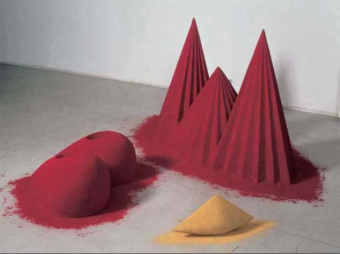
PLATE 2: Anish Kapoor, As if to Celebrate, I Discovered a Mountain Blooming with Red Flowers, 1981, Pigments, wood and plaster, 97 × 77 × 160 cm object, 33 × 71 × 82 cm object, 21 × 16 × 47 cm sculpture. (© Tate, London, 2005.)
First Impressions: Otherworldly. Sandcastles - fragility. Dust, possible crumbling of the structures. Primary Colours - red, and yellow. Round / Curved shapes - contrasted with Triangle / Cones / Sharp Spike shapes. Two of the red shapes are rounded, three are cones, the yellow shape is cone and rounded. Placed on a concrete floor in front of a white wall. Feels like an industrial setting.
Suggested Course Answer: Multicoloured. Fragile. Spiky.
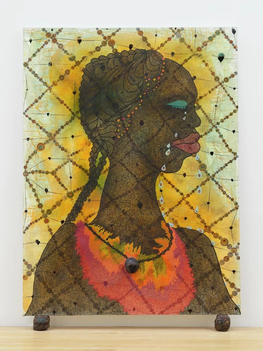
PLATE 3: Chris Ofili, No Woman No Cry, 1998, acrylic paint, oil paint, resin, pencil, paper collage, Letraset, glitter, map pins and elephant dung on linen with two dung supports, 244 × 183 × 5 cm. (© Chris Ofili. Courtesy of Chris Ofili – Afroco and Victoria Miro Gallery. Tate Photography.)
First Impressions: Wash - soft application of materials. Foggy haze. Quilt like embroidery design. Brown, some green-blue and yellow-orange colour scheme with some dark hues conveying lines > for me, creates a connection with the groundedness of the earth. Hair mirrors the embroidery, it’s ornate, well kept, intricate. Sadness, grief, loneliness, depression - tears flow from closed eyes.
Suggested Course Answer: Colourful. Dignified. Sad.
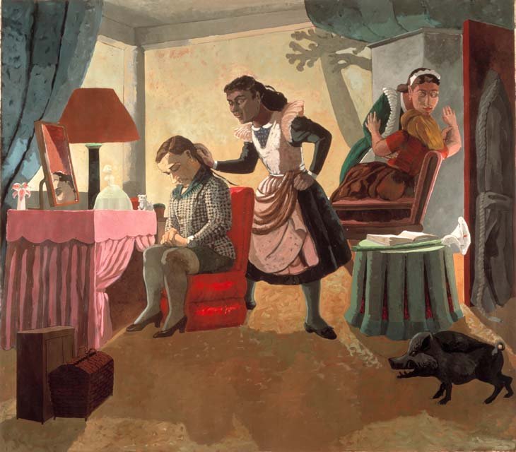
PLATE 4: Paula Rego, The Maids, 1987, acrylic on canvas backed paper, 214 × 244 cm. (Courtesy The Saatchi Gallery.)
First Impressions: Pastel colours, some earth tones but it all feels in shadow - there is light coming in and hitting the back wall, it feels artificial. The maids are persons of colour. They are tending to two white women. Black pig in lower right corner. Foreboding feeling, something isn’t right. The girl in green feels very forlorn, she faces us but her head is looking down, eyes closed with resignation, hands resting together on her lap. You can see her closed eye reflected in a small mirror sitting on the makeup table. A girl in red is not facing forward, there’s action in her stance, as it she might be wailing in pain, arms raised in objection and a feeling of abandonment. Her left arm holds the arm of the maid, as her head is pressed against the maid’s chest and the maid is resting her head on hers as if trying to comfort her.
Suggested Course Answer: Alice in Wonderland. Story-telling. Intriguing.
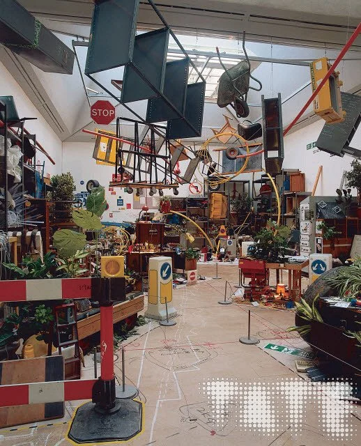
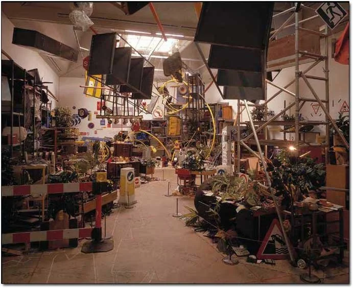
PLATE 5: Tomoko Takahashi, Learning How To Drive, 2000, mixed media installation, dimensions variable. (© Courtesy of the artist and Hales Gallery. Photo: Tate Photography/Mark Heathcote.)
First Impressions: Busy, chaotic, claustrophobic, disorganized, disorienting, messy but with a path of sorts leading through the mess, wayfinder signs point attention to different areas of the mess as opposed to a way through. Objects fill the space. Piles on the floor, things on shelves and furniture, things attached to (or leaning on) walls, and attached to / suspended from ceiling. Some times suspended from ceiling appear to be floating, as if they are weightless. There appear to be markings on the floor, scribbles, lines, writing, and splotches of paint too.
Suggested Course Answer: Messy. Confusing.
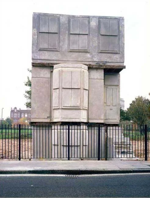
PLATE 6: Rachel Whiteread, House, 1993. (© The artist. Courtesy Gagosian Gallery.Photo: Tate Photography.)
First Impressions: Plain. Concrete. Molded / shaped / cast / preserved. Copy & Paste. Uninspired. Unoriginal, dull. Lifeless. Looks like it’s partially cast - feels like a roof is missing. Heavy, weighted, inaccessible.
Suggested Course Answer: Bland. Concrete.
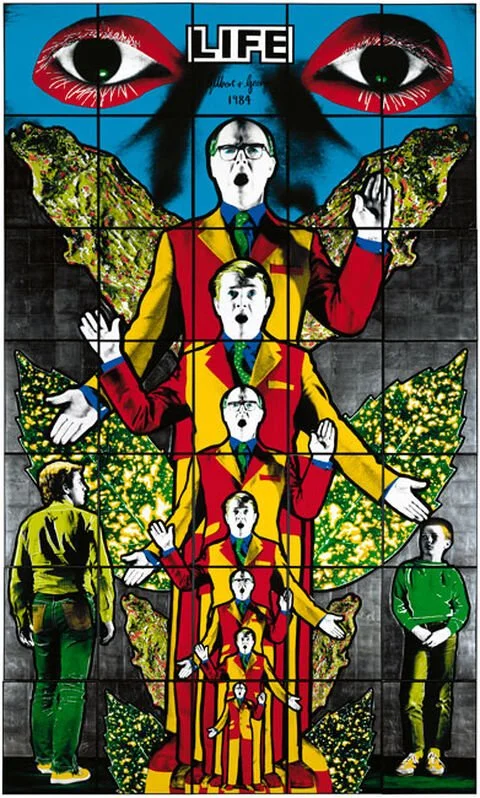
PLATE 7: Gilbert and George, Life from Death Hope Life Fear, 1984, handcoloured photographs, framed on paper, unique (Courtesy of Gilbert and George. © Tate, London, 2005.)
First Impressions: Bright, surreal dreamlike. Text information plus visual imagery that’s been transferred onto the surface. Repetition. Two central figure is repeated across the middle, but also works to form a singular figure of sorts - a monumental statue, or totem figure, telling a story.
Suggested Course Answer: Bright. Photographic. Joyous.
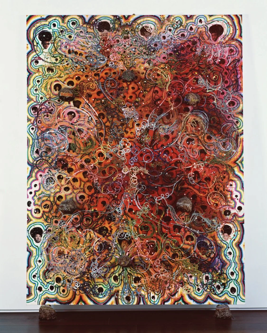
PLATE 8: Chris Ofili, Afrodizzia, 2nd version, 1996, acrylic, oil, resin, paper collage, glitter, map pins and elephant dung on canvas with two dung supports, 244 × 183 cm. (© Chris Ofili. Courtesy of Chris Ofili – Afroco and Victoria Miro Gallery.)
First Impressions: Washes / Swaths of colour flow across the picture plain - reds, oranges, browns / earth tones. Playful curvilinear line work also contributes to the flow. There’s a variety of mark making here, thick lines, lines of different colours, smooth lines, scratchy doodle lines, repetitive dots that make up a line. Feels like a high - psychedelic, a visual representation of being high. From a distance it feels like the image of the same Afro man is repeating itself but upon closer inspection one sees its many different faces throughout the piece, all with different expressions.
Suggested Course Answer: Colourful and complex. Dizzy. Flowing. Psychedelic.
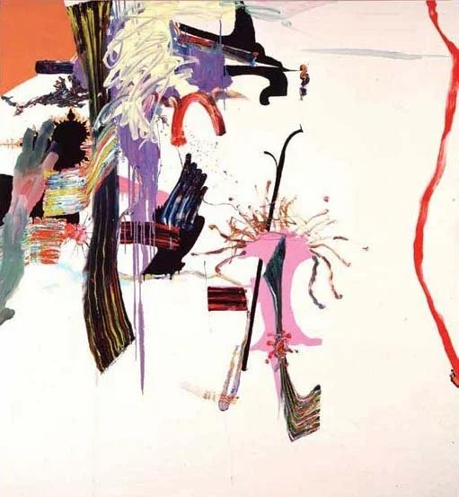
PLATE 9: Fiona Rae, Untitled (yellow), 1990, oil on canvas support, 214 × 198 cm. (© Fiona Rae. Courtesy Timothy Taylor Gallery. Photo: Tate Photography.)
First Impressions: There’s some balance between minimalist areas and more complex / developed areas. Some areas the paint is a wash, such as the background. Other areas it’s a flat surface applied evenly, some areas the paint was applied thin with drips allowed to move down the painting. Black is applied flatly, but has different colours of paint drawn and scratched into it. Overall - the piece is abstracted, but not representational.
Suggested Course Answer: Basic. Confusing. Splodges.
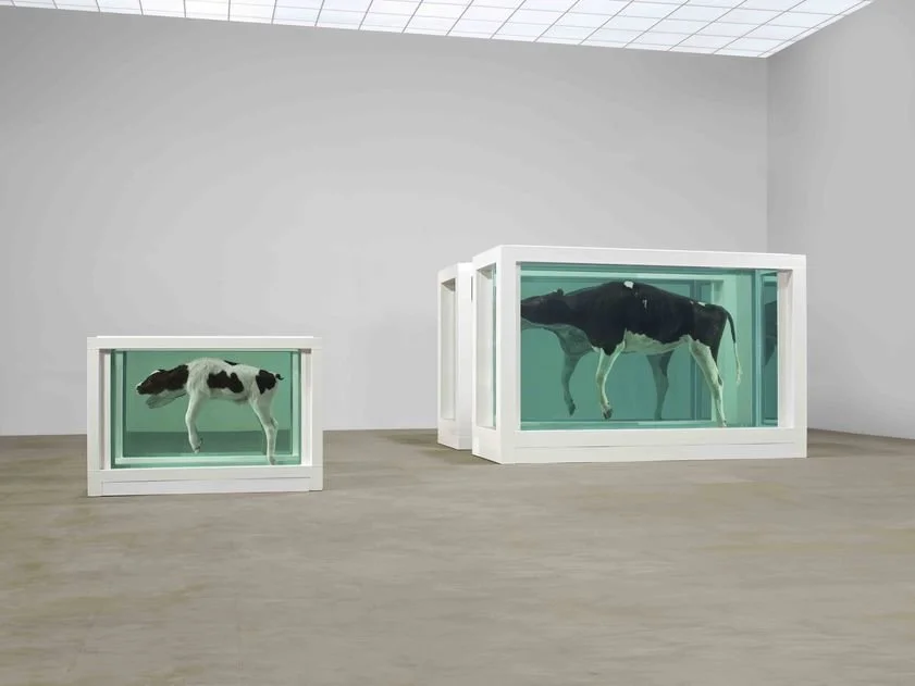
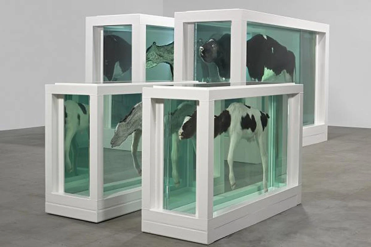
PLATE 10: Damien Hirst, Mother and Child Divided, 1993, steel, GRP composites, glass, silicone sealants, cow, calf, formaldehyde solution, tanks: 190 × 323 × 109 cm and 103 × 169 × 63 cm. (© The artist. Courtesy Jay Jopling/White Cube, London.)
First Impressions: Morbid, macabre, eerie, but suggestive of scientific inquiry - Dissections. Looks clean - very clean, sterile, clean white lines of case, perfectly clear glass, even the formaldehyde solution looks perfectly clear. The title says that this is a mother and child which is sad. Feels like an unnatural display because the animals are so large. Can’t really see from the photos, the insides of the animals. I’m curious as to how they were cut in half and suspended so nicely in the formaldehyde.
Suggested Course Answer: Repulsive. Dissections. Sad.
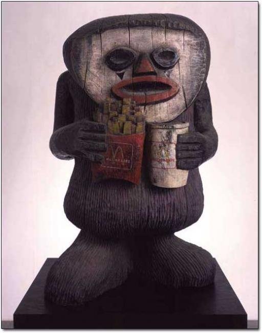
PLATE 11: Jake and Dinos Chapman, CFC76311561.1, 2002, painted bronze, 92 × 58 × 49 cm. (© The artists. Courtesy Jay Jopling/White Cube, London. Photo: Gareth Winters.)
First Impressions: Feels old, dark, weathered, like it’s been buried for a long time- like it is prehistoric, but that’s juxtaposed with the knowledge that this is about a contemporary subject matter (McDonald’s). Blocky, simple carving, nothing protruding from the piece, like an arm - makes it feel self contained. No deep relief, simple shapes for mouth, nose, and eyes. Painted face, nose and lips. Painted McDonald’s fries and drink cup. Feels somewhat playful, reminds me of some of the work created by Picasso during his African Period, the idea of Primitivism comes to mind. Appropriation as well, and how contemporary Western culture with its emphasis on “convenience” has spread across the globe so quickly over last 100 years.
Suggested Course Answer: Cute. Sturdy.
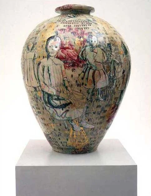
PLATE 12: Grayson Perry, Golden Ghosts, 2001, earthenware, 64 × 27 × 27 cm. (© Courtesy of the artist and Victoria Miro Gallery, London.)
First Impressions: Another artwork that has the feeling that it’s older than it is. For me though the subject matter doesn’t immediately make me think it’s a contemporary subject matter as I’m not sure what the figures are doing or who they represent. I am curious about what it means though. The figures look like they could be anime figures. Black line work grounds the piece, from many short dashes, as if counting in ordered sets. Cream colours, with some yellow and red throughout. The red appears to highlight some kind of hill. Some of the yellow appears in swaths, while some appears in scratches at the feet of one of the figures. The figures look rather forlorn, one looks angry. The figures are looking out in front of themselves but don’t appear to be looking exactly at a viewer.
Suggested Course Answer: Intriguing. Delicate.
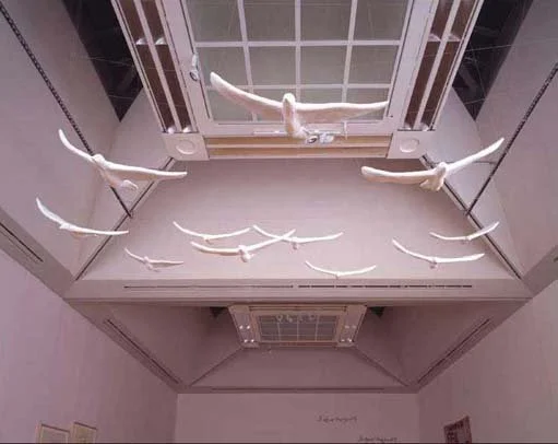
PLATE 14: Tracey Emin, In My Family When Someone Dies They Are Cremated And Their Ashes Are Thrown Across The Sea, 1997, plaster, white paint, eleven seagulls, 450 × 555 × 413 cm (variable) installation. (© The artist. Courtesy Jay Jopling/ White Cube, Lo
First Impressions: There’s a whimsical playfulness about this installation of seagulls. They feel as if they are suspended in the air, free floating, a moment of graceful movement captured in time. The white plaster gives it a dreamlike quality, that borders on the ephemeral. To paint them would have removed this feeling, even though seagulls are primarily white, they can have splashes or colour as found in their yellow beaks (with a splash of red) and feet, grey wing feathers and sometimes black and white tail feathers… by making them all white, it becomes a suggestion of a seagull, a memory of what once was.
Suggested Course Answer: Wistful. Flimsy.
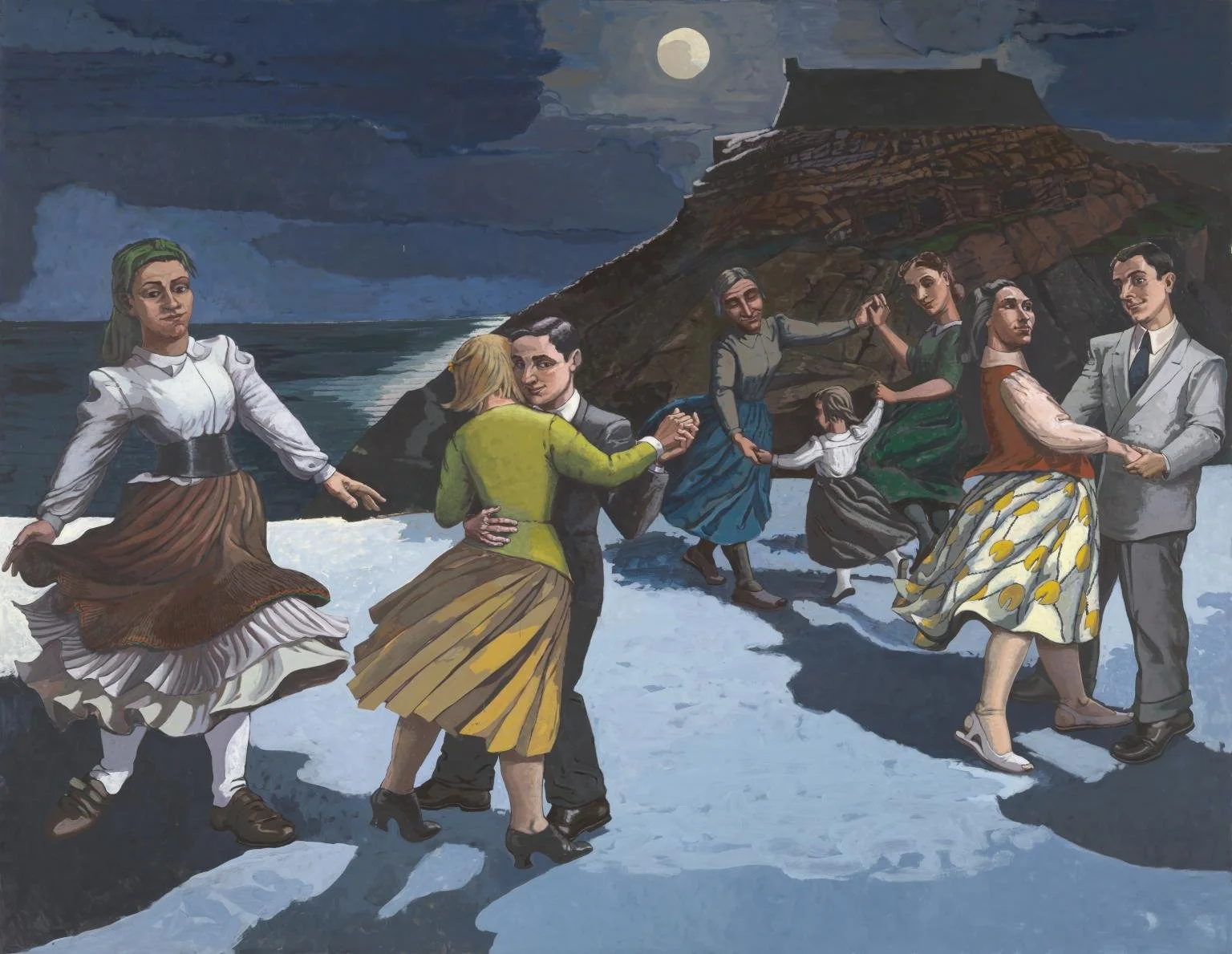
PLATE 14: Paula Rego, The Dance, 1988, acrylic on paper laid on canvas support, 213 × 274 cm. (© The artist. Courtesy Tate, London, 2005.)
First Impressions: This is another work that has a timeless quality to it that makes it feel as though it might have been painted in another century. The scene is set at night, overall everything is dark, save for the moon which hangs high, slightly right of centre, between parting clouds. It’s lighting up the far side of a hill off in the distance, and a body of water that sits behind it. It’s also lighting eight figures who are dancing, there shadows cast forward from the light of the moon that hits them. In some ways this painting feels like it might be a photograph, as five figures closest to the front of the frame feel as though they’ve been illuminated by the flash of a camera. There’s the obvious suggestion of movement, of rhythmic dance, and the figures feel at ease in the present moment of the dance. Some figures feel like they are alone to themselves in this moment, like the centre couple where the woman is wearing a greenish-yellow dress. Whereas the figures to the right of them seem to be appreciating each other as they dance.
Suggested Course Answer: Calm. Rhythmical.
At this point, the course website noted how:
“You'll be revisiting many of these works later in order to think about whether your feelings change as you learn more about them. However, the main focus of your study will be:
Chris Ofili's No Woman No Cry
Paula Rego's The Maids
Tracey Emin's The Perfect Place to Grow
As references to these plates are made, please make sure that you look at them to confirm what is being said about these art works. Just as with poetry, regular and detailed reference to the text is essential.
As you work through this course you'll use each point of the Study Diamond to help you to gather evidence about these art works. This will allow you to gradually build a well argued analysis of what you think these art works mean and what their significance is. With this task in mind, you should now allocate a separate section of your notes (perhaps using a fresh page) to each of the three art works. Put the art work title and the artist's name at the top of each page and for The Maids and No Woman No Cry, write down your first impressions of the works, as recorded in Activity 4.”
3.3 Reading an art text
Finally, the course website introduced the concept of reading a work of art, saying how:
“Having noted the immediate effect of an art work in terms of the way that it makes you feel, or the mood that it seems to convey, the next thing you can usefully do is to record the journey your eye takes as it experiences the work. This process of examining an art work is often called ‘reading’. Recording your first ‘read’ of an art work can give you some valuable supporting evidence to use when analysing it in more detail.”
