5.1 Introduction
The course website provides a solid introduction to the concept of colour, describing how:
“Colour can have a range of effects on us as spectators: for example, it can have an emotional impact, or it can encourage us to read the art work in a particular way. Here, you'll look at a range of questions that might be asked of the use of colour, namely:
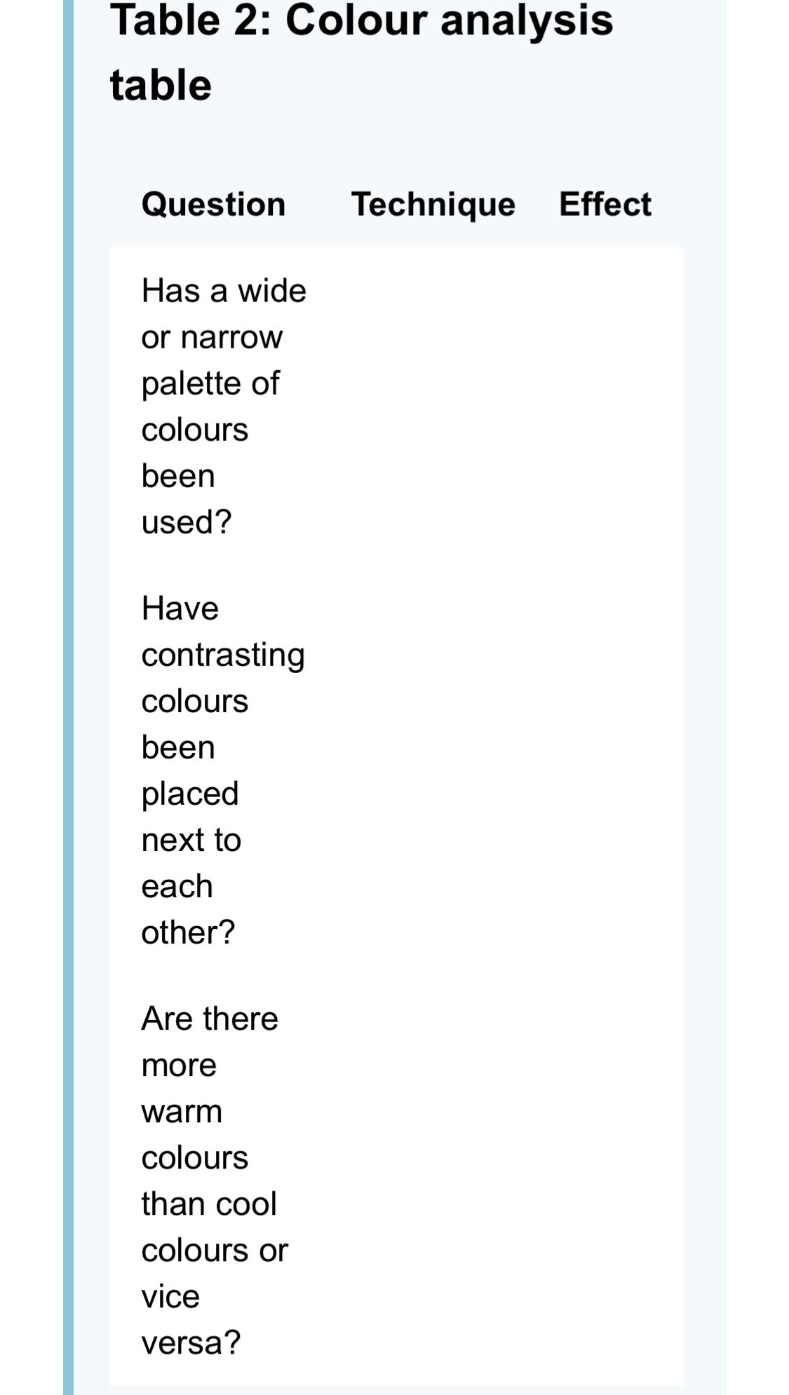
Has a wide or narrow palette of colours been used?
Have contrasting colours been placed next to each other?
Are there more warm colours than cool colours or vice versa?
Are the colours largely bright or dull?
In what way is dark and light colour used?
For each question you'll be encouraged to consider whether the use of colour conveys a particular mood or emotional effect and whether the use of colour helps to determine the order in which we read the art work.”
Wikipedia. “Colour Theory.”
Video > KQED Art School. “Elements of Art: Color | KQED Arts.” YouTube, 16 Jan 2015.
5.2 Question 1: Has a wide or narrow palette of colours been used?
The course website answers this question by explaining how:
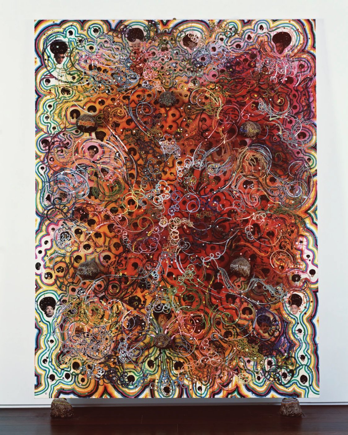
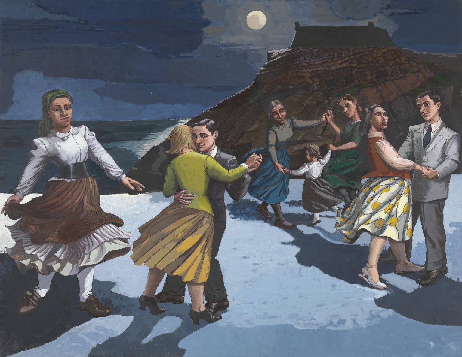
“The word ‘palette’ is used when describing the number of different colours that are present in an art work. A painting with many different colours, for example Chris Ofili's Afrodizzia (Plate 8), can be said to feature a wide palette of colours. In Paula Rego's The Dance (Plate 14) the range of colours is more limited, comprising mostly blue and yellow hues, so the painting can be said to feature a narrow palette.”
PLATE 8: Chris Ofili, Afrodizzia, 2nd version, 1996, acrylic, oil, resin, paper collage, glitter, map pins and elephant dung on canvas with two dung supports, 244 × 183 cm.(© Chris Ofili. Courtesy of Chris Ofili – Afroco and Victoria Miro Gallery.)
PLATE 14: Paula Rego, The Dance, 1988, acrylic on paper laid on canvas support, 213 × 274 cm. (© The artist. Courtesy Tate, London, 2005.)
The course continues, stating:
“Having identified the variety of colours that have been used in an art work, it's important to explore the effects of this. In Afrodizziafor example, the wide colour palette might be seen to convey a sense of confusion, giving no clues about which part of the painting to focus on first. It might also be seen to contribute to a joyous or cheerful feel. In my response to Activity 4 I described Afrodizzia as being ‘psychedelic’ and ‘colourful’. Clearly the colours had an immediate impact on me. In comparison, The Dance, with its more limited palette, feels calm, stately and subdued, effects that seem to be in keeping with the moonlit scene represented.“
5.3 Question 2: Have contrasting colours been placed next to each other?
The next question concerns how complementary colours work when used in an artwork:
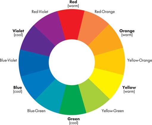
“Contrasting colours are those that are opposite, or almost opposite each other on a colour wheel. Their emotional effects can be to suggest drama, tension or perhaps vibrancy, as in Afrodizzia where it's arguable that the contrasting colours add to the lively, joyous feel of the art work. The effects of contrasting colours can cause the spectator to read a painting in a particular way by drawing their attention to areas of importance. For example, in The Dance, the contrast between the yellow dress of the woman placed left of centre in the composition and the blue that surrounds it tends to draw the spectator's eye to this area of the painting.”
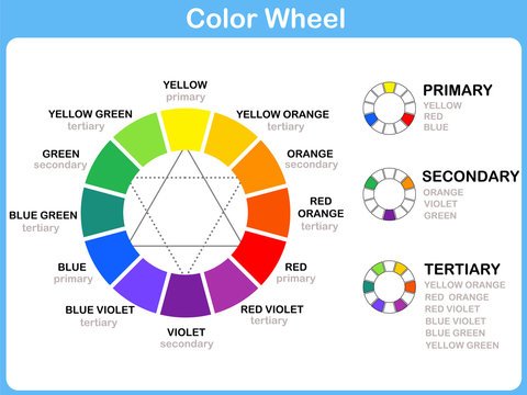
Figure 1: A colour wheel – a simple diagram that shows the relationship between colours.
Video > Art Summits. “How to Read A Color Wheel for Artists.” YouTube, 20 Oct 2021.
5.4 Question 3: Are there more warm colours than cool colours or vice versa?
The final question about colour which the course examines concerns the use of warm or cool colour schemes:
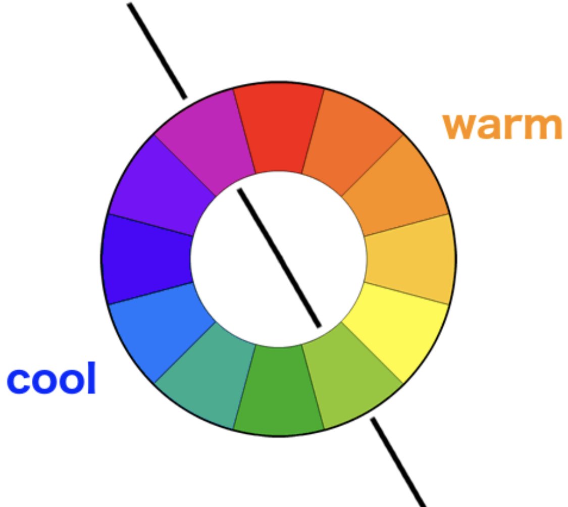
“Colours such as red, yellow, orange and some greens can be seen as ‘warm’ while blues, other greens, purples and even some shades of red can be described as ‘cool’. Warm colours tend to convey a positive, cheerful mood while cool colours can suggest calmness and serenity or perhaps sadness and gloominess. It's arguable that the dominance of blue in The Dance, for example, contributes to the peaceful night-time feel of the painting, while the dominant reds, yellows and greens in Afrodizzia help to convey a positive, cheerful mood.
Artdiscount. “What do we mean when we say there are 'Warm Reds' and 'Cool Reds'?”
Warmness or coolness of a colour refers to how much orange or blue it has.
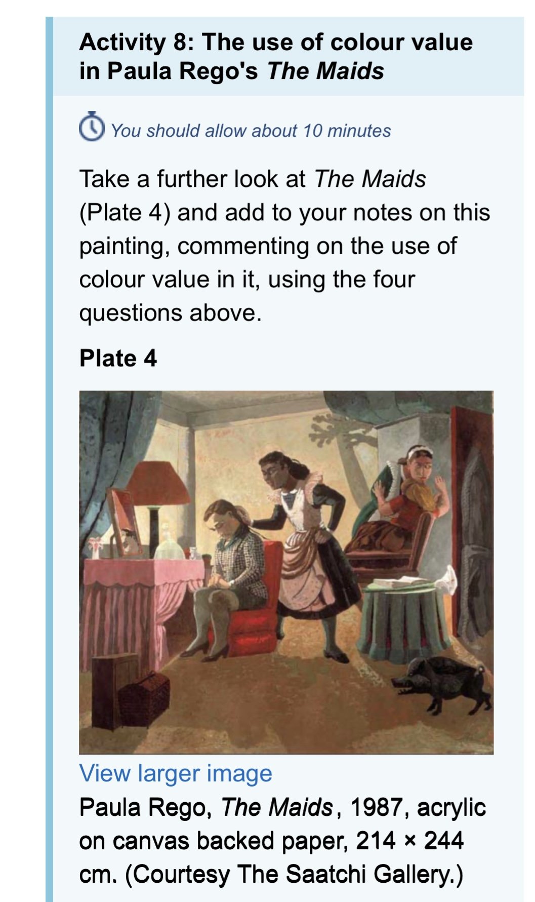
Activity 6: The use of colour in Paula Rego's The Maids

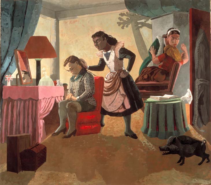
PLATE 4: Paula Rego, The Maids, 1987, acrylic on canvas backed paper, 214 × 244 cm. (Courtesy The Saatchi Gallery.)
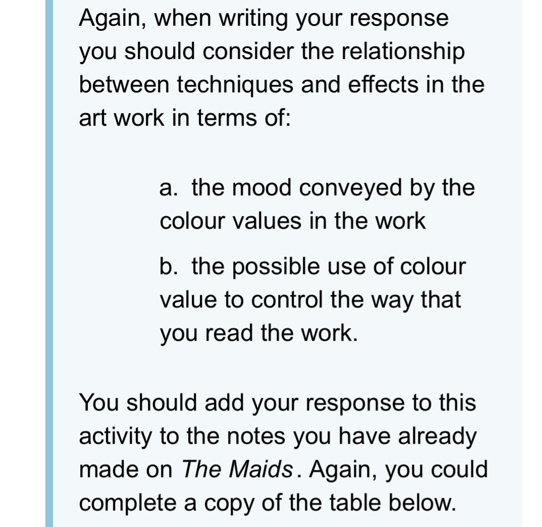
Look at Plate 4 below and make some notes on the use of colour in this art work, responding to the questions you have just worked through:
Has a wide or narrow palette of colours been used?
A wide palette of colours has been used by Rego in The Maids. Tints (produced when white is added to a colour - pastel colours are usually tinted), tones (produced when a neutral grey is added to a hue) and shades (produced when black is added to a hue) of red, red-orange, brown, as well as greens all compose the main palette being used. This use of colour contributes to the feeling of unease that permeates the scene.
Have contrasting colours been placed next to each other?
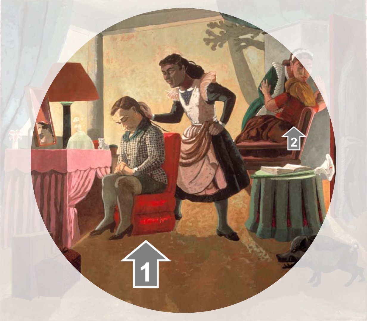
Contrasting colours do exist within Rego’s painting. The most stark contrast is with the woman in the cool mint green dress seated in the cool red chair, as pointed to by arrow 1 in PLATE 4A below. The back of the red chair also serves to separate the woman from the maid tending to her - she’s alone in the grief she’s possibly feeling. The area pointed to by arrow 2 in PLATE 4A below reveals the opposite - the girl here is in a red top, with a brown skirt. But the red is a dark shade of red, leaving her more obscure than the woman identified by arrow 1.
Are there more warm colours than cool colours or vice versa?
This painting features slightly warm light that hits the back wall, but the shadows cast upon the wall are cooler. The floor feels warm, but it’s an uncomfortable and slightly unpleasant warmth. The main girl sits in a heavily muted tone of green that leans cool. If not for the light that’s cast upon her, she’d be more obscured, and not as prominent a figure in terms of colour.
PLATE 4A
5.5 Question 4: Are the colours largely bright or dull?
The course then turned its attention to another consideration regarding colour, that of its value (aka luminosity, or brightness), noting how:
“Two colours may have the same hue (for example blue) but one may be vivid and the other dull. Look again at The Dance (Plate 14). Here, the sky is depicted using both dull and bright blue colours. However, neither dull colours nor bright colours dominate the painting; rather there's probably an equal amount of each.”
PLATE 14: Paula Rego, The Dance, 1988, acrylic on paper laid on canvas support, 213 × 274 cm. (© The artist. Courtesy Tate, London, 2005.)
The course also notes how:
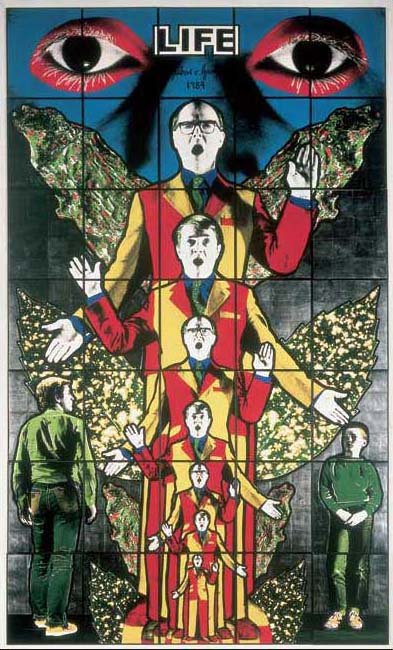
“Having identified the extent to which dull and bright colours feature in a painting, consider the likely effects of this. For example, an art work with mostly bright colours can suggest a livelier mood than one where the colours are mostly dull. Regarding your reading of the painting, if both bright and dull colours are present, your eye tends to be drawn to the bright colours first. Bright colours can also give an artificial feel, as in Life by Gilbert and George (Plate 7), where intense reds, yellows, greens and blue are dominant.”
PLATE 7: Gilbert and George, Life from Death Hope Life Fear, 1984, hand coloured photographs, framed on paper, unique. (Courtesy of Gilbert and George. © Tate, London, 2005.)
Activity 7: The use of brightness of colour in Paula Rego's The Maids
Are the colours largely bright or dull? There’s a strong contrast between what appears to be artificially lit areas which are fairly bright, lending to a somewhat bright and vibrant feel; with areas that exist in shadow, lending to a slightly unsettlingly dull atmosphere.
For example, when one focuses on the girl in the cool mint green dress seated in the cool red chair, as pointed to by arrow 1 in PLATE 4A above - one notices how the colour moves from light to dark, emphasizing the figure’s central importance in the artwork. By contrast, the girl identified by arrow 2 sits in shadow, and even though she is somewhat animated, the shadows in which she sits contributes to her feeling less prominent compared to the other girl who is strongly lit in her very quiet pose.
The lamp shade and carpet have some degree of dull yellow orange, which, in the carpeted areas closest to the front of the picture is a darker, more muddy brown colour. This darker foreground area creates a space between the viewer and the figures in the painting, further emphasizing the emotional distance between us and the figures, and even between the figures themselves. It’s interesting that the lighter areas of the floor match the colour of the girl 2’s hair and the lightness makes her appear more reactive to her emotions, even though she’s sitting in shade and not the main focus of the painting.
The course website emphasized:
“Again, your conclusions about the relationship between technique and effect in The Maids may have been very different. Please make sure you note your conclusions clearly as they will be valuable evidence upon which to base an interpretation of the meaning of the painting later in the course.”
5.6 Question 5: In what way is dark and light colour used?
The course website describes:
“How light or dark a colour appears is termed its tone or ‘value’. A colour's value is increased, or lightened, by adding white or another lighter value colour to it. A colour's value is decreased or darkened by adding black or a darker value colour to it. In The Dance, for example, the foreground area features both dark and light blues. Technically, the lightened colours are called ‘tints’ and the darkened colours are called ‘shades’.
Colour value is one of the most powerful aspects of form that can be used by an artist to create visual contrast in a painting. It can have considerable impact on the spectator, both by suggesting particular emotions and moods and by encouraging the spectator to read a painting in a certain way. Value can also be used to help in the representation of objects from the real world, for example, when an artist is trying to represent a three-dimensional shape or to represent light in a painting.
The course website continued, noting how:
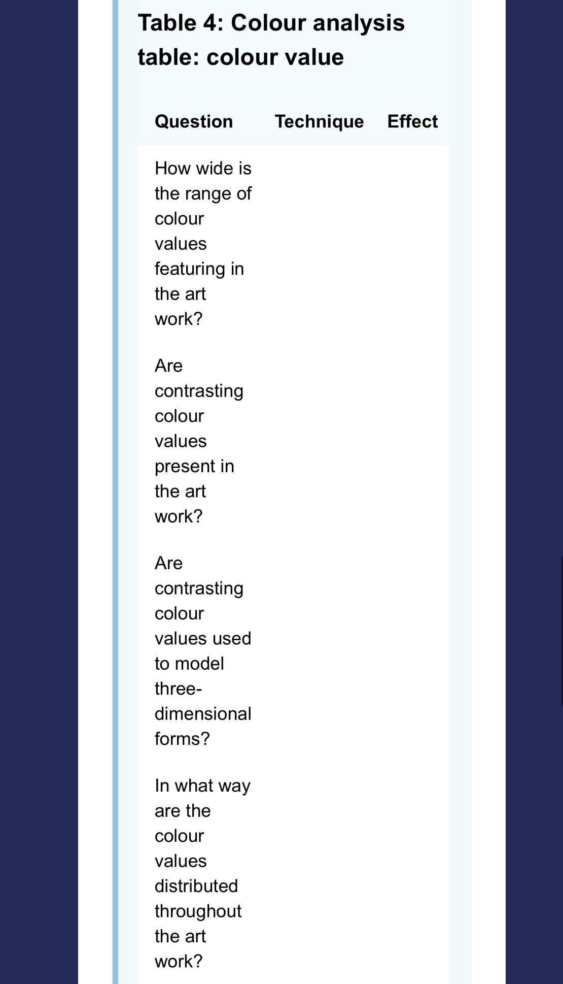
“When exploring colour value in an art work, we can ask the general question: ‘In what way is colour value used?’ This can be subdivided into several further questions of which I have chosen four…
How wide is the range of colour values featuring in the art work? In other words, what is the distribution of colour values from dark to light?
The breadth of the value range in a painting can be effective in helping to convey mood. For example, a painting comprising mostly dark colour values can make a work appear gloomy and sombre; whereas one with middle range colours can convey softness and harmony; and a painting comprising mostly light colour values can suggest optimism and cheerfulness.
Are contrasting colour values present in the art work? Or are dark and light colour values placed adjacent to each other?
Essentially, the greater the difference between light and dark colour values in a particular area, the more attention that area will attract.
Are contrasting colour values used to model three-dimensional forms?
In The Dance, for example, the contrast of light and mid colour values in the arm of the woman in yellow near the centre of the composition gives the limb a sense of roundness and solidarity.
In what way are the colour values distributed throughout the art work?
Concentrating most of the light values in one area of the composition and most of the dark values in another can be effective in emphasising one area of an art work over the rest. When light and dark values are placed adjacent and are distributed evenly throughout the art work it can give the composition a sense of ‘movement’, causing the eye to move from place to place rather than focusing on one particular area.
Look again at Paula Rego's The Dance (Plate 14). This painting features an even distribution of colour values, with dark and light colour values appearing throughout the composition. This seems to give the composition movement, leading the spectator's eye from one dancer to the next.
In Chris Ofili's Afrodizzia (Plate 8), while light and mid values tend to dominate much of the composition helping to convey a positive energetic feel, the dark values that are present in the tiny faces that punctuate the composition add additional interest and cause the spectator to pay extra attention to these areas of the work.”
Beach Painting Contractors. “Colour, Hue, Tint, Tone, and Shade.”
Wikipedia. “Tint, Shade, and Tone.”
Williams, Shirley. “Primary Colors, Secondary and Tertiary Explained.” The Colour Wheel Artist, 15 Feb 2017.
Williams, Shirley. “The Ultimate Guide to Understanding Hue, Tint, Tone and Shade.” The Colour Wheel Artist.
Activity 8: The use or colour value in Paula Rego’s THE MAIDS
