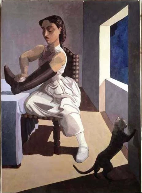
The course website describes how:
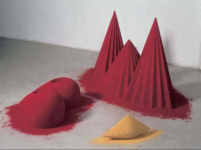
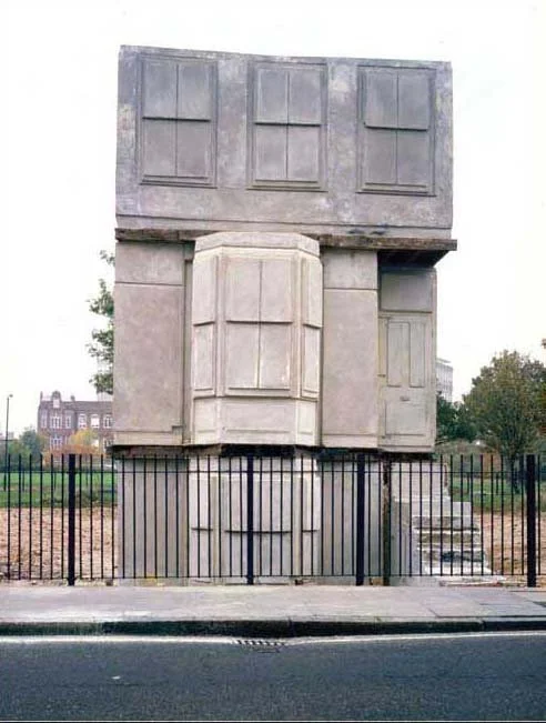
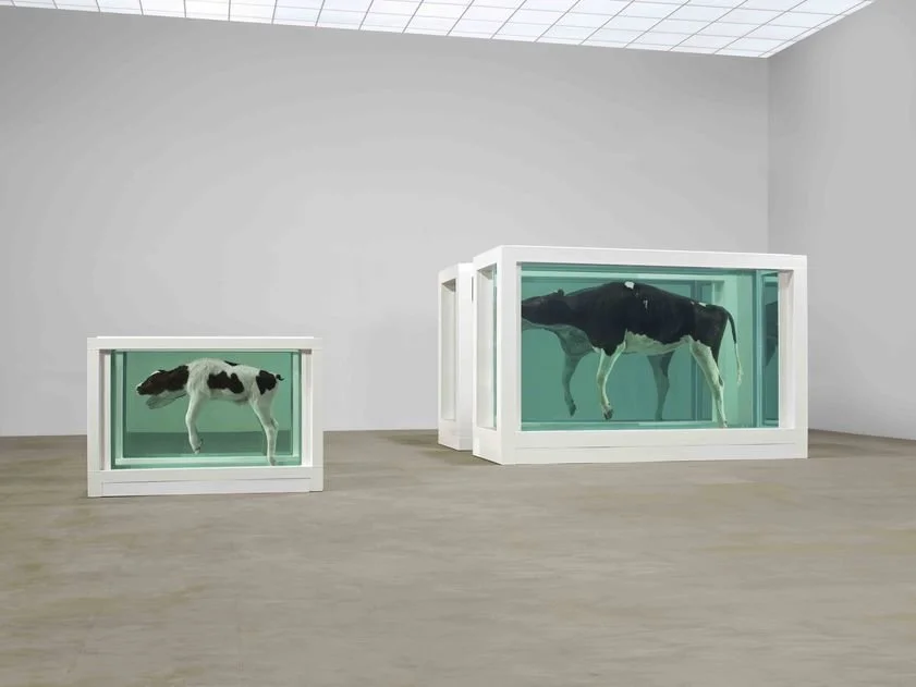
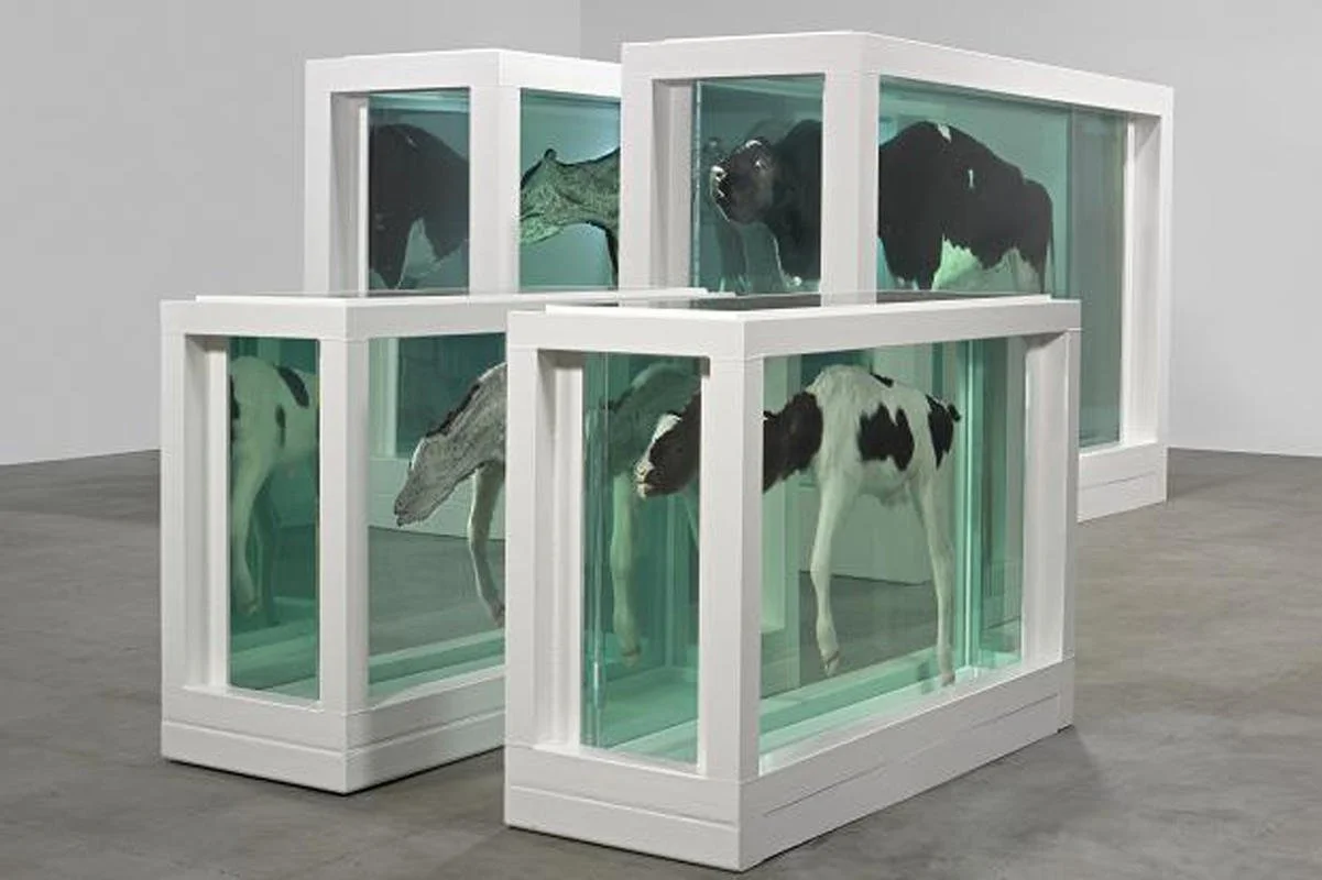
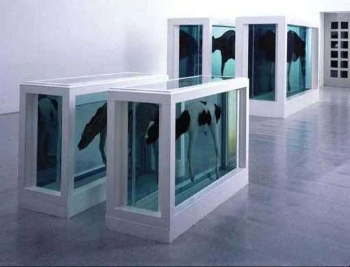
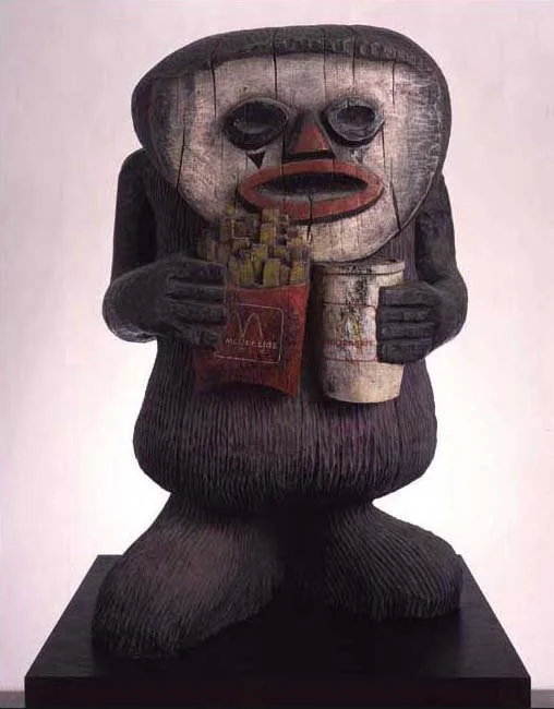
The word ‘medium’ (plural ‘media’) refers to the substance used to make a particular art work. The range of media used in the art works featuring in this course is wide, including oil paint, animal carcasses, elephant dung, photographs, glitter and road signs. When analysing the relationship between techniques and effects in any painting you should note the medium from which it has been made. Ask yourself why the medium was chosen. Some helpful questions are:
- Does the medium impose any limitations on the way the artist works, or allow any particular effects?
- Is the medium used unconventionally or is the medium itself unconventional and, if so, does this contribute to the expressive effect of the art work?
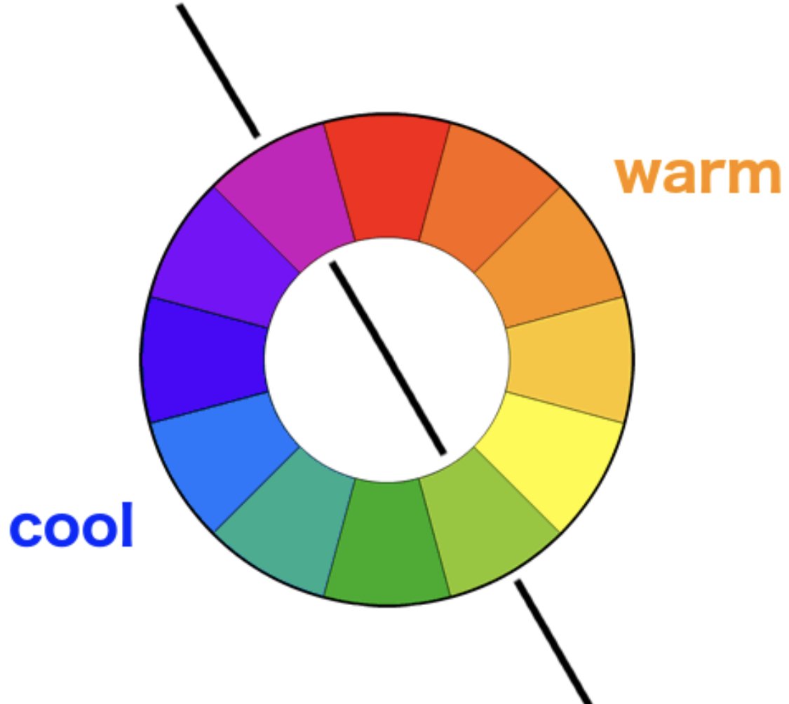
- Does the medium used suggest a particular mood?
- Does the medium used prompt the spectator to read the work in a particular way?
In the following discussion, you'll explore each of these questions in more detail.

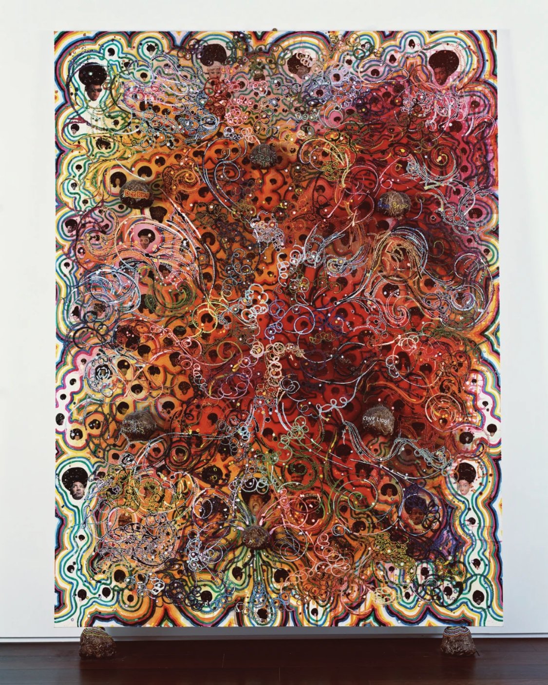
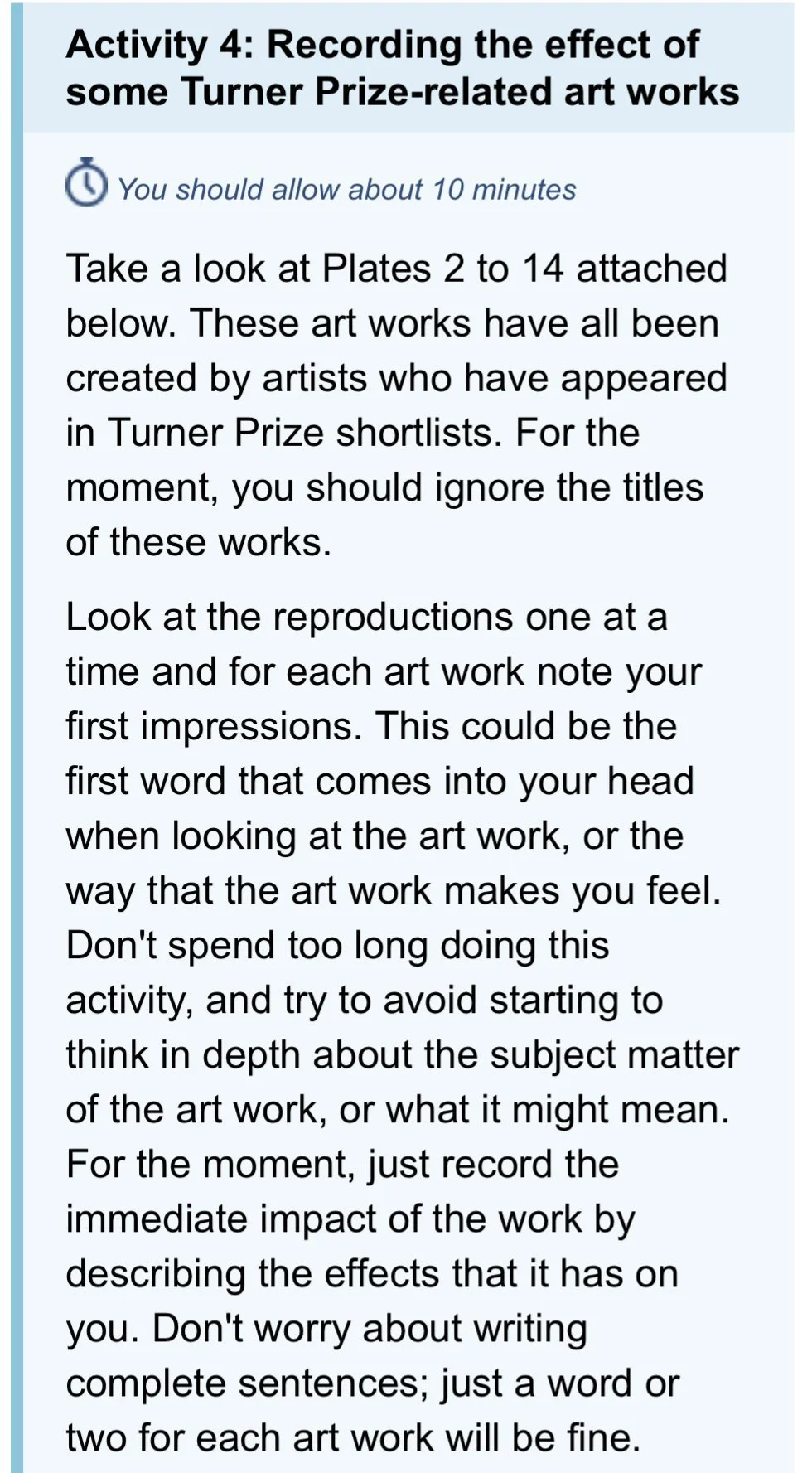
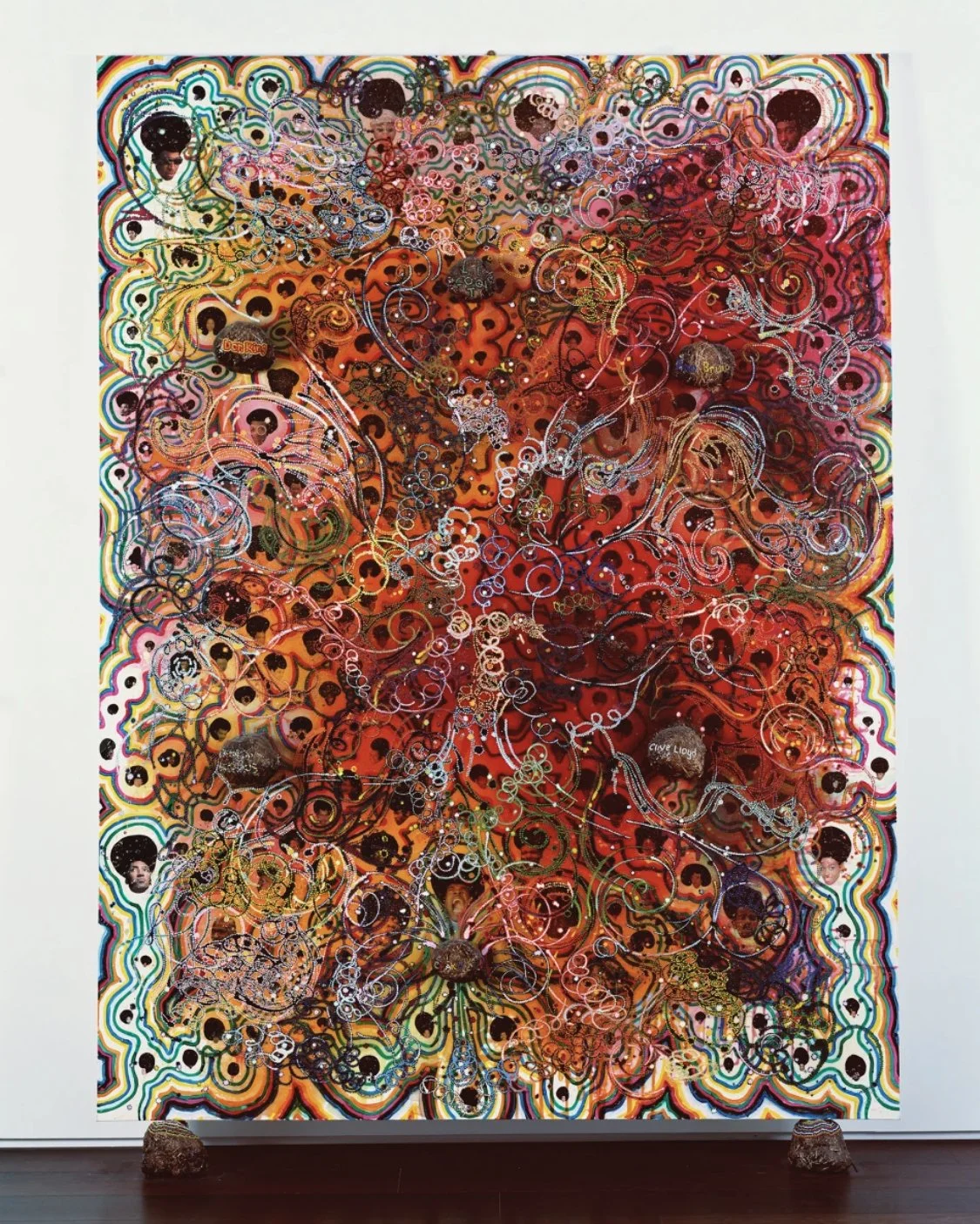
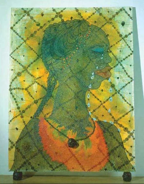
PLATE 3 > Chris Ofili, No Woman No Cry, 1998, acrylic paint, oil paint, resin, pencil, paper collage, Letraset, glitter, map pins and elephant dung on linen with two dung supports, 244 × 183 × 5 cm. (© Chris Ofili. Courtesy of Chris Ofili – Afroco and Victoria Miro Gallery. Tate Photography.)

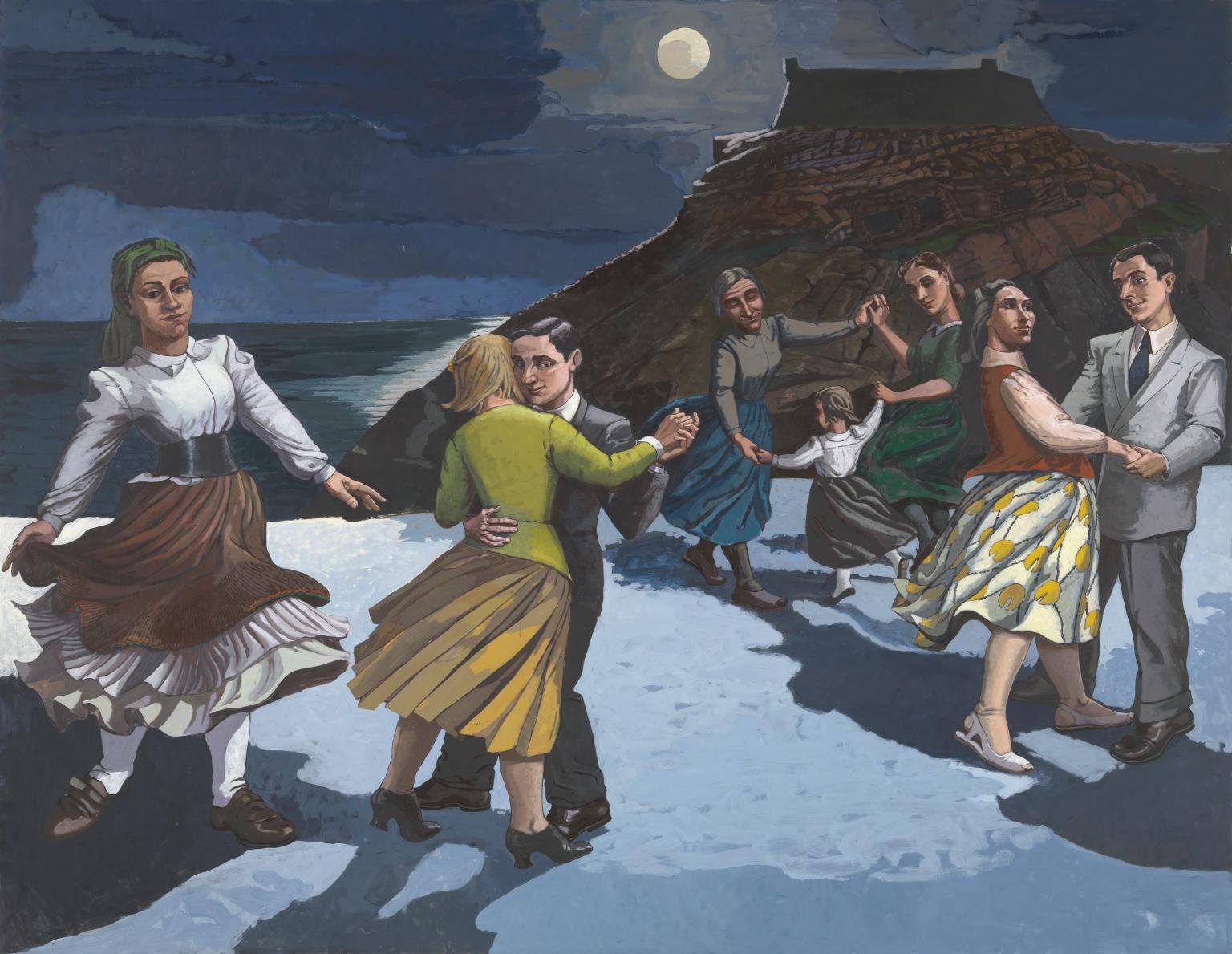
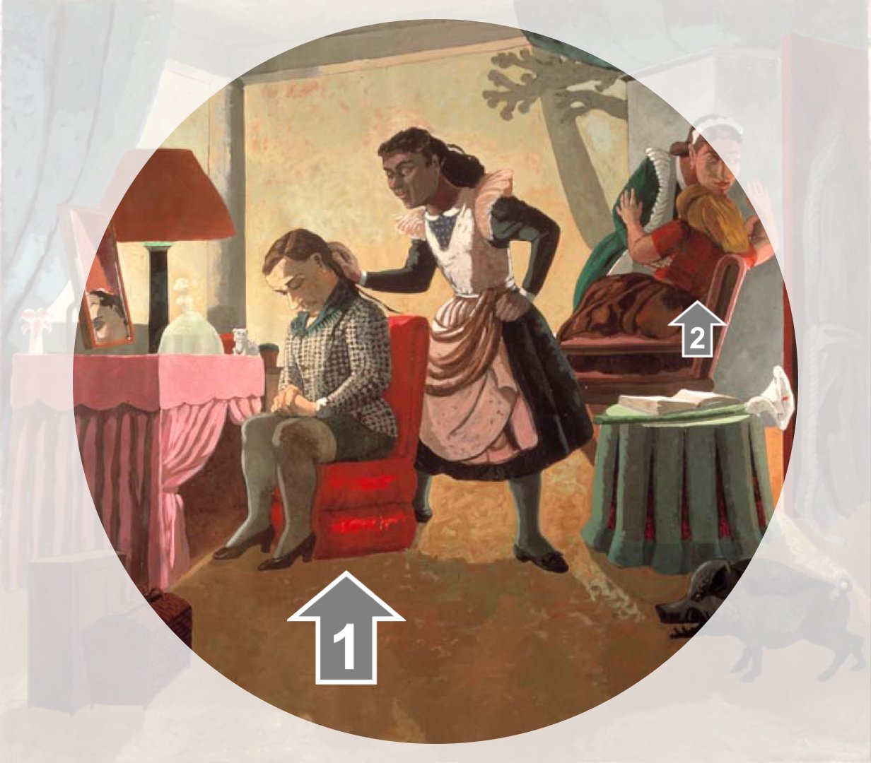
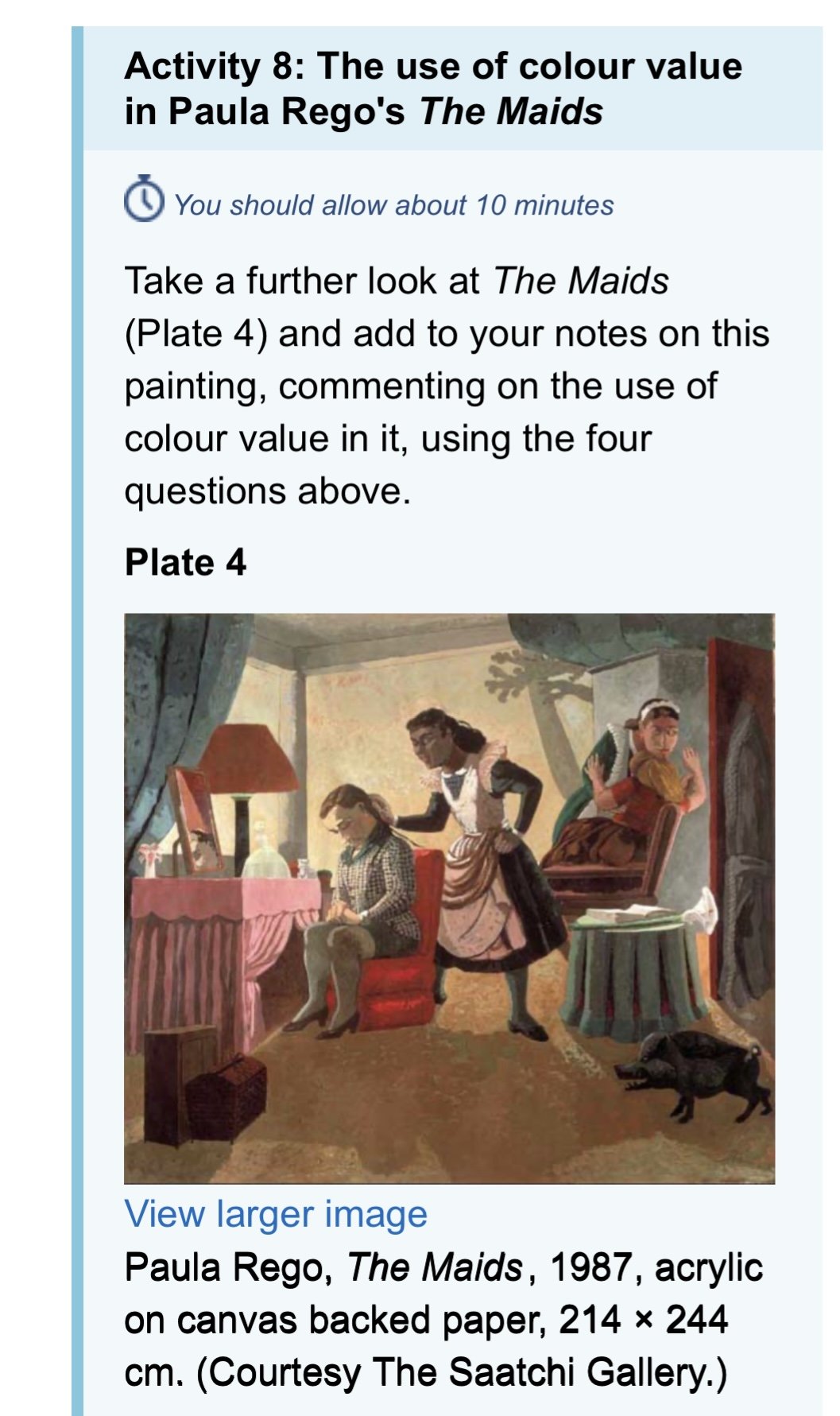
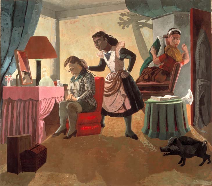
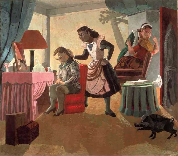
PLATE 4 > Paula Rego, The Maids, 1987, acrylic on canvas backed paper, 214 × 244 cm. (Courtesy The Saatchi Gallery.)